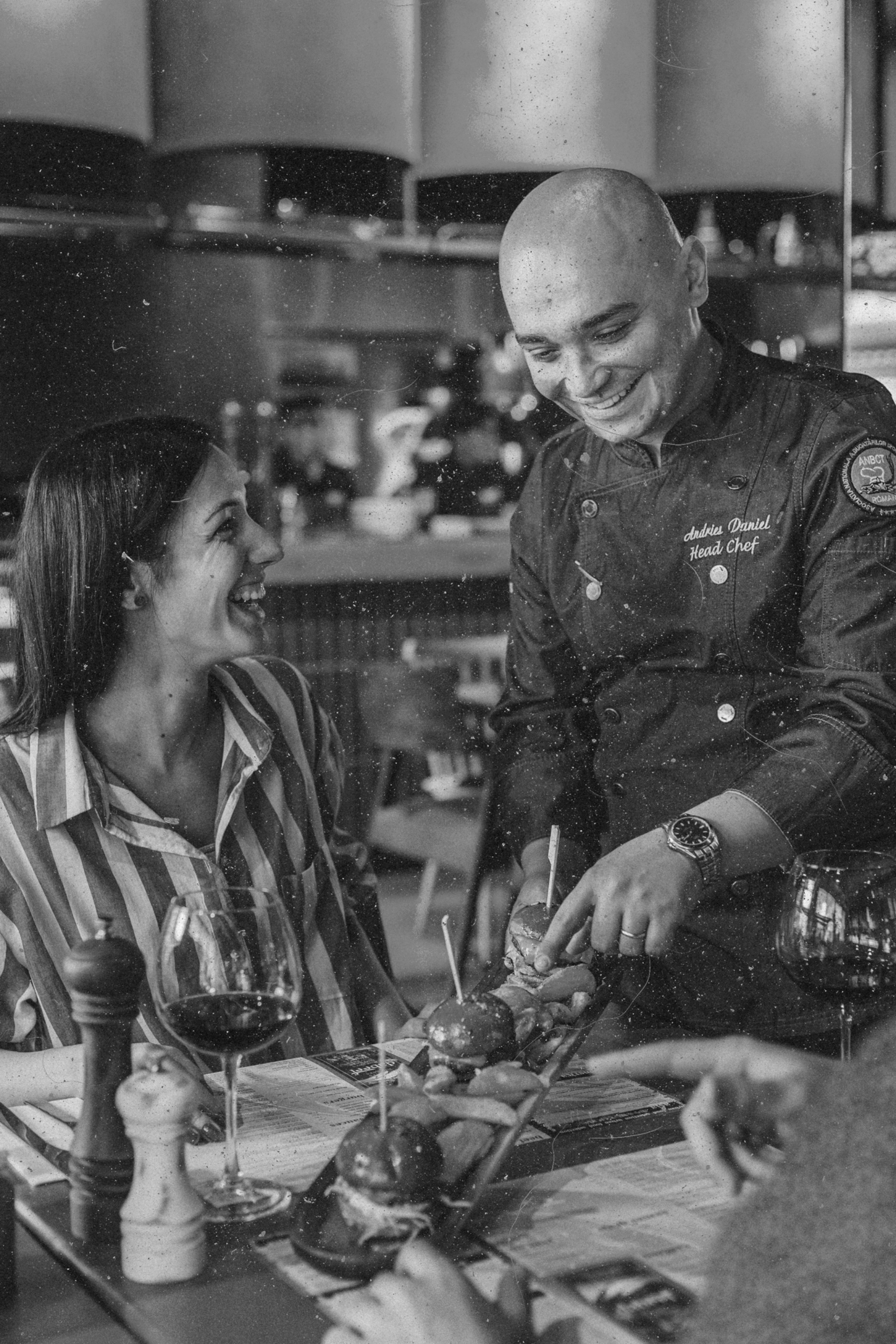
DaBeef emerged as a complete rebrand of a struggling Bucharest restaurant — same location, same staff, same kitchen, only the chef changed. The brief asked for an identity capable of carrying a deliberately split menu of classic steakhouse fare and urban street food, on one of the city's most prestigious streets. What followed was a name born from Dadaism, a brand system that used Kitsch as a precision tool rather than an accident, and a digital experience designed to sell the visit before the first table was set.
Challenge
A struggling restaurant. A menu split between two worlds. A prestigious address that punished any hint of inconsistency.
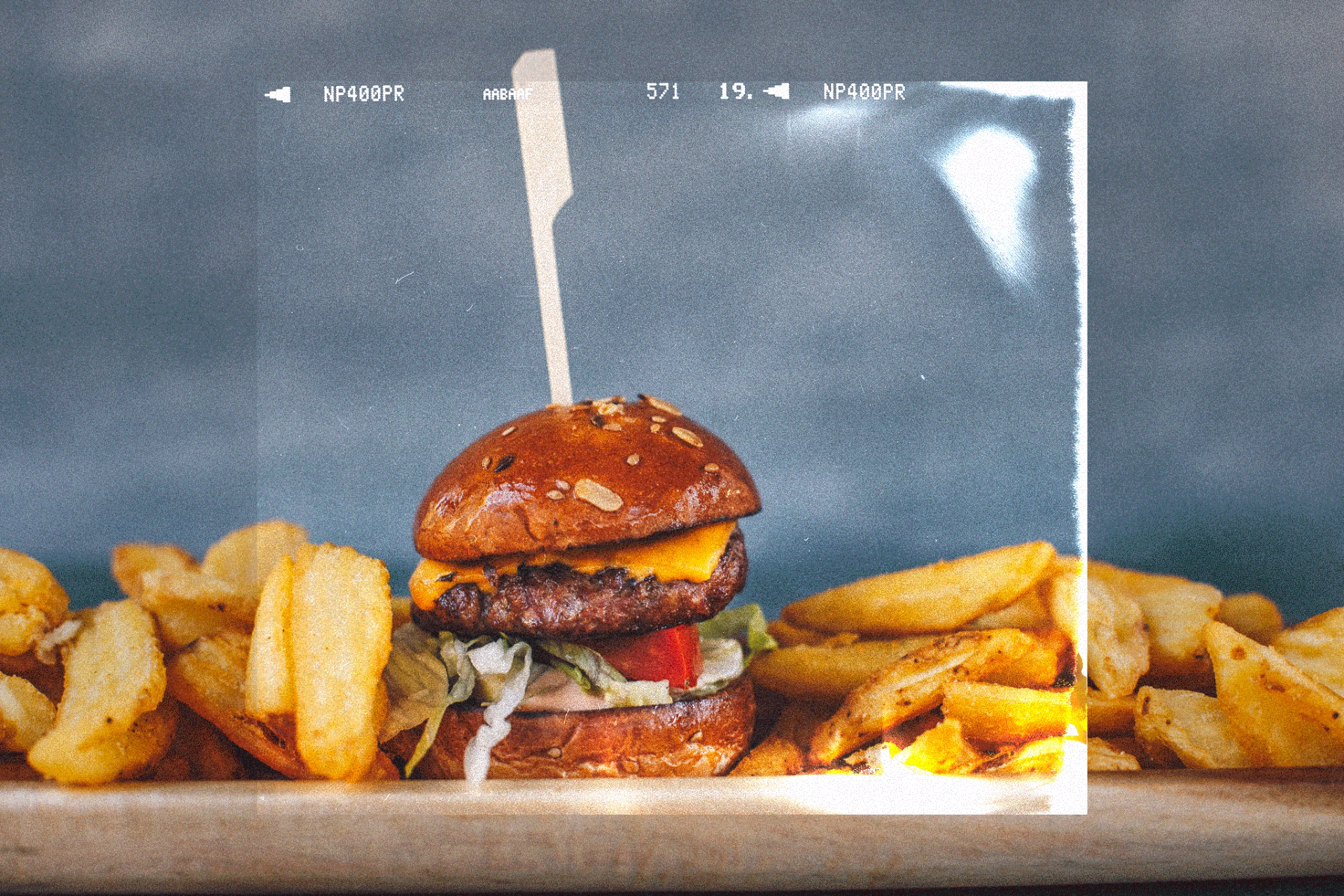
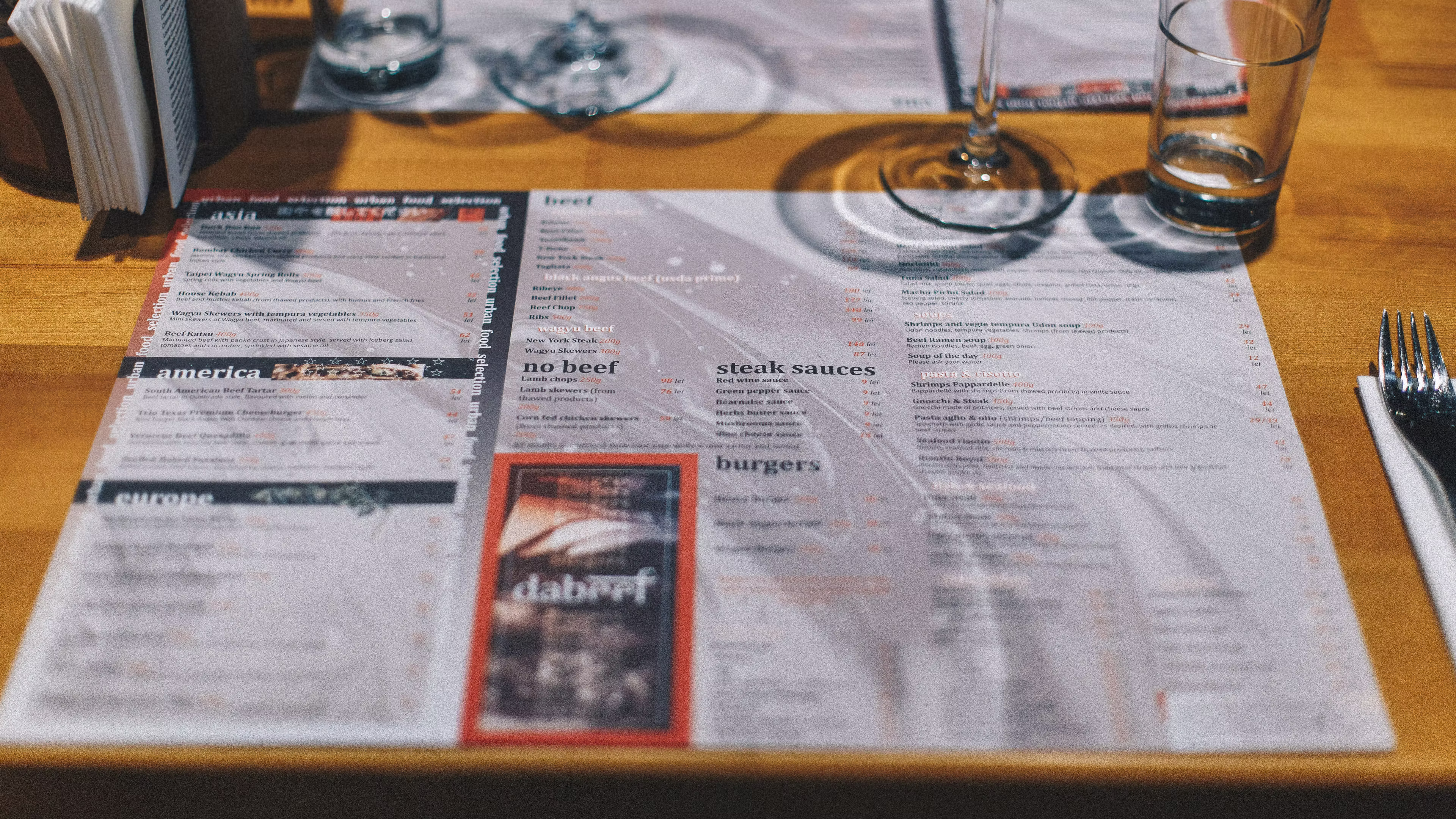
DaBeef inherited a failing location with most of its existing infrastructure intact. The new menu deliberately blended high-end classic steakhouse dishes with urban street food, a combination that risked reading as Kitsch by accident. The brand needed to set the tone, justify the price points, and recover an audience the previous identity had already lost.
Kitsch used with intention, not avoided by reflex.
Rather than fight the Kitsch associations the menu’s hybrid nature would inevitably trigger, we leaned into them with strategic discipline. Every Kitsch reference was placed deliberately, framed as a wink rather than a default. The result is a brand that holds its ground in a category most restaurants stumble into by mistake.
Challenge
A name born from Dadaism. A logo cut from a typeface that wasn't meant to bend.
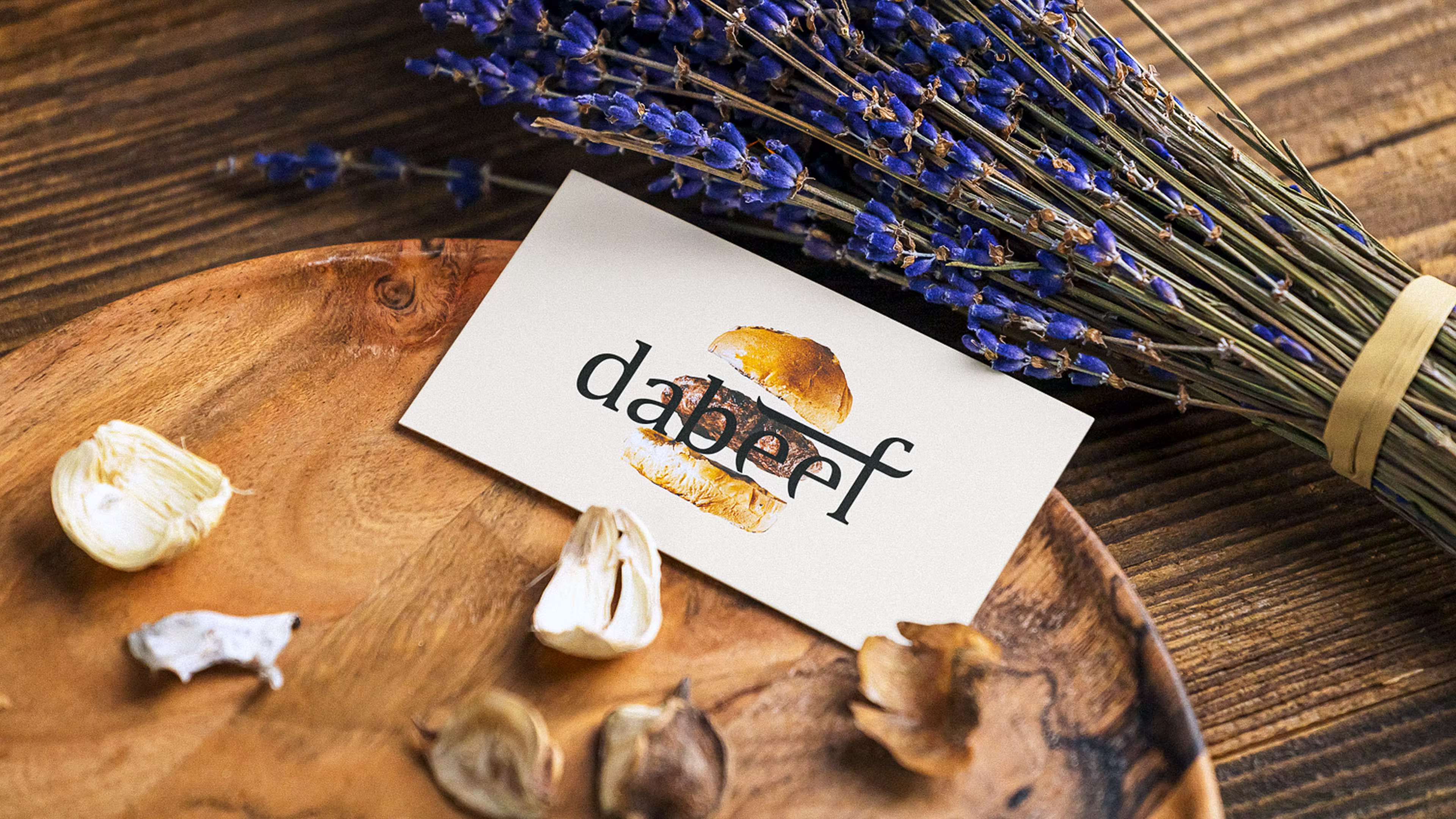
DaBeef takes its name from Dadaism and Beef, pronounced DáBeef. The Dadaist reference — inspired by Tristan Tzara’s anti-bourgeois philosophy of nonsense — gave the brand a quiet license to mock anyone, critic or chef, who treats food choices as social hierarchy. The name does the work of the brand before any visual identity has to.
Cambria, cut and reshaped into a cow.
Cambria — a transitional serif with even proportions, a tall x-height, and decisively rigid terminals — gave us a foundation that could be modified without breaking. We cut the e’s terminal and taper to resemble a cow’s body and legs, raised and lengthened the f’s cross stroke to read as horns. The logotype communicates the brand’s specialty — meat cuts — without ever resorting to literal illustration.
Goal
Attract a younger, high-end clientele to a restaurant that had already lost them once.
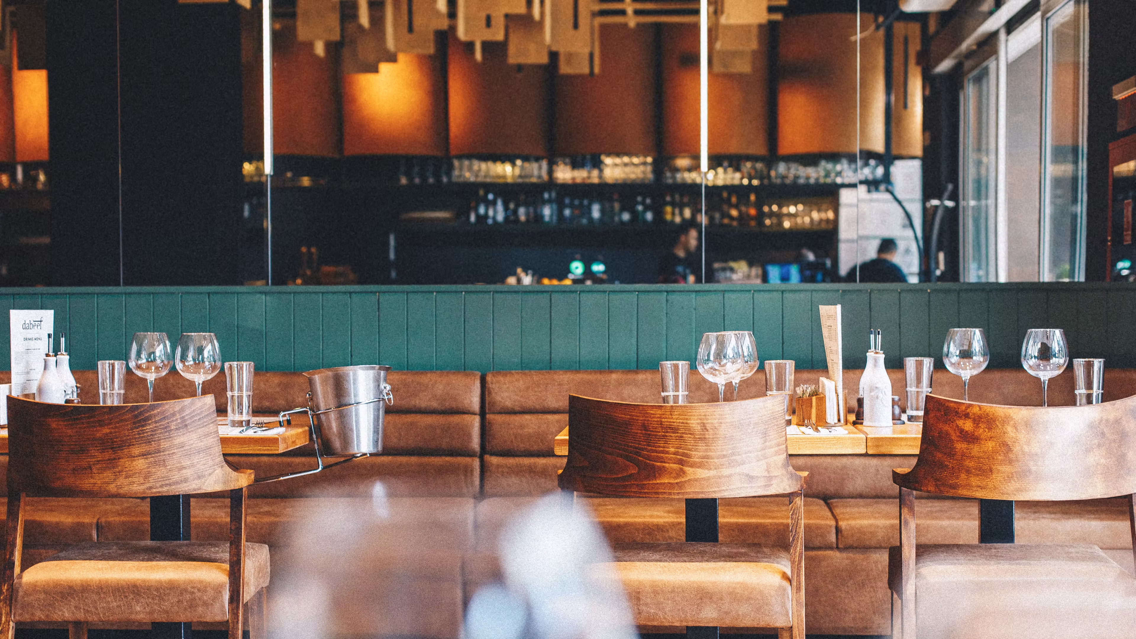
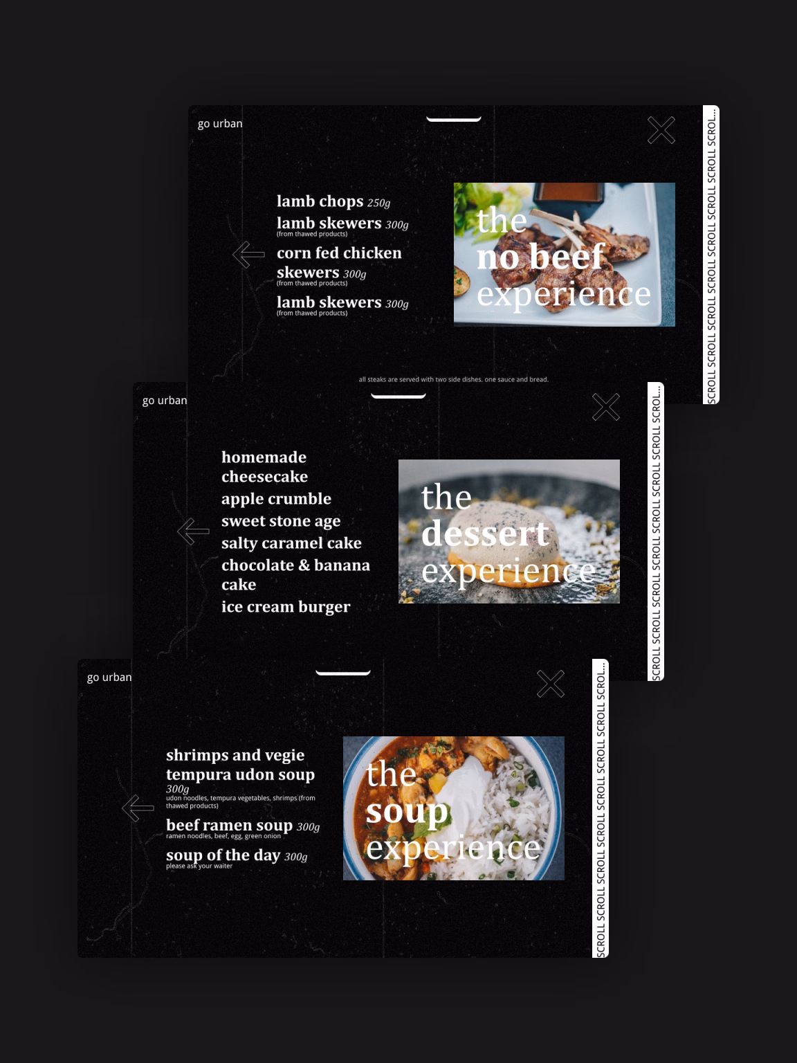
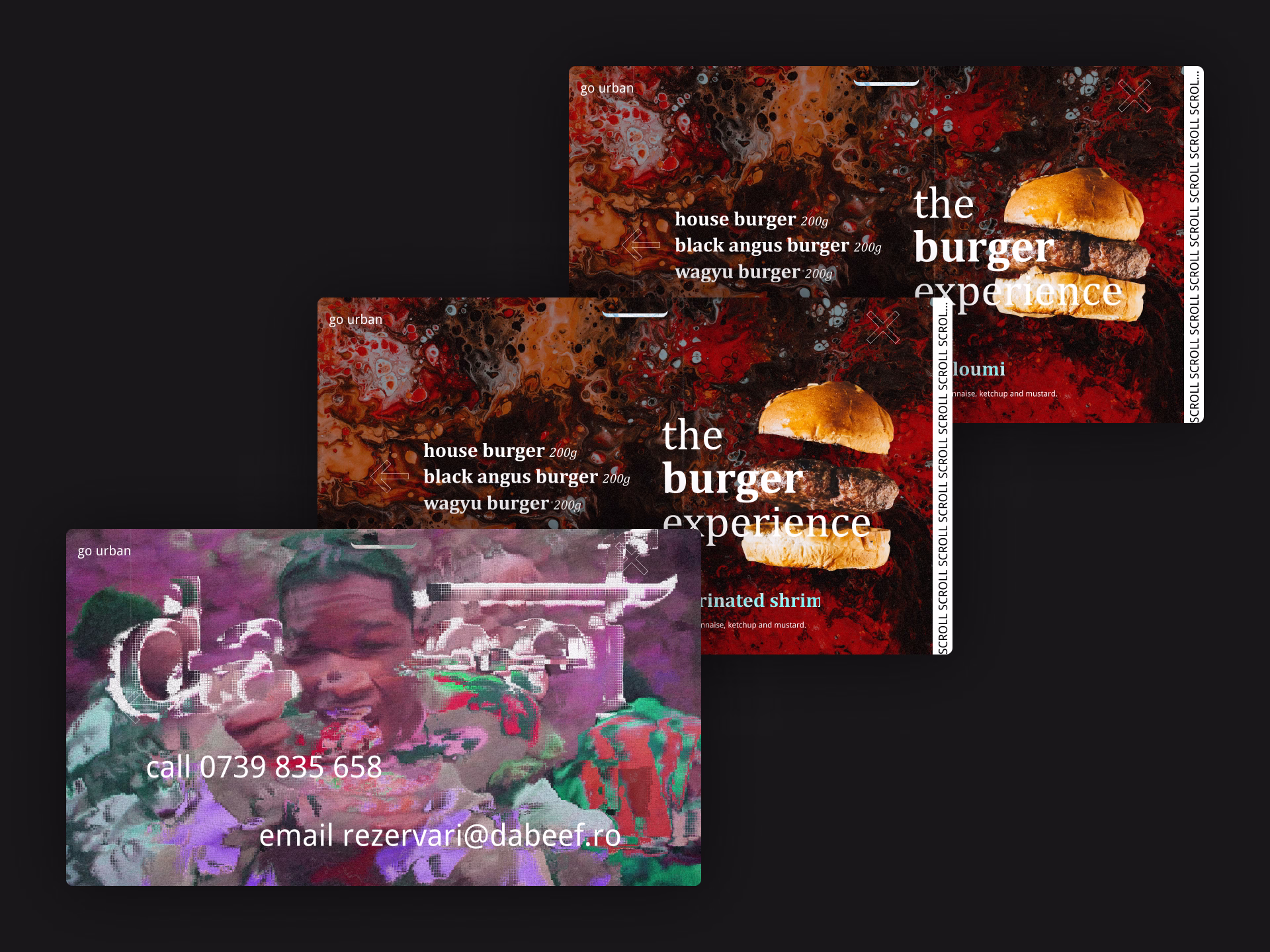
The target audience was young adults from upper-middle to high-class socioeconomic backgrounds — people looking for refreshing, confident, Instagrammable spaces. The brand needed to function as an event, not just a meal, and the digital experience had to do the heavy lifting before anyone walked through the door.
Result
A website that sold the visit before the first table was set.
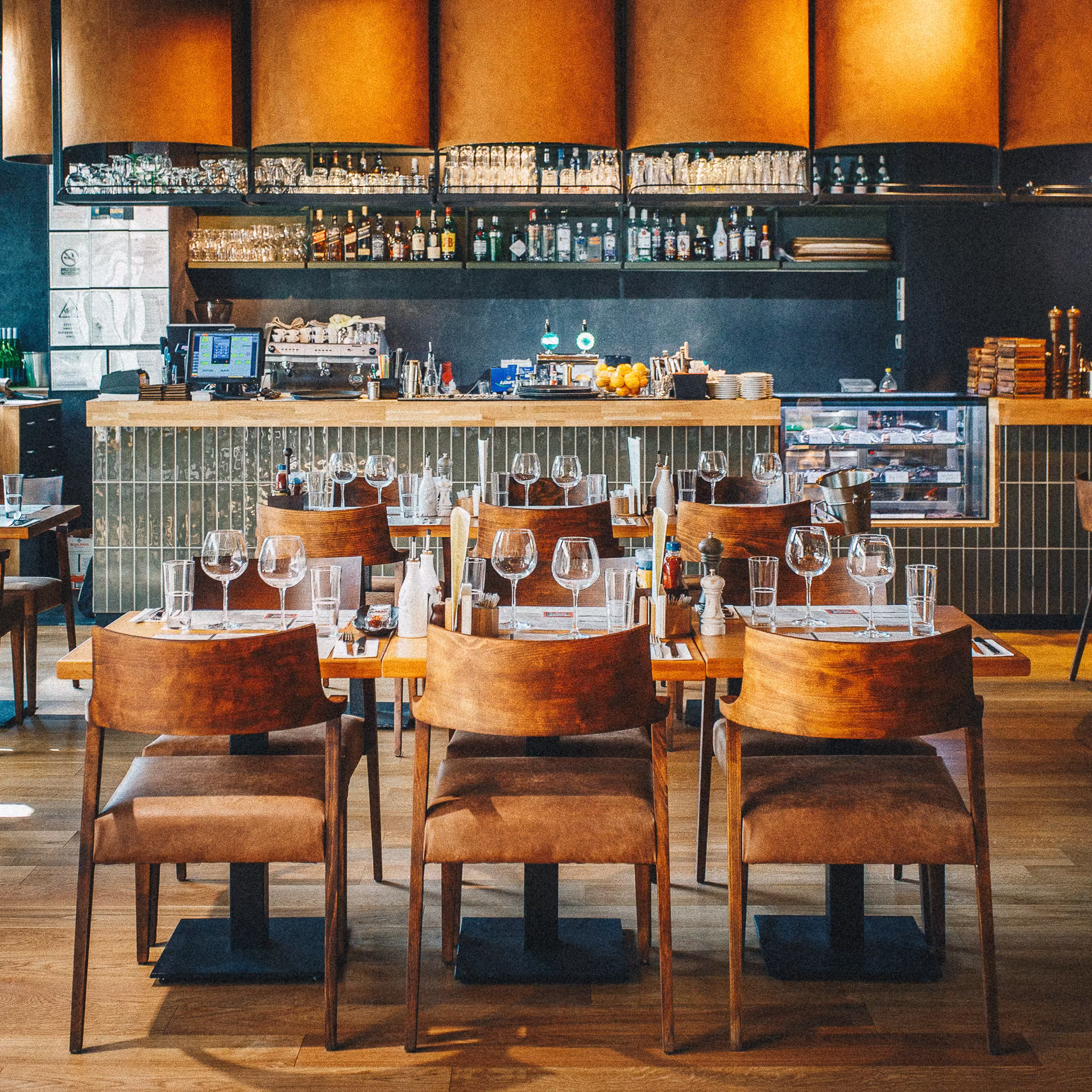
DaBeef’s site was built as three connected experiences: a home, an urban menu, and a classic menu — each with its own atmosphere. Visitors chose their mood on arrival. The classic side slowed users down with heavier typography and richer imagery; the urban side moved fast and playfully. Staff and customers said the website was what sold them on coming in, and it drove real foot traffic until the pandemic ended the project’s run.
A name from nonsense. A brand built with intention. A restaurant ahead of its moment.
A name from nonsense. A brand built with intention. A restaurant ahead of its moment.