Why Branding Matters in the Medical Sector
In many industries, branding helps businesses stand out. In the medical sector, it also helps people feel safe. That difference matters.
When someone encounters a medical practice, healthcare provider, clinic, specialist service or medical product, they are not just assessing appearance. They are asking whether the brand feels credible, organised and trustworthy. A poorly presented identity can introduce doubt, even when the service itself is excellent.
This is why medical branding has to do more than look polished. It needs to support understanding, reduce friction and communicate professionalism clearly. A strong healthcare branding approach helps audiences recognise what the organisation does, who it is for and why it feels dependable.
In practical terms, medical branding can influence:
- first impressions of competence and care
- how clearly services are understood
- how consistent the organisation feels across channels
- how confident patients feel when taking the next step
- how professional the business appears to partners, referrers or investors
For medical brands, trust is not built through style alone. It is built through clarity, consistency and credibility.
What Patients and Audiences Notice First
People usually notice the overall feel of a brand before they analyse the details. That first impression is shaped by a combination of visual signals, language and user experience.
Patients and audiences often pick up on questions such as:
- Does this look professional?
- Does this feel calm and clear?
- Is the information easy to understand?
- Does the tone feel reassuring or confusing?
- Does the website or communication feel current and well managed?
That means medical brand identity is rarely judged in isolated parts. A logo, website, brochure, signage, appointment flow and tone of voice all contribute to one overall perception.
For example, even a strong healthcare visual identity can feel weaker if the website structure is confusing or the written communication sounds vague. In the same way, a professional service can lose impact if its visual presentation feels inconsistent or outdated.
In medical branding, audiences notice three things very quickly:
Clarity
People want to understand who you are, what you offer and where to go next without effort. Confusing structure or unclear messaging makes a medical brand feel harder to trust.
Professionalism
Small details affect perception. Typography, layout, content hierarchy, imagery, language and consistency all shape whether the brand feels properly considered.
Reassurance
Medical communication should reduce uncertainty, not add to it. Brands that feel calm, direct and reliable are better positioned to earn confidence from the start.
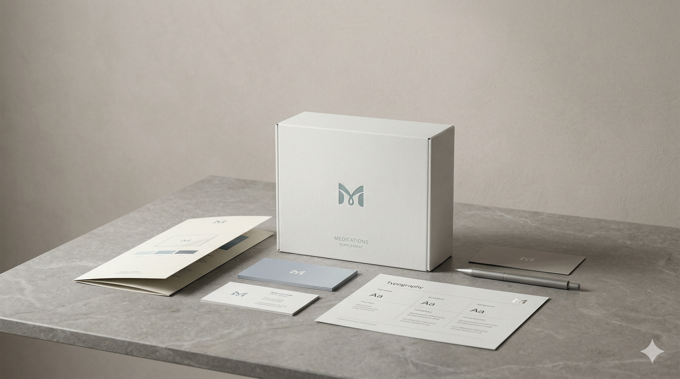
The Core Elements of Strong Medical Branding
Strong medical branding is not built from one design decision. It comes from a system of choices that work together across physical and digital environments.
Visual Clarity
Visual clarity is one of the most important parts of healthcare branding. In medical settings, design should support understanding rather than distraction.
A clear visual identity helps audiences navigate information, distinguish services and absorb key messages quickly. This usually includes:
- clean, structured layouts
- readable typography
- controlled colour use
- consistent iconography or graphic language
- straightforward visual hierarchy
- imagery that feels professional and appropriate
The goal is not to make the brand look cold or generic. It is to create an identity that feels organised, capable and easy to engage with. Medical brands often benefit from restraint, because too much visual noise can undermine confidence.
A strong healthcare visual identity should also work across real-world touchpoints, from websites and patient forms to presentation decks, signage and printed materials.
Trustworthy Tone of Voice
The way a medical brand sounds matters just as much as the way it looks. Tone of voice shapes how information is received and how trustworthy the organisation feels.
A strong medical tone of voice should be:
- clear rather than overly technical
- professional without sounding distant
- reassuring without becoming vague
- direct without feeling abrupt
- informative without overwhelming the reader
This balance matters because medical audiences often arrive with questions, uncertainty or urgency. Language that is too cold can feel impersonal, while language that is too promotional can feel inappropriate.
Trust in medical branding is strengthened when written and spoken communication feels consistent across every touchpoint, including websites, appointment emails, patient information, service pages, printed materials and social content.
Good tone of voice also helps medical organisations simplify complex topics. Patients do not always need more information. They need clearer information.
Consistent Patient Experience
Branding does not stop at visual identity or messaging. In the medical sector, the brand is also shaped by experience.
Patients notice whether the journey feels connected. If the website promises clarity but the booking process is frustrating, the brand loses strength. If printed materials look professional but follow-up communication feels inconsistent, trust can drop.
A strong medical branding system supports a consistent patient experience across:
- website navigation and content
- appointment booking flows
- confirmation emails and reminders
- reception materials and signage
- forms, guides and information sheets
- follow-up communication
- offline and digital brand presentation
Consistency makes a brand feel more reliable because it reduces uncertainty. It signals that the organisation is well managed, attentive and credible.
This is especially important in medical contexts where people may already feel stressed or cautious. A consistent experience helps the brand feel steadier and more dependable.
Professional Credibility
Professional credibility is the result of everything working together. It is what happens when identity, tone and execution all support the same impression.
Medical branding should signal that the organisation takes its role seriously. That does not require a rigid or overly formal style, but it does require discipline.
Credibility is often strengthened by:
- well-structured service information
- clear qualifications or expertise cues
- coherent brand presentation across teams and platforms
- thoughtful design standards
- clear calls to action
- accurate, accessible communication
- consistent use of visual and verbal brand assets
A brand may have excellent clinical expertise behind it, but if its presentation feels fragmented or unclear, audiences may not feel that confidence immediately. Strong branding helps that expertise become visible.
Common Medical Branding Mistakes
Many medical brands do not fail because they lack skill or service quality. They struggle because their presentation does not reflect their actual standard.
Some of the most common mistakes include:
Treating branding as decoration
When medical branding is approached as a surface-level design task, it often misses the deeper need for clarity, trust and structured communication.
Using inconsistent visual systems
Different colours, inconsistent typography, mismatched templates and unstructured materials can make the organisation feel fragmented.
Writing in a tone that is too technical or too generic
Overly clinical language can alienate audiences, while vague generic copy can reduce confidence. Both weaken communication.
Creating unclear user journeys
If patients cannot quickly understand services, navigate the website or know what to do next, brand trust suffers.
Looking professional in one place but weak in another
A strong homepage cannot compensate for poor appointment emails, weak signage or inconsistent documents. In medical branding, every touchpoint contributes to the same impression.
Over-prioritising appearance over usability
A visually refined system still needs to work in practical settings. If the hierarchy is weak or the information is hard to find, the branding is not doing its job.
What Stronger Medical Brand Execution Looks Like
Stronger execution usually looks calmer, clearer and more joined up. It does not need to be louder. It needs to be more coherent.
A well-executed medical brand often has the following qualities:
A clear identity system
The visual language feels intentional and consistent across digital and physical touchpoints. Colours, typography, layouts and assets work together rather than competing.
Better communication structure
The brand explains services, specialisms and next steps in a way that is easy to understand. Information feels organised and purposeful.
A defined tone of voice
The written communication sounds human, professional and reassuring. It supports clarity at every stage of the patient journey.
Connected touchpoints
From the website to patient-facing materials, the brand experience feels aligned. This creates a stronger sense of trust and competence.
Credibility without clutter
The brand presents expertise clearly without relying on heavy jargon, visual overload or unnecessary complexity.
For medical organisations, stronger brand execution is often less about making the brand more expressive and more about making it more dependable. It should help audiences feel that the organisation is capable, considered and clear in how it communicates.
FAQs
What is medical branding?
Medical branding is the way a healthcare or medical organisation presents itself through identity, communication and experience. It includes visual identity, tone of voice, messaging, website presentation and the consistency of patient-facing touchpoints.
Why is branding important in healthcare?
Healthcare branding matters because patients and audiences need to feel trust quickly. Clear, consistent and professional branding helps reduce uncertainty and makes services easier to understand and engage with.
What makes a strong medical brand identity?
A strong medical brand identity combines visual clarity, appropriate tone, consistency and professional credibility. It should feel organised, trustworthy and easy to navigate across all channels.
Is medical branding different from branding in other sectors?
Yes. While all branding aims to create recognition and differentiation, medical branding carries additional pressure around trust, clarity and reassurance. In healthcare contexts, professionalism and communication often matter more than visual impact alone.
Can branding improve patient experience?
Yes. Branding affects how clearly information is presented, how easy touchpoints are to use and how consistent the overall experience feels. Better branding can help patients feel more confident and better supported throughout their journey.
Final Thoughts
Medical branding is not only about how a brand looks. It is about how clearly it communicates, how consistently it behaves and how confidently it supports trust across every interaction.
In the medical sector, audiences notice professionalism quickly, but they also notice confusion just as quickly. That is why strong medical branding depends on more than visual appeal. It requires a joined-up identity, a trustworthy tone of voice and a patient experience that feels clear from start to finish.
Brands that get this right tend to feel calmer, more credible and easier to trust. That is what strong branding should do in healthcare.
If your medical brand needs to feel clearer, more consistent and more credible across its key touchpoints, it may be time to review how your identity, tone and digital experience are working together.