Why Medical Packaging Has Different Demands
Medical packaging often sits in a context where trust is fragile and accuracy matters immediately. People may be choosing products while unwell, under pressure or trying to compare unfamiliar options quickly. Healthcare professionals may also need to identify important details fast without working through unnecessary visual noise.
That makes medical product packaging more than a branding exercise. It becomes a communication tool. It must present key information clearly, support correct interpretation and reduce the risk of misunderstanding.
There is also very little room for ambiguity in this space. When packaging looks unclear, inconsistent or overly styled, it can weaken confidence. A product may still be effective, but the presentation can make it feel less credible or less safe than it should. That is why packaging for healthcare brands needs to be built around responsibility, not decoration.
What Audiences Need From Medical Packaging
Different audiences may interact with the same product, but they tend to want similar things from the packaging.
First, they need clarity. They want to understand what the product is, what it is for and how to identify the most important details quickly. This includes product name, dosage or specification, usage information and key warnings where relevant.
Second, they need reassurance. Good healthcare packaging design should feel controlled, considered and professional. People are often making decisions based partly on how safe and reliable the product appears. Packaging that feels chaotic or vague makes that harder.
Third, they need ease of use. Medical packaging should support quick scanning, simple navigation and a straightforward user experience. Whether the user is a patient, carer, buyer or clinician, the structure should help them find what matters without effort.
Finally, they need consistency. In medical categories, inconsistency can feel risky. A clear and stable visual system across products, formats and touchpoints helps reinforce confidence in the brand behind the product.
The Core Elements of Strong Medical Packaging Design
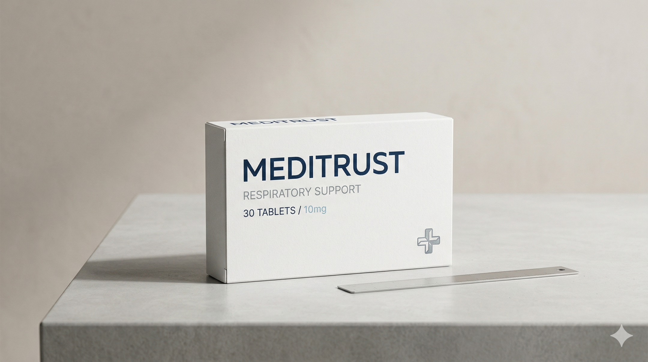
Information Clarity
Information clarity is one of the most important parts of medical packaging design. The packaging should make the essential information easy to find and easy to understand.
That usually means:
- clear product naming
- legible typography
- strong contrast
- unambiguous terminology
- simple instructions where possible
- visible distinction between primary and secondary information
Too much text can be a problem, but so can poorly organised text. Medical product packaging does not become clearer by adding more information without structure. It becomes clearer when the right information is prioritised and presented in the right order.
This is where hierarchy matters. A user should be able to scan the front and immediately understand the core product identity, then move naturally to supporting details.
Safety Cues
Safe packaging communication is not just about legal text or warnings. It also includes the visual signals that help a product feel controlled, trustworthy and carefully designed.
Safety cues can include:
- clean, stable layouts
- clear warning areas
- consistent icon use
- secure-looking seals or tamper-evident features
- calm and deliberate colour use
- easy-to-read instructions and caution notes
These cues matter because people often make fast judgments based on presentation. If the packaging feels disorganised, overly promotional or visually confusing, that can raise doubt. In contrast, a calm and disciplined design approach supports a sense of safety before the user has even read the full details.
Professional Credibility
Medical packaging should feel credible without becoming cold or inaccessible. It needs to communicate that the product belongs in a professional healthcare environment while still remaining readable and approachable.
Professional credibility often comes from restraint. The strongest packaging for healthcare brands usually avoids exaggerated claims, gimmicky visuals or trend-led styling that competes with the message. Instead, it relies on clear typography, consistent branding, sensible use of colour and a polished but disciplined layout.
Credibility also comes from coherence. When the brand identity, product naming, packaging structure and information design all work together, the product feels more reliable. Good packaging design should suggest that the same level of care has gone into both the product and the presentation.
Structured Hierarchy
Structured hierarchy is what turns information into usable communication. Medical packaging may include brand details, product name, category, strength, instructions, warnings, ingredients or technical information. Without hierarchy, all of that competes for attention.
Good hierarchy helps users understand:
- what the product is
- what level of information matters first
- where to find supporting details
- what needs careful attention
- how this product differs from others in the same range
This is especially important for product families, variants or SKUs where confusion could cause errors. Strong healthcare packaging design should create clear distinction without losing overall system consistency. Users should be able to recognise the brand while still telling products apart quickly and confidently.
Common Medical Packaging Mistakes
One common mistake is overcrowding. Brands often try to fit too much content into limited space without deciding what deserves priority. The result is packaging that feels dense, stressful and difficult to scan.
Another issue is weak hierarchy. Everything may technically be present, but if product name, dosage, instructions and warnings all carry similar weight, the pack becomes harder to use.
Overbranding is another risk. In some sectors, bold branding can help products stand out. In medical categories, too much visual personality can work against trust if it reduces clarity or makes the product feel less serious.
Poor typography choices can also weaken packaging quickly. Small text, low contrast, cramped spacing or inconsistent type treatment all make information harder to process.
Finally, inconsistency across the range creates confusion. If one product uses a different logic for layout, colour, labels or information grouping, the whole system can feel less dependable. Medical packaging design needs controlled consistency, especially when products are closely related.
What Better Medical Packaging Looks Like
Better medical packaging looks calm, clear and responsible. It presents information in a structured way, uses visual hierarchy to guide attention and supports trust through consistency and restraint.
It also understands that clarity and branding are not separate tasks. The visual identity should support communication, not compete with it. The strongest medical product packaging makes the brand feel more credible because the design is so well organised and easy to use.
In practical terms, stronger packaging often includes:
- a clear front-of-pack structure
- highly legible type
- logical grouping of information
- visible differentiation between products or strengths
- colour used carefully to aid navigation, not create distraction
- a professional visual system that can scale across a full product line
When these decisions are made well, packaging becomes an asset rather than a risk point. It helps products feel safer, more trustworthy and easier to choose.
FAQs
What makes medical packaging design different from standard packaging design?
Medical packaging design has to communicate with a higher level of clarity and responsibility. It often carries information that affects safe use, confidence and product understanding, so structure and readability matter more than visual novelty.
Why is trust so important in healthcare packaging design?
Trust matters because users often associate packaging quality with product reliability. If packaging feels confusing, inconsistent or poorly considered, it can reduce confidence even before the product is used.
How can packaging help communicate safety?
Packaging can communicate safety through clear hierarchy, legible instructions, visible warnings, calm visual language and structured layouts that reduce confusion. Safe packaging communication is both visual and informational.
Should medical packaging still reflect the brand identity?
Yes, but the identity should support clarity rather than dominate it. In medical categories, branding works best when it reinforces professionalism, consistency and ease of recognition.
What is the biggest mistake in medical product packaging?
One of the biggest mistakes is failing to prioritise information properly. Even accurate content becomes less useful when the hierarchy is weak and users cannot quickly identify what matters most.
Final Thoughts
Medical packaging design needs to do more than look clean or professional. It needs to communicate responsibly in situations where trust, safety and clarity matter immediately. Strong healthcare packaging design helps users understand products faster, feel more confident in what they are choosing and navigate important information without friction.
For medical brands, packaging should not be treated as a surface layer added at the end. It should be built as part of a wider communication system that supports credibility across every touchpoint.
If your medical packaging needs to communicate more clearly, feel more consistent or better support trust at first glance, it may be time to review how structure, hierarchy and brand presentation are working together.