Why Website Design Matters in Cosmetics
In cosmetics, visual impression shapes trust very quickly. People often decide within seconds whether a brand feels premium, credible, relevant or forgettable. That makes website design a major part of how a beauty brand is perceived online.
A cosmetics website is not just a digital catalogue. It acts as a brand experience, a product education space and a conversion path at the same time. Visitors may arrive for different reasons. Some want to discover a new brand. Others want to compare ingredients, understand shades, read product benefits or complete a purchase quickly. A site that only focuses on aesthetics can frustrate users. A site that only focuses on selling can feel generic and lose the brand’s distinctiveness.
Good cosmetics ecommerce design helps a brand appear polished while also making customer decisions easier. It should create desire, reduce hesitation and guide people clearly from first impression to action.
What Beauty Audiences Expect Online
Beauty audiences are visually aware and often comparison-driven. They notice detail, tone, consistency and quality cues more quickly than many other customer groups. That means expectations are typically high.
Most users expect a beauty brand website to deliver four things well.
First, they expect a strong sense of brand identity. The site should feel aligned with the packaging, product photography, tone of voice and overall positioning. If the website feels disconnected from the rest of the brand, trust can drop quickly.
Second, they expect clarity. Beauty products often involve nuanced decisions around skin type, ingredients, finish, routine fit or product use. People need information that helps them choose confidently.
Third, they expect ease of use. Even a premium beauty UX should feel intuitive. Users should not have to work hard to find product categories, understand benefits or navigate to checkout.
Fourth, they expect reassurance. Reviews, results, FAQs, usage guidance and shipping details all help reduce friction. In cosmetics, purchase confidence often depends on how clearly the product is explained.
A beauty website design that meets these expectations feels considered rather than decorative. It supports the emotional side of the category without neglecting practical needs.
The Core Elements of Strong Cosmetics Website Design
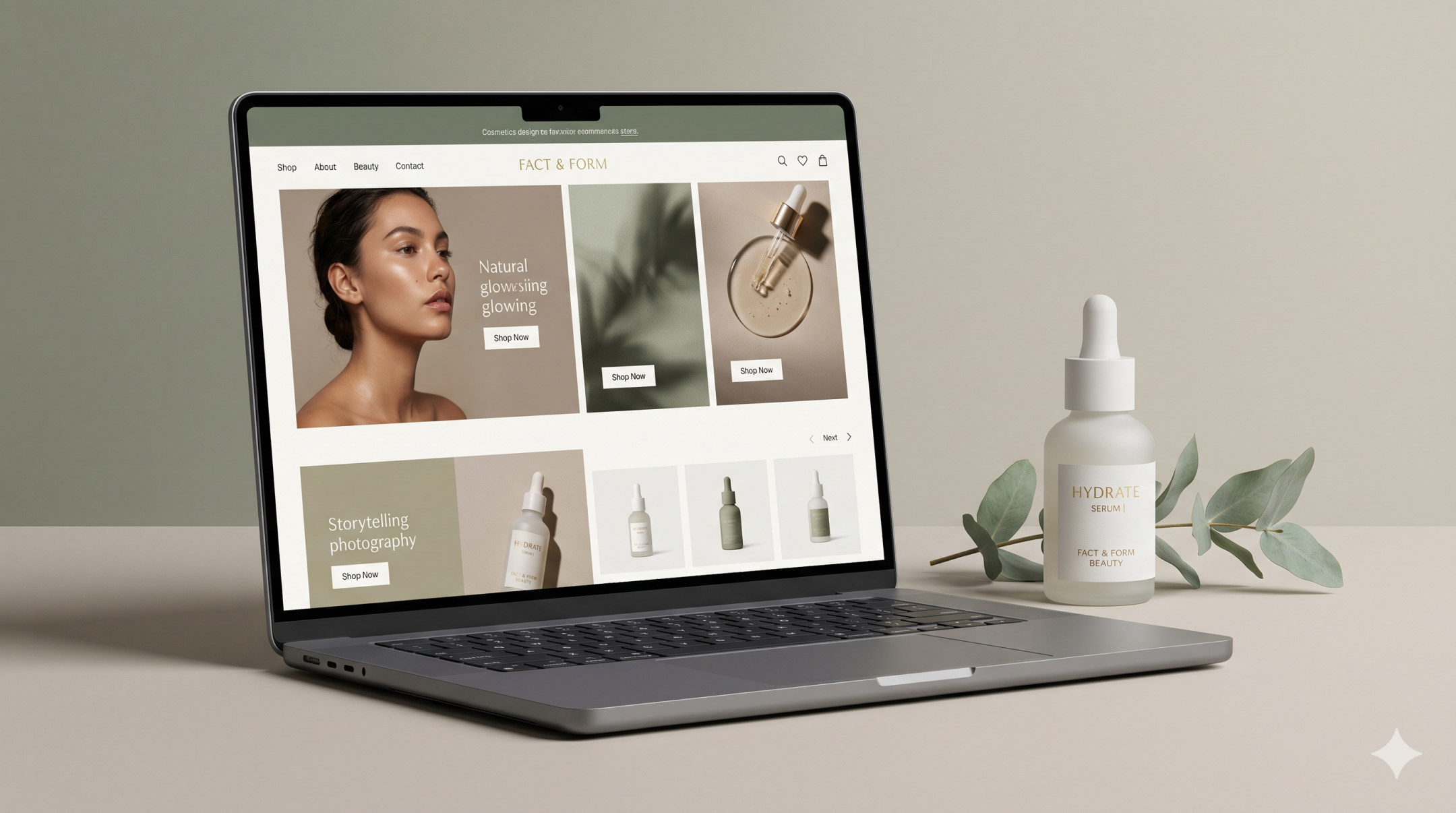
Visual Storytelling
Visual storytelling is one of the most important parts of cosmetics website design because beauty brands sell more than product function. They also sell mood, identity, aspiration and experience.
Strong storytelling begins with consistent art direction. Photography, typography, colour palette, spacing and layout should work together to create a recognisable brand world. A premium beauty brand website usually feels intentional in every detail, not overloaded with visual effects.
That said, storytelling should still serve the user journey. Homepage banners, campaign imagery and editorial content need to support understanding rather than distract from it. Beautiful visuals can introduce the brand and create desire, but they should also help direct visitors toward collections, categories or hero products.
Good storytelling also continues beyond the homepage. Product pages, collection pages and about sections should all reinforce the same brand perspective. When these sections feel disjointed, the experience becomes weaker and less credible.
Product Clarity
In beauty, desirability alone is not enough. Users need to understand what the product is, who it is for and why it matters.
Product clarity depends on strong hierarchy. The most important information should be easy to scan. That usually includes product name, category, key benefit, texture or format, size, price and relevant use details. Supporting content such as ingredient highlights, application guidance and routine recommendations can then add depth.
Clear product presentation is especially important when brands offer multiple variants or overlapping lines. If users cannot quickly tell the difference between products, conversion becomes harder. This is where cosmetics ecommerce design needs careful structure. Filters, comparison logic, category naming and product grouping all help users move through the range with less confusion.
Strong clarity does not make a site feel less premium. In fact, it often improves premium perception because it suggests confidence, care and attention to user needs.
Premium Feel
Premium feel in cosmetics website design comes from control, not excess. A site does not look more luxurious just because it uses oversized visuals, minimal text or dramatic motion. Premium digital experiences are usually defined by restraint, quality and consistency.
This can show up in several ways. Clean layouts give products room to breathe. Elegant typography supports perception without becoming difficult to read. Refined image treatment makes product photography feel deliberate. Subtle interaction design can add polish, but it should not create delay or confusion.
Premium feel also depends on coherence. If the homepage feels elevated but the product pages look generic, the experience breaks. The same applies when branding is strong but checkout feels clumsy or disconnected. True premium beauty UX needs consistency across every stage of the journey.
Importantly, premium does not mean inaccessible. A site can feel high-end while still being clear, inclusive and easy to navigate.
Conversion Simplicity
A cosmetics website should not hide the path to action. Users may enjoy the brand story, but they still need simple conversion routes.
Conversion simplicity means making key actions obvious and low-friction. Shop navigation should be visible. Product pages should have clear calls to action. Add-to-cart behaviour should feel smooth. Checkout should avoid unnecessary distraction.
The best-performing beauty websites also reduce decision fatigue. They help users narrow choices, understand routines and find the right product faster. This can be done through curated collections, guided navigation, bundling logic, quiz-led recommendations or clearly framed product categories.
Commercial clarity is especially important on mobile, where attention is shorter and screen space is limited. Cosmetics website design must make sure that storytelling, product discovery and purchase behaviour all work just as well on smaller screens.
Common Cosmetics Website Design Mistakes
One of the most common mistakes is over-prioritising aesthetics at the expense of usability. A site may look polished but still make it difficult to browse products, understand benefits or complete a purchase.
Another issue is weak product hierarchy. When every message competes for attention, users struggle to see what matters most. This often happens when brands try to communicate ingredients, claims, lifestyle messaging and promotional content all at once without clear structure.
Some beauty brand websites also rely too heavily on generic ecommerce layouts. These may function adequately, but they fail to express the brand’s identity. As a result, the site feels interchangeable rather than memorable.
On the other side, some brands become too editorial. They build visually rich experiences that communicate mood well but make shopping less intuitive. Users may admire the brand but still leave without converting.
Other frequent problems include:
- inconsistent branding between campaign pages and product pages
- unclear product differences across collections or SKUs
- slow-loading imagery and motion-heavy design
- mobile layouts that feel compressed or awkward
- checkout flows that break the premium experience
- lack of trust-building content such as reviews, FAQs or delivery clarity
These issues are rarely just visual problems. They are usually structural problems that affect both perception and performance.
What Better Beauty Website Execution Looks Like
Better execution starts with balance. A strong cosmetics website creates a brand-led experience without losing commercial focus. It knows when to inspire and when to simplify.
In practice, this means the homepage introduces the brand clearly while giving users obvious next steps. Navigation is structured around how people actually shop, not just how the brand internally organises products. Category pages help visitors narrow choices without friction. Product pages combine premium presentation with practical clarity.
A better beauty website design also respects different user states. New visitors may need brand context, reassurance and exploration. Returning visitors may want quick access to a known product. Effective design supports both.
It also reflects brand consistency across all touchpoints. Packaging, campaign visuals, product naming, tone of voice and website UX should all feel connected. This creates a stronger impression of quality and maturity.
Most importantly, better execution treats conversion as part of the experience rather than an interruption to it. Calls to action, product education and checkout design should feel naturally integrated into the brand world. That is where cosmetics ecommerce design becomes more effective. It turns desire into action without making the journey feel forced.
FAQs
What makes cosmetics website design different from general ecommerce design?
Cosmetics websites usually need a stronger balance between brand perception and product clarity. Beauty customers are often influenced by visual storytelling, but they also need help understanding product benefits, usage and suitability.
How can a beauty brand website feel premium without becoming hard to use?
Premium feel comes from consistency, restraint and detail rather than complexity. Clean layouts, thoughtful typography, refined imagery and intuitive navigation usually create a stronger result than overly dramatic design.
What matters most on a cosmetics product page?
The key priorities are clear product benefits, strong imagery, pricing, ingredients or formulation highlights where relevant, usage guidance and a simple call to action. The page should reduce hesitation and help users feel confident.
Should storytelling appear on every page?
Storytelling should be present throughout the website, but not in the same way everywhere. Homepage and campaign pages may carry more emotional brand content, while product and checkout pages should focus more heavily on clarity and action.
Why do some beautiful cosmetics websites still underperform?
They often prioritise visual mood over structure. If users cannot quickly find products, understand differences or move smoothly toward checkout, strong art direction alone will not support conversion.
Final Thoughts
The best cosmetics website design does not force a choice between storytelling and sales. It combines both. It helps a beauty brand feel distinctive and premium while still making the customer journey easy to follow.
When a site balances visual identity, product clarity, premium feel and conversion simplicity, it becomes more than an attractive digital surface. It becomes a stronger commercial tool and a more credible brand experience.
If your beauty brand website needs to feel more refined without becoming less usable, it may be worth reviewing how design, structure and messaging work together across the full customer journey.