For product brands, website performance is rarely just about visual polish. A strong product website needs to help people understand the offer quickly, explore with confidence and move toward action without unnecessary friction. Better UX gives structure to that process. It makes product discovery easier, supports stronger communication and helps conversion feel like a natural next step rather than a push.
Why UX Matters for Product Brands
Product brands often compete in crowded spaces where attention is limited and comparison is easy. Whether the category is FMCG, cosmetics or another consumer-focused sector, users tend to make fast judgments based on clarity, ease and trust.
That is why UX matters so much. A website can have attractive visuals and still underperform if the structure is confusing, the navigation is unclear or the product journey asks too much from the user. Good UX helps reduce that gap between interest and action.
For product brands in particular, UX affects several key outcomes:
- how easily users find the right product
- how clearly they understand what makes it relevant
- how quickly they feel confident enough to continue
- how naturally they move toward enquiry, purchase or retailer navigation
In other words, UX is not only about usability. It is also about commercial clarity. When the website is better organised, conversion often improves because the path makes more sense.
What Product Brand Websites Need to Do Clearly
A product brand website has a more specific job than a general brochure site. It needs to do more than present the brand well. It has to guide users through product-related decisions.
At a minimum, the website should make five things clear.
First, it should help users understand what the brand offers. If the product range, category focus or value proposition is vague, the site creates uncertainty too early.
Second, it should make product discovery simple. Users need a clear route into the catalogue, collection or featured solutions without feeling lost.
Third, it should explain the difference between products. This is especially important for brands with multiple SKUs, variants or use cases. If everything looks similar and sounds similar, the user has to do too much sorting work.
Fourth, it should support trust. Product details, ingredient information, usage guidance, proof points and supporting content all play a role in making the experience feel credible.
Fifth, it should make the next step obvious. That might be buying online, finding a retailer, requesting more information or comparing options. Whatever the conversion goal is, it should not feel hidden.
When these fundamentals are missing, even a well-designed interface can struggle to convert.
Best Practice 1: Make Product Discovery Easy
One of the most common UX problems on product brand websites is that users cannot quickly find what they are looking for. The product range may be strong, but the access points into that range are weak.
Product discovery should begin early and feel intuitive. Users should not need to dig through generic navigation labels or scroll through long pages before they understand where to go next.
A stronger product discovery approach usually includes:
- clear product categories or collections
- homepage entry points based on range, benefit or need state
- featured products or bestsellers placed in context
- filtering or sorting tools where product volume justifies it
- search that actually helps users narrow down options
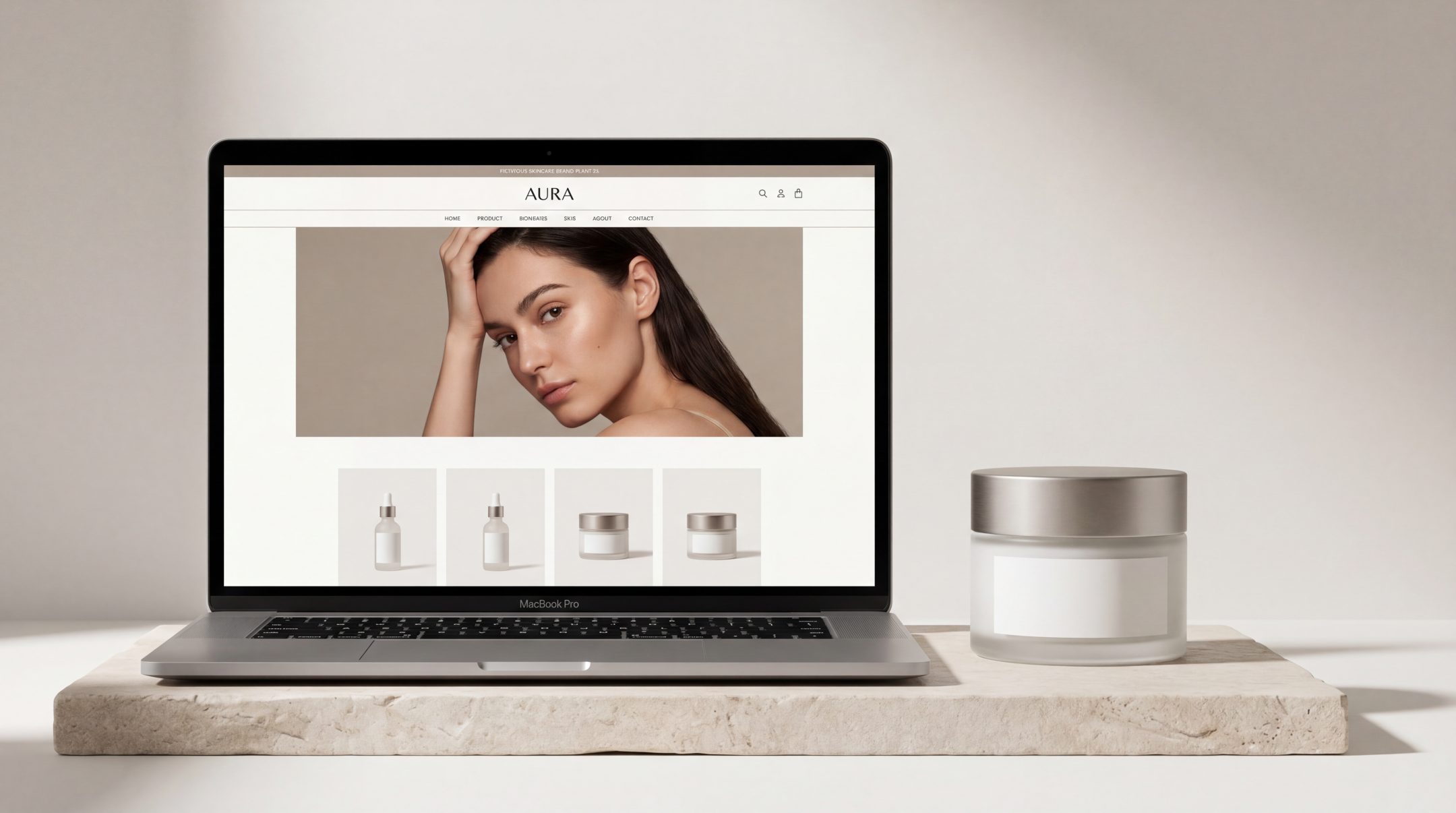
For example, a cosmetics brand may need to let users browse by skin concern, product type or routine stage. An FMCG brand may need to guide users by product family, format or intended use. The goal is always the same: reduce the effort required to reach relevant options.
Good product website UX respects the fact that users arrive with different levels of certainty. Some know what they want. Others only know the problem they want solved. The structure should support both.
Best Practice 2: Build a Clear Information Hierarchy
A product website often contains a mix of branding, product detail, benefits, technical information, usage guidance and conversion prompts. Without a clear hierarchy, all of that information starts competing for attention.
Strong UX gives each content layer a clear role and priority.
Users should be able to scan a page and quickly understand:
- what the product is
- who it is for
- why it matters
- what they should do next
This means the most important information should appear first and the supporting information should be structured beneath it. Headlines, product descriptions, feature blocks, specs, FAQs and calls to action all need to work in order rather than compete at the same visual level.
Prioritise the essentials first
The first screen of a product page should not try to say everything. It should do the core job well: identify the product, communicate the primary value and present the next action.
If essential details are buried lower down the page, users may leave before they ever reach them.
Support scanning, not just reading
Most visitors do not read product pages line by line. They scan. That makes layout decisions especially important. Clear headings, grouped content, concise copy and strong spacing help users absorb information without fatigue.
This is where conversion-focused UX becomes practical. The easier a page is to scan, the easier it becomes to move forward with confidence.
Best Practice 3: Reduce Friction in Navigation
Navigation problems often look small from the brand side but feel large from the user side. A menu label that makes sense internally may not help users at all. A content structure that reflects the business may not reflect how people actually browse.
Reducing friction in navigation means removing unnecessary decisions, not just adding more menu items.
For product brand websites, this usually involves:
- keeping top-level navigation focused and easy to interpret
- using labels that reflect user language rather than internal terminology
- avoiding unnecessary menu depth
- making key routes visible across the site
- maintaining consistency between navigation, page titles and content structure
Users should not have to guess whether they need to click “Shop,” “Products,” “Collections,” “Solutions” or something else entirely. The route should feel obvious.
On larger ecommerce UX projects, friction also appears in cross-navigation moments such as moving from category pages to product pages, or from product pages to checkout or stockist information. Every extra moment of confusion adds drop-off risk.
A smoother structure helps users stay oriented. That sense of orientation matters more than many brands realise.
Best Practice 4: Use Conversion Cues Without Overloading the Page
A conversion-focused UX approach does not mean turning every section into a hard sell. On product brand websites, overloading pages with prompts can make the experience feel cluttered, distracting or even untrustworthy.
The better approach is to use conversion cues with restraint and purpose.
A good conversion cue can be:
- a clearly placed add-to-cart or buy-now button
- a stockist finder prompt
- a comparison link
- a routine builder or product selector
- a sign-up point for updates or launch access
- a contact route for wholesale or distributor enquiries
The key is relevance. Conversion prompts should appear where they support the user’s decision-making rather than interrupt it.
Match the cue to the page context
Not every page needs the same call to action. A homepage may point users toward product exploration. A collection page may focus on comparison and filtering. A product page may support purchase, stockist search or more detailed enquiry.
When every section pushes the same action with the same intensity, the page starts to feel noisy. When cues are aligned with user intent, the experience feels helpful.
Let content and action work together
Conversion tends to improve when information and action are connected. A strong benefit statement followed by a relevant next step works better than a disconnected button placed without context.
This is especially important for product communication. Users need enough understanding to feel ready, but not so much clutter that they hesitate.
Best Practice 5: Connect Product Storytelling With User Action
Product brands often invest heavily in storytelling, and rightly so. Storytelling helps communicate values, quality, positioning and emotional appeal. But on many sites, storytelling sits too far away from action.
The result is a disconnected journey. Users enjoy the brand narrative but struggle to translate that interest into a decision.
Better website UX for product brands connects these elements more closely. It allows storytelling to support movement rather than delay it.
For example:
- ingredient or sourcing stories should connect to relevant products
- brand purpose content should guide users into collections or categories
- educational content should link to product solutions
- campaign pages should include clear routes into browsing or buying
This matters across both FMCG and cosmetics environments. A premium feel alone does not convert. Nor does purely functional structure without any brand texture. The strongest product brand website combines both.
When storytelling and user action are aligned, the website feels more coherent. Users understand not only what the brand stands for, but also where to go next.
Common UX Mistakes on Product Brand Websites
Even visually strong product websites can underperform because of structural mistakes that create confusion or friction.
Some of the most common issues include:
Too much emphasis on visuals, not enough on clarity
Strong imagery can elevate a product brand, but it cannot replace information structure. If pages look polished but users cannot understand the product range or next step, conversion suffers.
Weak product categorisation
When products are grouped unclearly, or when categories are too broad or inconsistent, discovery becomes harder than it should be.
Overcrowded product pages
Trying to include every message, every badge and every benefit at once often makes pages harder to use. Users need prioritisation, not volume.
Unclear calls to action
If users cannot tell whether they should shop, enquire, compare or find a retailer, the website leaves too much open to interpretation.
Disconnected brand and commerce experiences
Some websites split storytelling and shopping into separate worlds. The brand pages feel rich, but the product pages feel flat or generic. Better UX connects them.
These problems are rarely solved by surface tweaks alone. They usually point to a deeper structural issue in how the website is organised.
What Better Product UX Looks Like
Better product UX is not about making everything minimal or stripping away brand expression. It is about making the website easier to understand, easier to move through and easier to act on.
In practice, stronger product website UX usually looks like this:
- users can identify the product range quickly
- product categories reflect real user logic
- key pages communicate benefits and differences clearly
- visual hierarchy supports scanning
- navigation feels predictable and light
- calls to action appear where they are most useful
- brand storytelling strengthens decisions instead of delaying them
For product brands, this often leads to a website that feels more commercially mature. It supports discovery, understanding and action in a more joined-up way.
That matters whether the user is making a fast consumer decision or a more considered purchase. In both cases, structure creates confidence.
FAQs
What is website UX for product brands?
Website UX for product brands refers to how the site is structured and experienced by users, especially when they are exploring products, comparing options and moving toward action. It includes navigation, information hierarchy, product discovery and conversion flow.
How does UX affect conversion on product websites?
UX affects conversion by making it easier for users to understand the offer, find relevant products and take the next step without confusion. Better structure reduces friction and supports decision-making.
What is the difference between good design and good UX?
Good design often focuses on visual quality and brand presentation. Good UX focuses on usability, clarity and flow. The strongest product brand websites combine both rather than treating them as separate priorities.
Why do product pages often fail to convert?
Product pages often fail when they overload users, bury key information, use weak hierarchy or present unclear next steps. Even strong products can underperform if the page structure makes decision-making harder.
Is UX only important for ecommerce websites?
No. UX matters for any product brand website, including those focused on retailer direction, lead generation or product education. Wherever users need to understand something and act, UX plays a role.
Final Thoughts
For product brands, better UX is not a finishing touch. It is part of how the website performs. When structure is clearer, product discovery becomes easier, communication becomes stronger and conversion becomes more natural.
A website should help users move from interest to confidence without unnecessary effort. That is where better UX makes a measurable difference.
If your product website feels visually strong but structurally harder to use than it should be, it may be worth reviewing how the experience is organised. Improving that structure can make product discovery and conversion feel easier for users and more effective for the brand.