Strong product page UX helps buyers understand what a product is, why it matters and whether it fits their needs. This is especially important for FMCG, cosmetics and product-led brands, where users often need to process visual cues, specifications, benefits, ingredients, variants and purchase options quickly.
A good product page does not simply display information. It structures information so users can make sense of it. The easier that decision feels, the more likely users are to move forward with confidence.
Why Product Page UX Matters
A product page is often where interest becomes evaluation. A user may arrive from a search result, an ad, a category page, a social post or a recommendation, but the product page is where they decide whether the product is worth considering.
That decision depends on clarity. Users need to understand the product value, the practical details, the available options and the next action. When the page is hard to scan or compare, even a strong product can feel uncertain.
This is why product page UX sits at the intersection of design, content, ecommerce UX and conversion. It affects how quickly users understand the offer, how confidently they compare options and how easily they complete the next step.
For product brands, a clear product brand UX structure helps turn product information into a more coherent buying journey. It gives users a logical path from first impression to informed action, rather than leaving them to interpret scattered details on their own.
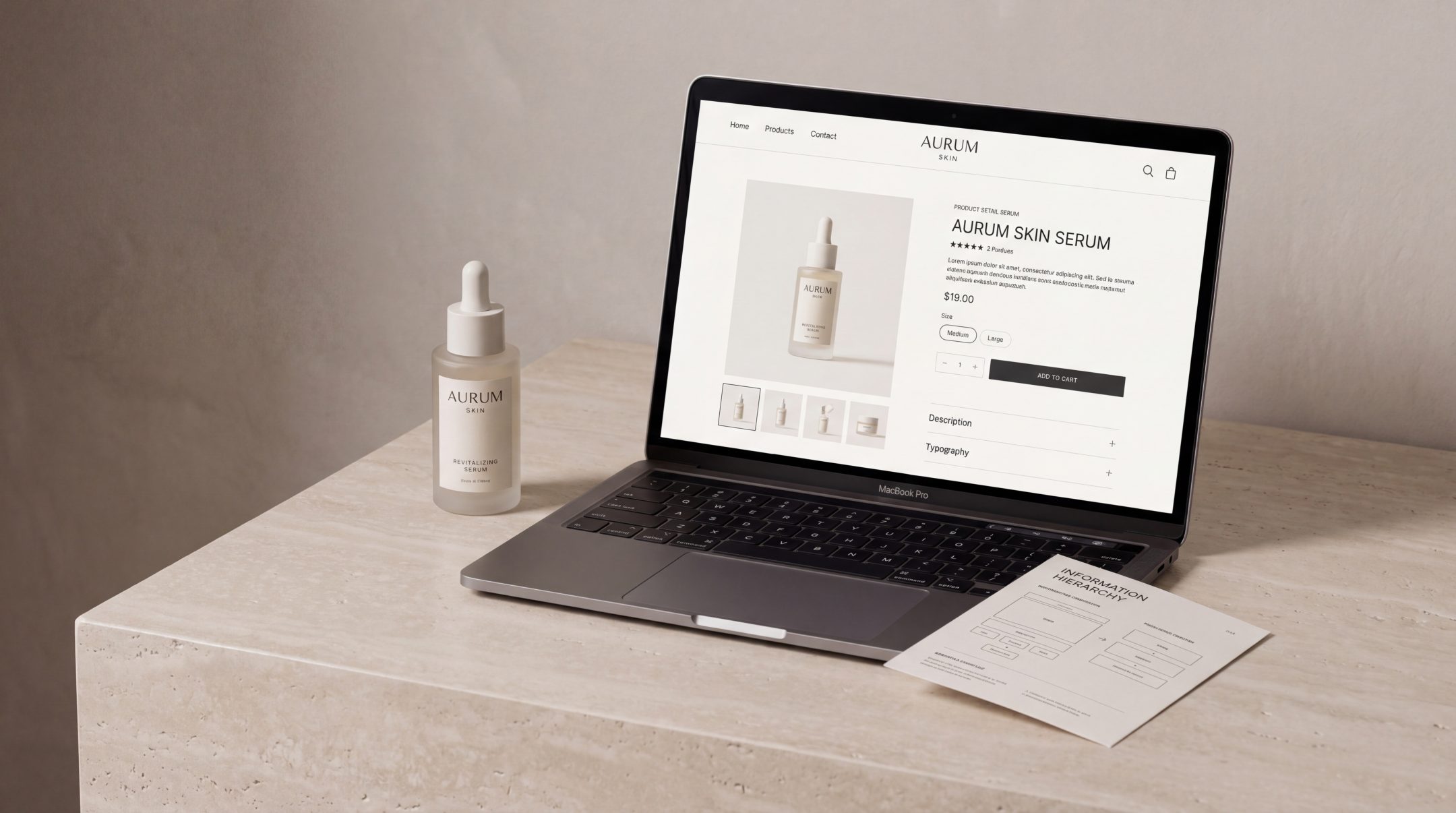
Best Practice 1: Make the Product Value Clear Fast
The first job of a product page is to answer a simple question: what is this product and why should I care?
This does not mean reducing the product to a slogan. It means giving the user an immediate understanding of the main value before asking them to process deeper details. A clear product title, short benefit-led summary, strong product imagery and visible price or purchase information all help users orient themselves.
For FMCG and cosmetics brands, this first impression is especially important. Users often compare multiple similar products and make quick judgements based on perceived relevance, quality and fit. If the page delays the core value, the user may leave before reaching the details that would have convinced them.
A good product page should make the primary value visible above the fold or very close to it. Users should not have to search for the product type, main benefit, size, variant, price or intended use.
What clear value usually includes
The strongest product pages tend to make these elements easy to find:
- Product name and product type
- Primary benefit or use case
- Product image or visual context
- Price or price range
- Key variant information
- Main call to action
- Short trust or reassurance cues, where relevant
This supports the kind of ecommerce product page guidance that emphasizes answering buyer questions, helping comparison and making the purchase process easier.
Best Practice 2: Organize Information by Buyer Priority
Product information should not be arranged around what the business wants to say first. It should be arranged around what the buyer needs to know first.
That distinction matters. A brand may want to lead with its story, formulation process or technical innovation. The user may first need to know whether the product suits their skin type, fits their usage need, comes in the right size or can be delivered quickly.
Good product information UX starts with buyer priority. It asks: what does the user need at this stage of the decision?
Prioritize the decision path
A useful product page usually moves through information in this order:
- What the product is
- Who it is for
- What problem it solves or what value it provides
- What variants, sizes or options are available
- What details support confidence
- What the user should do next
This does not mean every page must follow the same layout. A premium cosmetics product may need more storytelling and sensory detail. An FMCG product may need faster comparison and clearer pack information. A technical product may need stronger explanation and proof. The structure should reflect the purchase context.
When teams make stronger e-commerce development decisions, product information becomes easier to manage, scale and adapt across categories, filters, product templates and future store growth.
Best Practice 3: Reduce Confusion Around Details
Product pages often fail not because they lack information, but because they present too much information with too little structure.
Specifications, ingredients, usage instructions, delivery notes, certifications, compatibility details, reviews and FAQs can all be useful. But if they are visually crowded or poorly grouped, users may miss the details they need.
Reducing confusion means making information easier to scan, not removing useful content.
Group related information clearly
A strong product page groups information into logical sections. For example:
- Benefits and use cases
- Ingredients or materials
- Size, quantity and format
- Directions for use
- Delivery and returns
- Certifications or claims
- Reviews and social proof
- FAQs
This allows different user types to find what matters to them. Some users are ready to buy and only need a quick confirmation. Others are comparing products carefully and need deeper information before acting.
Use plain language where possible
Product information should be accurate, but it should also be understandable. This is especially important in cosmetics, medical-adjacent, wellness, FMCG and technical product categories.
Technical terms may be necessary, but they should not be left unexplained if they affect the buying decision. For example, an ingredient benefit, filtration specification or formulation claim should be translated into user value wherever possible.
A good test is simple: could a motivated buyer understand the practical meaning of the detail without asking another person?
Best Practice 4: Support Comparison and Decision-Making
Users rarely view a product page in isolation. They compare products across tabs, brands, marketplaces and price points. Strong product page design makes that comparison easier.
The page should help users understand what makes this product different, who it is best for and how it compares with alternatives in the same range.
Make differences visible
For brands with multiple variants, comparison clarity is essential. Users should be able to distinguish between sizes, shades, scents, strengths, formats or bundles without guessing.
This can be supported through:
- Clear variant labels
- Consistent product imagery
- Comparison tables
- Short “best for” notes
- Highlighted differences between similar products
- Filters or selectors that explain the options
For cosmetics brands, this is where cosmetics website design becomes especially important. The page must carry brand desirability while still helping users understand shades, routines, product benefits and purchase options clearly.
Give users confidence signals
Comparison is not only rational. Users also look for reassurance. Reviews, usage guidance, delivery information, return policies, certification notes and transparent product claims can all reduce uncertainty.
The goal is not to overload the page with proof. It is to place reassurance where hesitation naturally appears. If users are likely to question suitability, show usage or compatibility guidance. If users may hesitate around delivery, make shipping and returns visible. If product claims are important, support them clearly and responsibly.
Best Practice 5: Make the Next Step Easy
Once users understand the product, the next action should feel obvious. Product page optimization often focuses on calls to action, but the CTA only works when the information around it has already reduced friction.
The user should know:
- What happens when they click
- Which option they are choosing
- Whether the product is available
- How much it costs
- Whether delivery or return details affect the decision
A strong call to action is visible, specific and supported by the surrounding page. It should not compete with unnecessary buttons or unclear secondary actions.
Match the CTA to the buying context
Not every product page needs the same action. An ecommerce product page may use “Add to Cart” or “Buy Now”. A B2B product page may use “Request a Quote” or “Speak to Our Team”. A premium or technical product may need a softer action, such as “Find the Right Product” or “View Specifications”.
The right CTA depends on the user’s decision stage. Good product page UX makes that stage feel clear.
Common Product Page UX Mistakes
Many product pages contain the right information, but the experience still feels difficult. The issue is usually structure, hierarchy or clarity.
Treating the page as a content dump
A product page is not a storage space for every product detail. It is a decision-making interface. When every detail has equal visual weight, the user has to do too much work.
Better UX creates priority. It helps users move from overview to detail in a natural order.
Hiding important information too low on the page
If price, availability, size, delivery, usage or key product benefits are difficult to find, users may lose confidence. Important information should appear before users need it, not after they become frustrated.
Using unclear variant selectors
Variant selection is a common source of friction. If users cannot tell which shade, size, scent, format or pack type they selected, mistakes become more likely. This is especially relevant for cosmetics, FMCG bundles and products with multiple SKUs.
Relying too much on brand storytelling
Storytelling can improve product perception, but it should not block product understanding. A beautiful product page still needs clear information, strong hierarchy and practical buying cues.
Making mobile product pages too dense
Many users browse and buy on mobile, where space is limited and scanning behaviour changes. Long paragraphs, crowded accordions, unclear buttons and hidden details can quickly weaken the experience.
Good mobile product page UX gives users the same decision support in a more focused format.
How to Apply These Best Practices in Real Projects
Improving product page UX does not always require a full redesign. Sometimes the biggest gains come from restructuring information, rewriting unclear copy or improving page templates.
A practical process starts with the current user journey.
Audit the existing product page
Review the page from the user’s perspective. Ask:
- Is the product value clear within a few seconds?
- Can users understand the main benefit without scrolling too much?
- Are product options clear?
- Are practical details easy to find?
- Does the CTA feel obvious?
- Does the page support comparison?
- Are there points where users may hesitate?
This kind of review helps separate visual issues from structural issues. A page may look polished but still fail to guide users clearly.
Define the product information hierarchy
Before changing design, define the order of information. Decide what users need first, what supports confidence and what belongs deeper in the page.
A simple hierarchy might include:
- Product identity
- Primary value
- Selection and purchase information
- Benefits and differentiators
- Technical or detailed information
- Trust and reassurance
- Related products or next steps
This hierarchy can then guide layout, copy, imagery and development.
Build flexible product templates
For ecommerce websites with many products, the product page should not be treated as a one-off design. It needs a template system that can handle different product types while staying consistent.
This is where product page UX and development need to work together. The CMS or ecommerce platform should make it easy to manage product descriptions, variants, specifications, media, related products and structured content blocks.
A strong template keeps the experience consistent while allowing enough flexibility for different categories, ranges and buyer needs.
Test clarity with real users or internal teams
Even light testing can reveal where product information is unclear. Ask someone unfamiliar with the product to explain:
- What the product is
- Who it is for
- What makes it different
- Which option they would choose
- What they would do next
If they struggle, the page may need clearer hierarchy, simpler language or better visual support.
The value of product page UX research is that it shows how small usability issues can affect product understanding, comparison and purchase decisions across ecommerce experiences.
FAQs
What is product page UX?
Product page UX is the structure, content and interaction design that helps users understand a product and decide what to do next. It includes product information, imagery, layout, variant selection, reassurance cues and calls to action.
Why is product page UX important for ecommerce?
It matters because users rely on product pages to evaluate products before buying. If the page is unclear, crowded or difficult to compare, users may hesitate or leave even when the product itself is relevant.
What makes product information easier to understand?
Product information becomes easier to understand when it is prioritized, grouped logically and written in clear language. Users should be able to identify the product value, practical details, differences between options and next step without unnecessary effort.
How does product page design affect conversion?
Product page design affects conversion by shaping clarity and confidence. A well-structured page reduces confusion, answers important questions and makes the buying action easier to complete.
Should product pages be different for cosmetics or FMCG brands?
Yes. Cosmetics product pages often need to balance storytelling, sensory appeal, shades, ingredients and routine guidance. FMCG product pages usually need fast recognition, clear product information and easy comparison. The UX principles are similar, but the content priorities can differ.
Final Thoughts
Product page UX is not just about making a page look better. It is about making product information easier to understand, compare and act on.
When product value is clear, details are well structured and the next step is simple, users can make decisions with less friction. For FMCG, cosmetics and ecommerce brands, that clarity can make the difference between interest and action.
If your product pages feel visually polished but still leave users uncertain, Fact & Form can help review the structure, content and UX decisions behind them so product information becomes clearer, more useful and easier to move through.