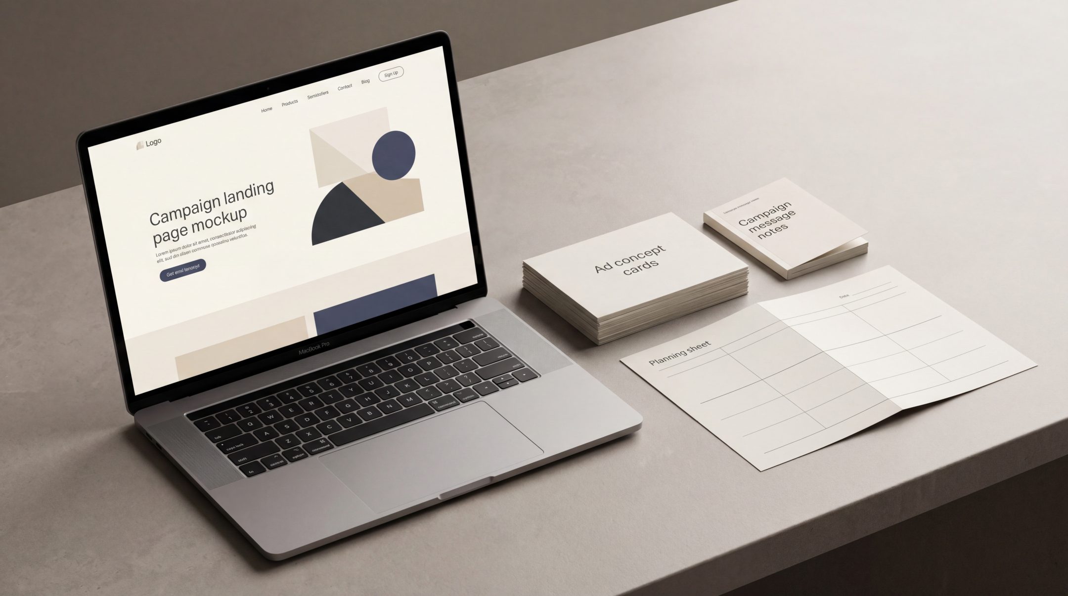
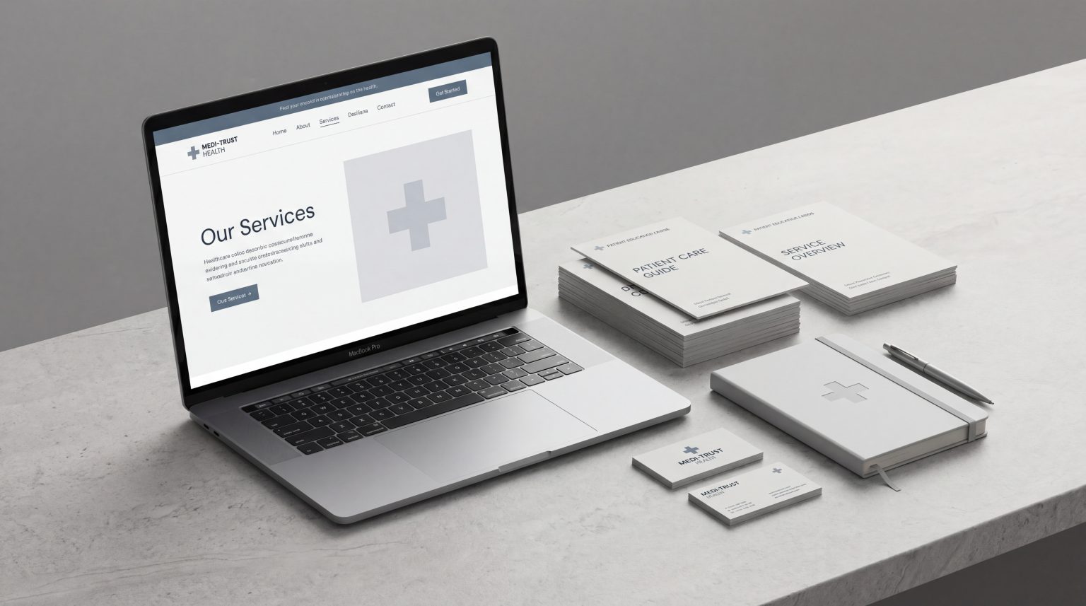
Campaign landing pages work best when they are not treated as isolated design assets. A strong page connects the campaign message, user intent, visual structure and conversion action into one coherent journey. When that connection is clear, the page does more than receive traffic. It continues the argument that started in the ad and helps the user decide what to do next.
Why Campaign Landing Pages Need a Framework
Campaign landing pages often sit between two teams: the media team that drives traffic and the design or web team that builds the page. When those teams work separately, the result can feel disconnected. The ad promises one thing, the page leads with another, and the conversion action appears before the user has enough confidence to act.
A framework helps prevent that disconnect. It gives the campaign a clear logic from first impression to final action. The user sees a message, clicks with a specific expectation, lands on a page that confirms that expectation, then moves toward a relevant next step.
This matters because a landing page is part of the campaign experience, not just a destination. Google’s own guidance on landing page experience places emphasis on usefulness, relevance, transparency and ease of navigation. In practical terms, the page has to feel aligned with what the user clicked and simple enough to act on without confusion.
A good framework for campaign landing pages should answer five questions:
- What message brought the user here?
- What does the user expect to find immediately?
- What action should they take?
- What information or reassurance do they need before acting?
- How will the page be reviewed and improved after launch?
Step 1: Start With the Campaign Message
The landing page should not be planned after the ad is finished. It should be shaped by the same strategic thinking. A strong campaign message gives the page a clear starting point because it defines what the user has already been promised.
If the ad focuses on speed, the page should not open with a broad company introduction. If the ad focuses on product quality, the page should not lead with a generic discount. If the ad speaks to a specific audience problem, the page should continue that problem-solution logic immediately.
Keep the promise visible
The first screen of the landing page should confirm that the user is in the right place. This does not mean copying the ad word for word, but the message should feel continuous.
For example, if a campaign promotes a free consultation for website improvement, the landing page should make that offer clear at the top. The headline, supporting copy and call to action should all reinforce the same idea. If the page instead opens with a long explanation of the agency, the user has to work harder to reconnect the click with the reason they arrived.
Avoid changing the angle after the click
A common mistake is using one message to earn the click and another message to sell on the page. This creates friction because the user has to reinterpret the offer. Campaign landing pages should reduce that mental effort.
The page can expand the message, add detail and support decision-making, but it should not change the core angle. The job is to make the original message clearer, more credible and easier to act on.
Step 2: Match the Page to the User’s Intent
Every click carries intent. Some users are comparing options. Some are looking for proof. Some are ready to request a quote. Some need a simple explanation before they can make a decision.
A strong post-click experience matches the landing page to that level of intent. The page should not ask too much too soon, but it should also avoid hiding the next step when the user is ready.
Understand what the campaign is really capturing
Different campaigns attract different kinds of attention. A search campaign may capture users who already know what they need. A social campaign may interrupt users who are interested but not actively searching. A retargeting campaign may speak to people who have already visited the website and need a reason to return.
The same landing page will rarely serve all of those situations equally well. Search traffic may need direct relevance, clear service fit and fast access to action. Social traffic may need more context, explanation and trust-building. Retargeting traffic may benefit from stronger proof, objection handling or a more specific offer.
Build the page around the user’s next question
After the click, the user is usually asking a simple question: “Is this relevant to me?” Once that is answered, the next question becomes: “Can I trust this?” Then: “What happens if I take action?”
Campaign landing pages should answer those questions in order. If the page jumps straight to a form before establishing relevance and trust, it can feel premature. If it explains too much before showing a clear action, it can lose momentum.
Step 3: Design Around One Clear Action
Campaign landing page design should be focused. The page can include supporting information, but it should not compete with itself. When every section pushes toward a different action, the user has to decide what matters. That decision should already be made by the campaign strategy.
The primary action might be to book a consultation, request a quote, download a guide, register interest, start a trial or view a product range. Whatever the action is, the page should make it easy to understand and easy to complete.
Make the call to action specific
Generic calls to action often weaken conversion landing pages because they do not explain what will happen next. “Submit” or “Get started” may be acceptable in some contexts, but they rarely carry enough meaning on their own.
A stronger call to action connects to the offer. For example:
- Request a Landing Page Review
- Book a Campaign Consultation
- Get the Product Guide
- Start the Quote Process
- Check Availability
The right wording depends on the campaign, but the principle is the same. The action should feel clear, specific and low-friction.
Remove unnecessary decisions
A campaign landing page is not a full website. It does not need to expose every service, every page and every possible route. Navigation, secondary offers and unrelated content should be treated carefully because they can distract from the intended conversion path.
This does not mean every landing page must be minimal. It means every element should earn its place. If a section supports the decision, keep it. If it introduces a new decision that does not help the campaign goal, question whether it belongs on the page.
Step 4: Support Trust and Decision-Making
People do not convert only because a page looks good. They convert when the page makes the next step feel relevant, credible and safe enough. Trust is especially important when the user has arrived from an ad, because they may have limited knowledge of the brand.
Trust can come from different places: clear writing, professional design, transparent process information, recognizable proof points, useful detail, strong page structure and consistent brand presentation.
The Nielsen Norman Group’s guidance on trustworthy page design highlights the importance of professional presentation, organized content and credibility cues. For campaign landing pages, those elements matter because the user is often forming a quick judgment about whether the brand feels legitimate.
Use proof where it helps the decision
Proof does not always mean a case study. It can include product details, process steps, certifications, testimonials, client types, service explanations, guarantees, comparison points or clear answers to objections. The best proof depends on the campaign.
For a service campaign, users may need to know how the process works. For a product campaign, they may need specifications, usage details or delivery information. For a high-consideration offer, they may need reassurance about expertise, fit and next steps.
Keep the design calm and intentional
Campaign landing page design should guide attention. Visual hierarchy, spacing, section order and content rhythm all affect how easily users understand the offer.
A page that looks polished but lacks hierarchy can still perform poorly. A page that is visually busy can make a simple offer feel complicated. The design should support the message by making the most important information easy to see, scan and act on.
Step 5: Review Performance and Improve the Page
A landing page is not finished when it goes live. It should be reviewed against the campaign objective and improved based on real behaviour.
This is where performance thinking becomes important. The goal is not to change everything at once, but to understand where users may be losing clarity, confidence or momentum.
Useful review points include:
- Is the page attracting the right traffic?
- Are users engaging with the first screen?
- Are they reaching the form or key action?
- Are they dropping off at a specific section?
- Is the offer clear enough?
- Does the page match the ad message closely enough?
- Is the form asking for too much too soon?
- Are mobile users experiencing friction?
Small conversion improvements can make a meaningful difference when they remove friction from the decision path. This might involve rewriting a headline, simplifying the form, strengthening the CTA, reordering proof points or clarifying what happens after submission.
Review the page in context
Landing page performance should not be reviewed in isolation. A weak conversion rate may be caused by the page, but it may also come from traffic quality, offer fit, targeting, creative mismatch or unclear campaign positioning.
The best review process looks at the full journey: ad, audience, click intent, page content, form experience and follow-up. That broader view helps teams avoid blaming the page for every issue while still improving the parts that genuinely create friction.
Where Campaign Landing Pages Usually Get Stuck
Campaign landing pages often get stuck when they are built around production speed rather than campaign logic. Teams need a page quickly, so they reuse a generic template, add campaign copy and launch. That can work for simple campaigns, but it often creates problems when the offer, audience or intent is more specific.
The message is too broad
A landing page that tries to serve every audience usually feels vague. The user should recognize the specific problem, offer or use case that brought them there. Broad brand messaging has its place, but campaign pages need sharper relevance.
The design is attractive but unfocused
Good visuals can improve perception, but they cannot replace structure. If the page does not guide users through message, proof and action, the design may look strong while still underperforming.
The CTA appears without enough context
Some pages ask users to convert before explaining why they should. Others explain everything but hide the CTA. The page should create a rhythm where action is available early, then repeated naturally after useful supporting information.
The form creates too much friction
Forms should match the value of the offer. A high-value consultation may justify more fields than a simple download. But every field should have a reason. If the user feels the page is asking for too much information before earning trust, completion rates can suffer.
The page is not reviewed after launch
Many campaign landing pages are launched and then left unchanged. This limits learning. Even a strong first version should be reviewed once traffic and behaviour data are available.
Applying This Framework in Paid Campaigns
In paid campaigns, landing pages have a direct relationship with media efficiency. When the page is aligned with the ad, the offer and the user’s intent, the campaign has a better chance of turning attention into action.
This framework can be applied before launch as a planning checklist:
Before creative development
Clarify the main message, audience, offer and conversion action. The landing page should be considered at the same time as the ad creative, not after it.
Before page design
Define the page structure. Decide what the user needs to see first, what proof they need, what objections should be answered and where the CTA should appear.
Before launch
Check message continuity. The ad, headline, first screen, CTA and form should feel like one connected path.
After launch
Review data and behaviour. Look for signs of mismatch, hesitation or friction. Improve the page in focused stages rather than making random changes.
Campaign landing pages are most effective when they are treated as part of the campaign system. The ad creates interest. The page develops that interest. The design guides attention. The proof supports confidence. The CTA makes the next step clear
FAQs
What are campaign landing pages?
Campaign landing pages are pages created for specific marketing campaigns. Their role is to continue the message from an ad, email, social post or other campaign touchpoint and guide the user toward one clear action.
How are campaign landing pages different from normal website pages?
A normal website page may serve multiple audiences, messages and navigation paths. A campaign landing page is more focused. It is usually built around one audience, one campaign message and one primary conversion action.
What makes a campaign landing page convert better?
A campaign landing page is more likely to convert when the message matches the ad, the page reflects user intent, the design guides attention clearly, trust signals support the decision and the CTA is specific and easy to complete.
Should every paid campaign have its own landing page?
Not always, but many paid campaigns benefit from a dedicated page. If the campaign has a specific audience, offer, message or conversion goal, a tailored landing page usually gives the post-click experience more focus than a generic website page.
How often should landing pages be improved?
Landing pages should be reviewed after enough campaign data is available to identify patterns. Improvements should be based on behaviour, relevance and friction rather than personal preference alone.
Final Thoughts
Campaign landing pages are not just design outputs. They are part of the performance system that connects message, intent, trust and action.
When the page continues the campaign message clearly, matches the user’s expectation and removes unnecessary friction, it gives the campaign a stronger chance of converting. The best results usually come from planning the ad and landing page together, then reviewing performance once real users interact with the page.
For brands running paid campaigns, a clearer landing page framework can help turn traffic into more meaningful action, without relying only on bigger media budgets.