Why Packaging Matters in Cosmetics
Cosmetics is a category driven by perception as much as performance. Before someone experiences the formula itself, they usually encounter the product through its pack, whether on a shelf, in an online store, in a social media image or in the hand of an influencer or customer.
That means packaging has several jobs to do at once:
- create immediate visual appeal
- communicate brand quality
- help customers understand the product quickly
- differentiate the item from similar alternatives
- support consistency across the wider range
In beauty, people often make fast judgments. They assess whether something feels premium, modern, clinically effective, playful, minimalist or natural within seconds. Packaging is central to that judgement.
For established brands, good packaging reinforces recognition and trust. For newer brands, it can help close the gap between being unknown and being taken seriously. In both cases, cosmetic brand packaging has to work harder than a simple container. It acts as a brand signal, a communication tool and a commercial asset.
What Makes Beauty Packaging Different
Beauty packaging design operates in a category where visual nuance matters. Small choices in finish, tone, typography or structure can significantly affect how a product is perceived.
Unlike some other sectors, cosmetics packaging is expected to perform on both emotional and practical levels. It needs to attract attention, but it also needs to reassure. It should feel refined, but not confusing. It should express personality, but still make product information easy to find.
Several category-specific pressures shape packaging for beauty brands:
- products often compete in crowded visual environments
- customers expect a stronger sense of style and desirability
- ranges often include multiple SKUs, variants and formats
- premium cues need to feel intentional, not exaggerated
- product usage, shade, benefit or skin concern still needs to be clear
This is why premium cosmetics packaging is rarely about decoration alone. The most effective packs balance emotion with clarity. They create aspiration without losing usability.
The Building Blocks of Strong Cosmetics Packaging
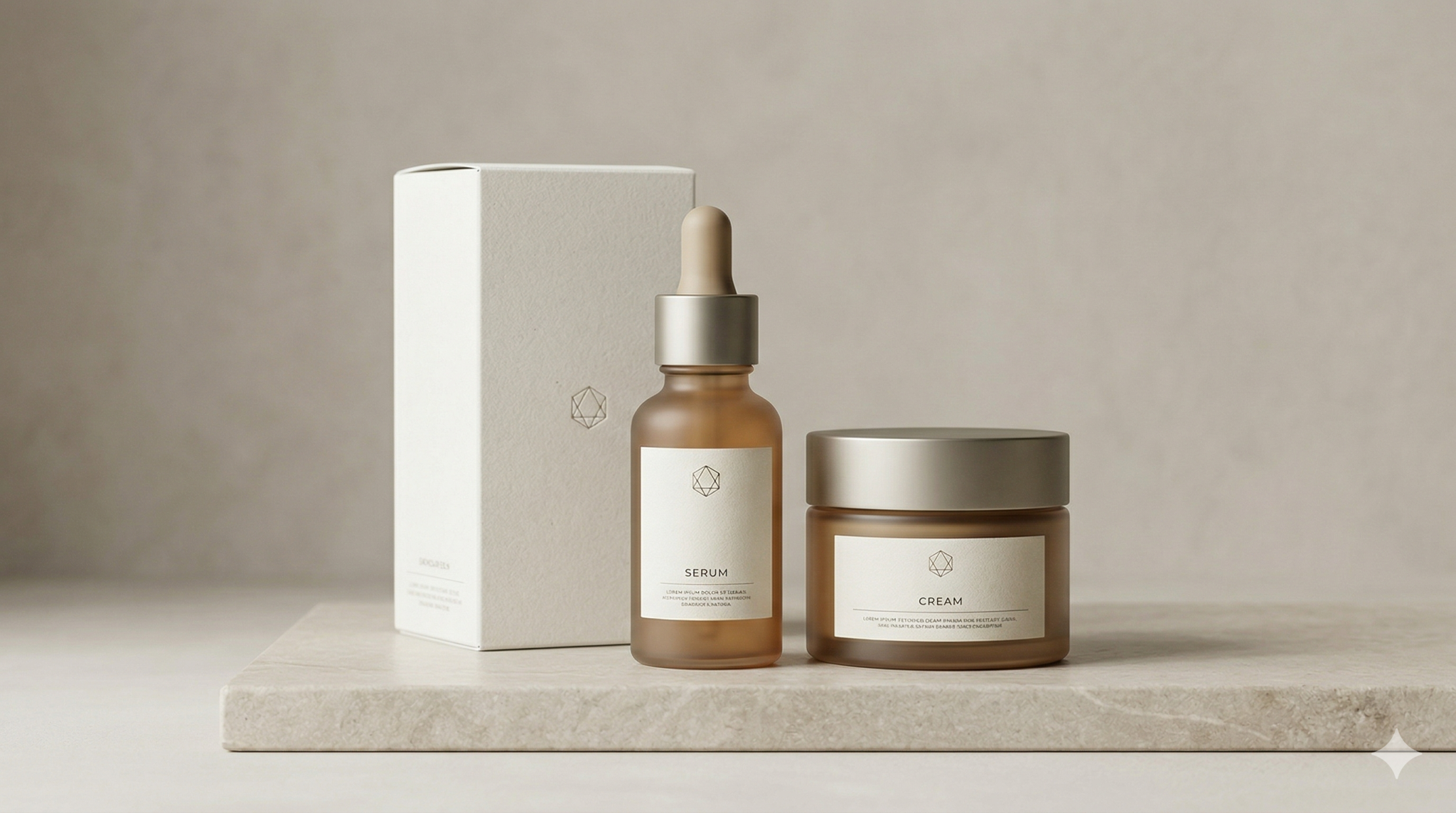
Premium Perception
Premium feel is one of the most misunderstood parts of cosmetics packaging design. Many brands assume premium means adding more visual complexity, metallic finishes or luxury-coded details. In practice, premium perception usually comes from control.
Well-executed premium packaging tends to feel considered rather than overloaded. It often relies on:
- strong typography choices
- clear spacing and hierarchy
- restrained use of colour
- thoughtful material and finish decisions
- confidence in what is left out as much as what is added
A premium beauty product should not feel visually uncertain. When too many claims, colours or graphic devices compete for attention, the result is usually weaker, not stronger.
Premium also needs to match the product and audience. A prestige skincare line may benefit from understated refinement, while a vibrant colour cosmetics range may need a more expressive premium language. The point is not to make every product look minimal. It is to make it feel intentional, elevated and credible within its own space.
Brand Fit
Cosmetic brand packaging should feel like a natural extension of the brand, not a disconnected design exercise. This is where many packaging systems start to break down. A product may look attractive in isolation, but if it does not feel aligned with the wider brand identity, the result becomes fragmented.
Strong brand fit comes from consistency between packaging and the rest of the brand ecosystem, including:
- visual identity
- brand positioning
- tone of voice
- target customer expectations
- digital and retail presentation
For example, a clinically positioned skincare brand may need packaging that feels precise, clean and credible. A lifestyle-led beauty brand may need more warmth, softness or personality. A high-performance cosmetic line may need to communicate confidence and efficacy without becoming cold or generic.
Brand fit matters because packaging is rarely seen on its own. Customers encounter it alongside websites, campaign visuals, social content, retail displays and secondary packaging. When all of those signals align, the brand feels stronger and more coherent.
Clarity
No matter how beautiful a pack looks, it still needs to tell people what they are buying. Clarity is one of the most commercially important aspects of packaging for beauty brands, especially when ranges grow more complex.
Customers should be able to understand the essentials quickly:
- what the product is
- what it does
- who it is for
- where it sits in the range
- how it differs from nearby variants
This becomes even more important in skincare, treatment-led beauty products and multi-step routines. If the hierarchy is weak or the copy is difficult to scan, the pack starts creating friction.
Clear beauty packaging design does not mean sacrificing elegance. It means making sure the most important information is easy to access. That often depends on better hierarchy, cleaner architecture and more disciplined messaging.
A premium look without clarity can feel frustrating. Clarity without brand expression can feel generic. Strong packaging finds the balance.
Product Experience
The packaging experience does not begin and end with front-of-pack visuals. In cosmetics, how the product feels in the hand, opens, dispenses and stores also shapes brand perception.
This includes factors such as:
- pack format suitability
- ease of use
- tactile quality
- closure confidence
- label legibility in real use conditions
- consistency across the product range
A serum that leaks, a compact that feels flimsy or a label that becomes hard to read in a humid bathroom can quickly undermine a premium impression. Product experience is where visual promise meets physical reality.
This is why strong cosmetics packaging design considers both appearance and interaction. A product should not only look elevated on a product page. It should also feel satisfying and reliable during everyday use.
Common Cosmetics Packaging Mistakes
Cosmetics brands often get pulled in two directions. They either over-prioritise aesthetics and lose clarity, or over-correct toward functional communication and lose emotional appeal. Both can weaken performance.
Some of the most common mistakes include:
Mistaking luxury cues for premium design
Adding foil, gloss, heavy decoration or ornate details does not automatically create a premium result. When these elements are not supported by clear hierarchy and confident design decisions, the pack can feel forced.
Losing the brand across product lines
Many brands create attractive individual products but fail to build a recognisable system. This leads to packaging that looks inconsistent from one SKU to the next, making the range harder to navigate and the brand harder to remember.
Making product information too hard to find
When key information is too small, poorly prioritised or buried among claims, customers have to work harder than they should. This affects both shelf performance and online conversion.
Following category trends too closely
Beauty packaging trends move quickly. Minimal palettes, clinical aesthetics, soft pastel systems and bold typographic approaches all rise and fall in popularity. Referencing category norms can be useful, but over-relying on them can make a brand feel interchangeable.
Ignoring the physical user experience
A pack may look refined in a mockup but disappoint in use. Poor material choices, awkward dispensing or lack of durability can damage brand perception very quickly.
What Better Premium Execution Looks Like
Better execution in premium cosmetics packaging usually looks calmer, clearer and more consistent. It is not necessarily louder, more expensive-looking or more complex. It simply feels more resolved.
In practice, stronger packaging tends to have the following characteristics:
A clearer packaging hierarchy
The brand name, product name, category cues and key benefit work together in a predictable, readable order. This helps customers understand the product faster.
More disciplined visual language
Typography, colour, layout and finishes are used with purpose. There is a recognisable logic behind the design, rather than a collection of disconnected choices.
Stronger range consistency
Products feel like part of the same family without becoming repetitive. Variants are differentiated clearly, but the overall system still feels coherent.
Better alignment with brand positioning
The packaging feels appropriate for the intended audience, price point and market context. It supports the product promise instead of contradicting it.
More thoughtful real-world usability
The pack looks good, but it also works well. It feels stable, legible and satisfying in real use, not just in presentation visuals.
When cosmetics packaging gets this balance right, the result is more than visual polish. It creates a stronger perception of quality, reduces hesitation and helps the brand present itself more confidently across channels.
FAQs
What is cosmetics packaging design?
Cosmetics packaging design is the process of shaping how beauty products look, communicate and function through their packaging. It includes visual identity, layout, materials, hierarchy, usability and range consistency.
Why is packaging so important for beauty brands?
Packaging plays a major role in how a beauty product is perceived before it is tried. It influences desirability, trust, clarity and recognition, which makes it a key part of both branding and sales performance.
What makes packaging feel premium in cosmetics?
Premium cosmetics packaging usually feels intentional, coherent and well-controlled. Good typography, disciplined hierarchy, suitable materials and strong brand alignment often matter more than decorative effects alone.
How can beauty packaging stay clear without looking basic?
Clarity comes from strong information hierarchy, concise messaging and thoughtful layout. It does not require the design to become plain. In fact, clear packaging often feels more premium because it appears more confident and resolved.
What is the difference between attractive packaging and effective packaging?
Attractive packaging may create a positive first impression, but effective packaging also communicates clearly, supports product understanding, fits the brand and performs well in real use. The best beauty packaging does both.
Final Thoughts
Cosmetics packaging design needs to do more than look refined. It has to create desirability, support product understanding and reinforce the wider brand in a category where perception moves quickly and competition is intense.
The strongest packaging solutions are usually the ones that feel balanced. They deliver premium perception without becoming overworked, clarity without feeling generic and brand expression without losing commercial focus.
For beauty brands, that balance is where packaging becomes far more than surface design. It becomes part of how the product earns attention, builds trust and holds its place in the market.
If your beauty packaging needs to feel more premium, more coherent or easier to understand across the range, it may be time to review how brand fit, communication and product experience are working together.