Why Packaging Matters So Much in FMCG
Few categories are as competitive as FMCG. Shelves are crowded, buying habits are often fast and many products sit beside direct alternatives with similar price points, similar claims and similar formats. In that environment, packaging becomes one of the first and most important points of contact between the brand and the buyer.
Unlike high-consideration purchases, FMCG decisions are often made quickly. Consumers may scan for a known brand, look for a specific variant or choose the option that feels clearest and most trustworthy at a glance. That means the pack has to do several jobs at once.
It needs to:
- attract attention in a busy shelf environment
- signal the brand clearly and consistently
- communicate what the product is
- help the buyer find the right variant quickly
- support confidence in the purchase
When packaging fails in any of these areas, even a good product can become easier to ignore. When it succeeds, it helps drive faster recognition and a smoother path to purchase.
What Consumers Notice at Speed
Consumers rarely study FMCG packaging in detail during an initial shelf scan. Most first impressions happen through quick visual processing. That is why the strongest designs are usually built around immediate cues rather than overloaded explanation.
At speed, consumers tend to notice a few things first:
Overall colour and contrast
Bold, distinctive colour use can help a product stand out from surrounding competitors. Contrast is especially important because it affects how quickly the eye can separate one pack from another.
Brand block and logo presence
If the brand is hard to spot, recognition slows down. A strong brand presence helps returning buyers locate the product quickly and helps new buyers start building familiarity.
Pack architecture and layout
People notice structure before they read details. A clear visual hierarchy helps them understand what matters first, second and third.
Product type and variant cues
In fast-moving categories, shoppers want quick reassurance that they are picking the correct product. Flavour, function, benefit or format should be easy to identify without effort.
Visual confidence
Packaging that feels organised, intentional and consistent often appears more credible. Even without reading deeply, people pick up signals about quality and trust from design execution.
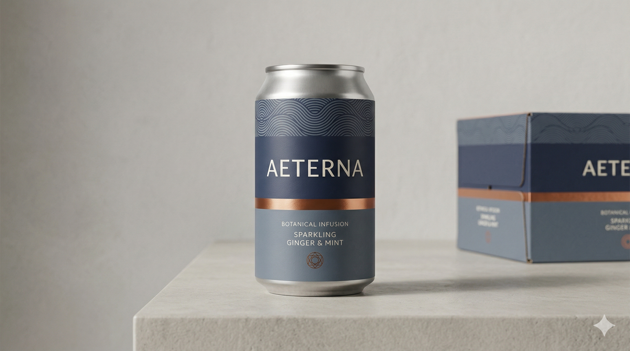
The Core Elements of Effective FMCG Packaging
Strong FMCG packaging design works because it solves several shelf-level problems at once. It does not rely on decoration alone. It is built to perform in the real context where products are seen, compared and selected quickly.
Shelf Visibility
Shelf visibility is about helping the product get noticed in a crowded environment. This can come from colour contrast, a strong silhouette, clear brand blocking, distinctive graphics or a packaging system that creates impact across multiple SKUs.
Visibility is not only about being loud. In some categories, a more restrained design can stand out precisely because the shelf is visually noisy. The key is difference with purpose. The pack needs to create enough visual interruption for the eye to stop.
Effective shelf visibility often depends on:
- strong contrast between foreground and background elements
- clear separation between brand and product information
- distinctive colour ownership
- consistent layout across the range
- pack features that remain recognisable from a distance
Recognition
Recognition is what helps buyers find a product again. In FMCG, that matters because repeat purchase is often driven by speed and familiarity. If a shopper has bought the product before, packaging should help them relocate it immediately.
Recognition comes from consistency. Brand assets such as logos, typography, colours, graphic devices and layout principles need to work together in a stable way. Even when variants change, the brand should still feel instantly identifiable.
Stronger FMCG brand recognition usually comes from:
- consistent visual identity across the range
- repeatable layout logic
- strong use of distinctive brand elements
- careful control of variant differences
- packaging systems that scale without losing brand memory
Clarity
A pack can be visually strong and still fail if it is unclear. FMCG packaging must communicate quickly. People should be able to understand what the product is, what makes it different and whether it is the right option for them without unnecessary effort.
Clarity is especially important in categories with multiple variants, technical claims or a wide range of formats. If information hierarchy is weak, consumers may hesitate or choose a simpler-looking alternative.
Good clarity often includes:
- clear naming
- prioritised product information
- easy-to-find variant markers
- simple benefit communication
- readable typography
- minimal conflict between decorative and functional elements
Clarity does not mean removing personality. It means ensuring the message is easy to process under real shelf conditions.
Brand Fit
Effective consumer packaging design should feel right for the brand, the category and the intended audience. Packaging that performs well on shelf is not only visible and clear. It also reflects the brand position accurately.
For example, a value-led product, a wellness-focused line and a premium FMCG brand should not all communicate in the same way. The tone of the packaging needs to match the product promise.
Brand fit depends on:
- visual language that supports the positioning
- materials and finishes that reflect the intended market level
- communication style that feels appropriate to the audience
- consistent alignment between packaging, branding and product expectations
When brand fit is weak, packaging may still be noticed, but it can create confusion about quality, audience or price positioning.
Common FMCG Packaging Mistakes
Many packaging issues happen because design is judged in isolation rather than in shelf context. What looks appealing on a screen does not always perform well in store.
Here are some of the most common FMCG packaging mistakes:
Overcrowding the front of pack
Trying to communicate too much at once weakens hierarchy. When every message competes for attention, nothing lands clearly.
Weak brand presence
Some packs prioritise descriptive content so heavily that the brand becomes secondary. That can reduce recognition and make repeat purchase harder.
Poor variant differentiation
In multi-SKU ranges, variants need to feel connected but not interchangeable. If the system is too subtle, consumers may pick the wrong product or miss the one they want.
Generic category design
Following category conventions too closely can reduce distinction. Packaging needs to feel relevant, but it also needs enough character to stand apart.
Inconsistent range execution
When different products within the same line use different structures, brand assets or visual priorities, the result is weaker recognition across the shelf.
Designing without shelf testing in mind
Packaging should be considered in context, not only as a flat artwork file. Distance, adjacency, lighting and competitor presence all affect how well it performs.
What Stronger Shelf Execution Looks Like
Better FMCG packaging design tends to look simpler, clearer and more intentional, but the real difference is strategic. Stronger shelf execution comes from understanding what the pack needs to do before styling begins.
In practice, stronger execution often means:
A clearer visual hierarchy
The buyer can quickly see the brand, the product type and the variant without searching for meaning.
More disciplined use of brand assets
Typography, colour, logos and graphic devices are used consistently so the product becomes easier to recognise over time.
Better variant logic
The range holds together as a family, but each SKU is still easy to distinguish. This is especially important for fast repeat purchase.
More focused communication
Claims and benefits are prioritised instead of stacked. The most important message is made obvious first.
Packaging that reflects the brand position
The design does not just chase attention. It supports the intended perception of the product, whether that is functional, affordable, premium, natural or performance-led.
Stronger system thinking
The best FMCG product packaging is rarely a one-off design solution. It is usually part of a broader packaging system that can flex across formats, product lines and future launches while preserving recognition.
FAQs
What is FMCG packaging design?
FMCG packaging design is the process of creating packaging for fast-moving consumer goods in a way that supports shelf impact, quick recognition, product clarity and brand consistency. It combines visual design, communication hierarchy and practical retail thinking.
Why is shelf impact important in FMCG?
Shelf impact matters because FMCG products compete in crowded retail spaces where buying decisions are made quickly. Packaging that stands out appropriately has a better chance of being noticed, understood and chosen.
What improves FMCG brand recognition on packaging?
Consistency is the main driver. Repeated use of recognisable brand elements such as logo placement, colour ownership, typography and layout structure helps buyers identify the product faster over time.
How is FMCG packaging different from packaging in other sectors?
FMCG packaging usually needs to work faster. It often relies on instant visual communication, repeat purchase behaviour and strong shelf competition. That makes visibility, clarity and recognition especially important.
What makes consumer packaging design effective?
Effective consumer packaging design balances distinctiveness with clarity. It helps people notice the product, understand it quickly and connect it to the brand without friction.
Final Thoughts
FMCG packaging design has to perform under pressure. In fast-moving retail environments, products are judged quickly and often chosen with minimal attention. That is why shelf visibility, recognition, clarity and brand fit matter so much.
The strongest packaging does not simply look good in isolation. It works in context. It helps the right buyer notice the product, understand it quickly and recognise it again later. When that happens consistently, packaging becomes a meaningful driver of commercial performance.
If your FMCG packaging needs to work harder on shelf, a stronger strategic approach to structure, recognition and communication can make the design far more effective. Fact & Form helps brands create packaging that feels clear, distinctive and better suited to fast-moving retail environments.