Why Web Design Matters So Much in Healthcare
Healthcare is a high-trust category. People visiting a medical website are often looking for answers quickly, and sometimes under stress. They may be trying to understand a treatment, check symptoms, confirm a clinic’s credibility or book an appointment for themselves or a family member. In that context, a poorly structured website does more than create inconvenience. It can create doubt.
Good healthcare web design supports confidence from the first interaction. It helps users find what they need, understand what a provider offers and feel reassured that they are dealing with a professional, credible organisation. This is especially important in medical sectors where communication needs to be clear, responsible and easy to follow.
It also affects practical outcomes. A site that is easier to use can reduce unnecessary calls, improve appointment enquiries, guide patients to the right services and make information more accessible across devices. When the experience is clear, patients are more likely to stay engaged rather than leave in frustration.
What Patients Notice First on Medical Websites
Patients tend to make quick judgments online, even in serious categories like healthcare. Before they read deeply, they notice whether a website feels trustworthy, current and easy to understand.
One of the first things they respond to is the overall sense of professionalism. A clean layout, calm visual language and clear messaging signal care and competence. An outdated or cluttered design can have the opposite effect, even if the medical service itself is excellent.
They also notice how quickly they can answer basic questions. Can they immediately understand what the practice, clinic or provider does? Can they find contact information, services, location details or appointment options without effort? If those essentials are buried or unclear, confidence drops quickly.
Another early factor is tone. Medical websites need to feel professional without becoming cold or inaccessible. Patients want information that is clear and responsible, but also human. A site that feels overly technical, vague or impersonal can create distance rather than trust.
Finally, mobile usability matters. Many users visit healthcare websites on their phones, often while on the move. If pages are hard to read, buttons are awkward to use or key information is hidden, the experience breaks down immediately.
The Core Elements of Strong Medical Web Design
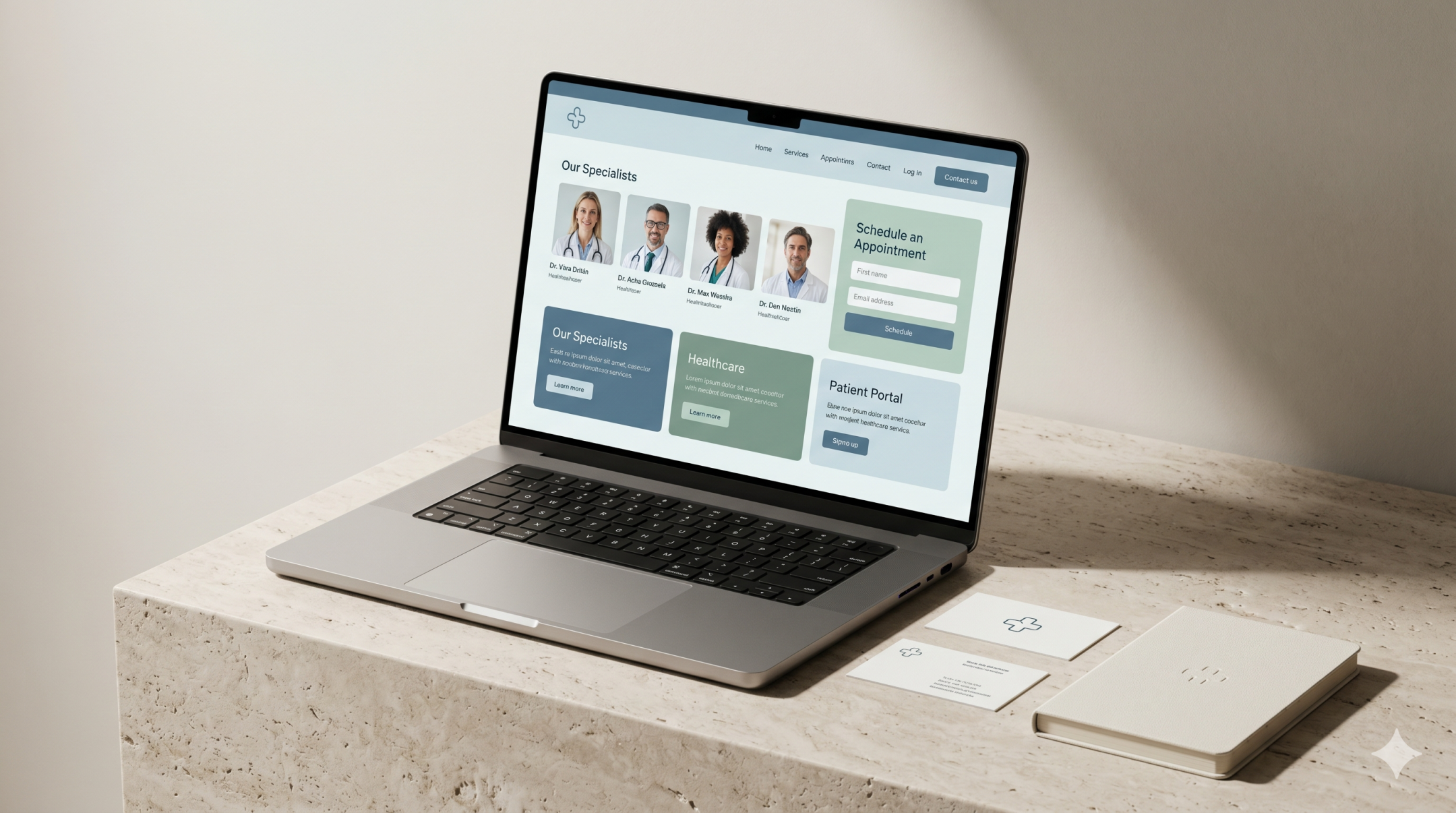
Trust Signals
Trust is one of the most important parts of medical website design. Patients want reassurance that the provider is credible, qualified and established. That reassurance comes through both content and presentation.
Clear trust signals often include clinician profiles, qualifications, accreditations, contact details, real location information and transparent explanations of services. Testimonials or reviews may also help when used appropriately and responsibly. The design should present these elements clearly rather than forcing users to search for proof of credibility.
Photography and imagery also influence trust. Generic visuals can make a healthcare brand feel distant or impersonal. A more considered visual approach, aligned with the organisation’s real environment and tone, usually feels stronger and more believable.
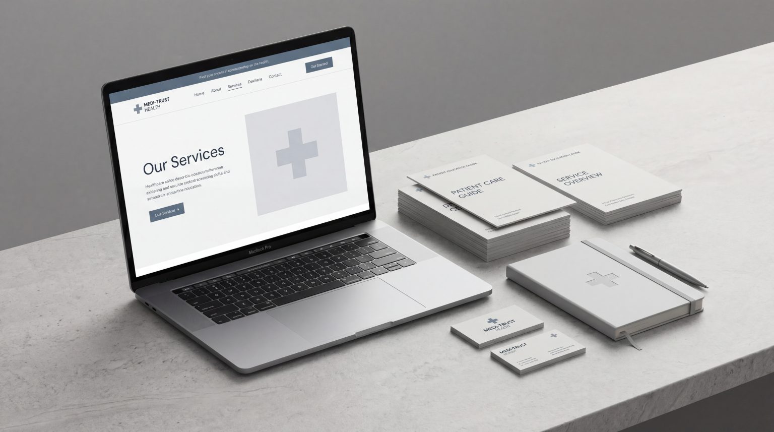
Clear Information Hierarchy
Medical information can be complex, but website structure should not make it harder to understand. Strong medical website design uses clear hierarchy to guide people through content in a logical way.
Important information should appear where users expect to find it. Core services, contact details, booking options, practitioner information and key patient guidance should be prioritised rather than buried in long blocks of text. Headlines, subheadings, page sections and visual spacing all help users scan content more effectively.
This matters because patients are often not browsing casually. They are looking for specific answers. A strong hierarchy helps them identify relevant information quickly and reduces the mental effort required to use the site.
Simple Navigation
Navigation on a healthcare website should feel intuitive. People should not have to guess where information lives or work through an overly complex menu just to find basic details.
Simple navigation means using clear labels, sensible grouping and a structure that reflects real patient needs. For example, users may want to explore services, find a doctor, understand a treatment area, check insurance or referral information, or book an appointment. The website should make those paths obvious.
This is where healthcare website UX becomes especially important. Good navigation is not about offering more options. It is about making the most important options easier to find and easier to use.
Friction-Free Patient Journeys
A patient journey on a medical website should feel direct and supportive. Once someone lands on a page, the next step should be clear. That might mean booking, calling, sending an enquiry, downloading forms or reading more about a treatment.
Friction appears when journeys are fragmented or unclear. Common examples include too many clicks to reach contact details, unclear calls to action, inconsistent page layouts or forms that ask for too much too soon. These issues create hesitation at the exact point where the user needs confidence.
Friction-free journeys keep momentum moving. They reduce barriers between information and action. In a medical setting, that is especially valuable because users are often time-sensitive and emotionally invested in getting the right answer quickly.
Common Medical Website Mistakes
One of the most common problems in medical website design is prioritising internal business language over patient understanding. Healthcare providers often know their services in detail, but patients may not understand specialist terminology or clinical categories. When language becomes too technical too early, the site feels harder to use.
Another frequent issue is poor content structure. Important pages become dense, repetitive or difficult to scan. Patients should not have to read everything to find basic facts. Design and content need to work together to simplify, not complicate.
Outdated visuals and inconsistent branding can also weaken trust. A site does not need to feel trendy, but it does need to feel current, cared for and professionally maintained. In healthcare, visual neglect can affect perceived credibility very quickly.
Weak mobile experience is another major issue. Many healthcare websites still perform poorly on smaller screens, even though mobile traffic is often significant. If key journeys do not work well on mobile, the site fails many users at the point of need.
Finally, some medical websites make action unnecessarily difficult. Booking systems may be confusing, contact options may be hidden or service pages may explain the problem without helping users understand what to do next. Strong design should always connect information with action.
What Better Healthcare Website Execution Looks Like
Better healthcare web design begins with understanding the patient perspective. It asks what people need to know, what they are likely to worry about and what will help them move forward with confidence.
A stronger site usually has a clearer structure, more focused content and more intentional user journeys. The homepage quickly explains who the provider is, what they offer and where users should go next. Service pages are organised around patient understanding rather than internal complexity. Contact and booking options are visible, accessible and easy to use.
It also balances professionalism with usability. The best medical websites do not feel overdesigned or overly corporate. They feel calm, trustworthy and purposeful. Their design supports communication rather than distracting from it.
From a user experience perspective, better execution also means consistency. Layouts, buttons, navigation patterns and calls to action should work predictably across the site. This creates familiarity and reduces decision fatigue.
Ultimately, good medical website design is about making digital healthcare interactions feel easier, safer and clearer. When structure, design and content align well, the website becomes a more useful extension of the healthcare experience itself.
FAQs
What is medical web design?
Medical web design is the process of designing websites for healthcare providers, clinics, practices, hospitals or related medical brands. It focuses on creating digital experiences that feel trustworthy, clear and easy for patients to use.
Why is web design especially important in healthcare?
Healthcare websites often deal with urgent, sensitive or high-trust decisions. Patients need information quickly and need to feel confident in the provider. Good design helps reduce confusion, build trust and improve access to important services or next steps.
What makes a healthcare website feel trustworthy?
Trust usually comes from a combination of factors, including professional design, clear service information, visible contact details, clinician credentials, structured content, calm visual language and straightforward user journeys.
How can a medical website improve patient experience?
A medical website improves patient experience by making information easier to find, simplifying navigation, reducing friction in booking or enquiry journeys and presenting services in a way that is clear and reassuring.
What are common problems with medical website UX?
Common issues include confusing navigation, too much technical language, weak mobile usability, poor information hierarchy, hidden calls to action and outdated visual presentation that reduces trust.
Final Thoughts
Medical web design has a bigger role than many organisations realise. It does not just shape how a healthcare brand looks online. It shapes how patients feel, how easily they find answers and how confidently they move toward care.
In a sector where trust, clarity and professionalism matter immediately, stronger design choices make a measurable difference. A clear healthcare website supports better communication, better usability and a better overall patient experience.
If your current site feels difficult to navigate, unclear in its messaging or too disconnected from patient needs, it may be time to rethink the structure behind it. Creating healthcare websites that feel trustworthy, clear and easier to use starts with better decisions in design, content and user experience.