Good products do not always sell themselves online. In many cases, the product is strong, the offer is relevant and the audience has a genuine need, but the page fails to explain value clearly enough. Product communication online needs more than attractive visuals or a list of features. It needs structure, hierarchy, proof and a clear next step.
Why Product Communication Online Needs a Framework
Online buyers make decisions with limited context. They cannot hold the product, compare packaging in person, ask a sales assistant or experience the material, texture, size or function directly. The website has to do more of the work.
That is why product communication online needs a framework. Without one, product pages often become a collection of disconnected pieces: a headline, a few images, technical specifications, a short description, some icons and a button. Each element may be useful on its own, but the overall experience can still feel unclear.
A strong framework helps answer the questions buyers usually have:
What is this product?
Why should I care?
Is it right for me?
How is it different?
Can I trust it?
What should I do next?
Good product page UX is not only about making a page look clean. It is about making the product easier to understand, compare and act on. Nielsen Norman Group also highlights that effective product pages should provide the information users need to make informed decisions, using text and media together rather than relying on one format alone through ecommerce product page guidance.
The goal is not to say more. The goal is to say the right things in the right order.
Step 1: Make the Product Benefit Obvious
The first communication gap is usually the most damaging: the product benefit is not clear fast enough.
Many product pages open with a product name, a packshot and a technical description. That may be accurate, but it often does not explain why the product matters. Buyers should not have to translate features into value by themselves.
A good product benefit should answer one simple question: what does this help the customer do, solve, improve or feel?
For an FMCG product, the benefit might be convenience, flavour, freshness, speed or everyday practicality. For cosmetics, it might be hydration, texture, glow, confidence, routine simplicity or ingredient-led performance. For technical products, it might be filtration quality, compatibility, safety, durability or long-term reliability.
Move from feature-first to value-first communication
Features matter, but they should not carry the whole message alone. A feature says what the product has. A benefit explains why that feature matters.
For example:
“Contains hyaluronic acid” is a feature.
“Helps skin feel hydrated and smoother” is a benefit.
“Three-stage filtration” is a feature.
“Reduces unwanted particles before water reaches the tap” is a benefit.
“Compact 250ml format” is a feature.
“Easy to carry, store and use daily” is a benefit.
The strongest product page communication usually combines both. It makes the benefit visible first, then uses features to support it.
Avoid vague value claims
Many brands weaken their online product communication by relying on broad claims such as “premium quality”, “innovative formula”, “advanced technology” or “designed for modern lifestyles”.
These phrases may sound polished, but they rarely help buyers decide. A clearer approach is to define what quality, innovation or performance actually means in the context of the product.
Instead of saying “advanced skincare formula”, explain the role of the formula. Instead of saying “high-performance filtration”, explain what the system is designed to filter, where it is used and what makes it suitable.
Clear value communication reduces guesswork.
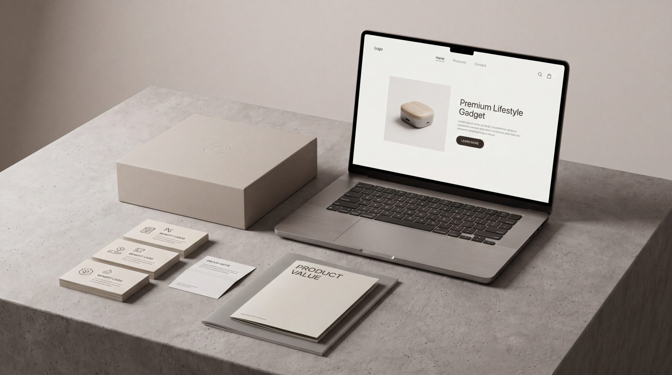
Step 2: Connect Visuals With the Product Story
Product visuals often receive the most attention during design, but they are not always connected to the story the page needs to tell.
A product image should do more than show the object. It should help explain scale, usage, context, ingredients, texture, finish, variants, compatibility or expected outcome. When visuals and copy do not work together, buyers may like the look of the product but still feel unsure about it.
This is especially important for product categories where physical experience matters. Cosmetics buyers want to understand texture, tone, application and routine fit. FMCG buyers often need quick recognition and clear pack communication. Technical product buyers need to understand components, fit, installation, operation or performance.
Use visuals to answer practical questions
Good product visuals can clarify questions such as:
How big is it?
What does the product look like in use?
What is included in the pack?
Which variant is this?
How does it compare with other options?
Where does it fit in a routine, shelf, system or device?
A product page that only uses polished hero images may look premium but still leave practical gaps. A page that combines hero visuals, detail shots, usage context and explanatory graphics can communicate much more effectively.
Keep the visual hierarchy aligned with the message
If the most important benefit is ease of use, the visuals should show ease of use. If the product is built around a technical advantage, the visuals should help simplify that advantage. If the product is premium, the visuals should support premium perception without hiding key information.
For brands in fast-moving categories, FMCG product communication often depends on visual clarity as much as written explanation. Buyers need to understand product type, variant, value and relevance quickly. If the visual system creates confusion, the copy has to work harder than it should.
Step 3: Explain Details in the Right Order
Product pages often fail because the information is present, but not prioritised correctly.
A page may include ingredients, specifications, usage instructions, benefits, warnings, reviews, delivery details and cross-sells. The issue is not always missing content. It is that the content appears in the wrong sequence, with no clear hierarchy.
Product page communication should move from broad understanding to deeper confidence.
A useful order is:
First, explain what the product is and who it is for.
Then, explain the primary benefit.
Next, support that benefit with key features or details.
After that, provide proof, reassurance and usage information.
Finally, guide the user toward the next step.
This order can shift depending on the product category, but the principle stays the same. Do not ask buyers to process technical details before they understand why the product is relevant.
Prioritise decision-making information
Not all product details have equal weight. Some details help people decide. Others support confidence after interest is already established.
For example, a buyer may need to know skin type suitability before reading the full ingredient list. A water filtration customer may need to know product compatibility before reading installation details. A food or beverage buyer may need flavour, format and nutritional cues before storage information.
This is where website content structure becomes important. The page should not simply contain information. It should organise information around how people actually evaluate the product.
Make technical information readable
Technical products often suffer from over-explaining too early. Brands include dense specifications because they want to appear credible, but too much detail without framing can create friction.
The solution is not to remove technical information. The solution is to layer it.
A strong product page can use:
Short summaries for quick understanding
Expandable sections for deeper detail
Icons for scannable cues
Comparison tables for variants or specifications
Plain-language explanations before technical terminology
Documentation downloads where appropriate
This gives different buyers the level of detail they need without overwhelming everyone.
Step 4: Add Proof Where Buyers Need Confidence
Online product communication becomes stronger when claims are supported by proof. Proof helps buyers move from interest to confidence.
Proof can take several forms, depending on the category:
Customer reviews
Ratings
Certifications
Testing information
Ingredient transparency
Compatibility details
Before and after explanations, where responsible and appropriate
Usage guidance
Guarantees or return information
Clinical, technical or regulatory documentation, where relevant
The important point is placement. Proof should appear where buyers need reassurance, not only at the bottom of the page.
If a product makes a performance claim, support it near the claim. If a technical product depends on compatibility, show compatibility proof near product selection. If a cosmetic product is positioned around sensitive skin, make suitability cues visible before the buyer reaches the basket.
Baymard Institute’s product page UX best practices also point to the wider role of product page usability in helping users evaluate products without unnecessary friction.
Match proof to the risk level of the purchase
The more risk a buyer feels, the more proof they need.
Risk can be financial, functional, emotional, medical, technical or reputational. A low-cost snack may need simple flavour, freshness and review cues. A premium cosmetic product may need ingredient clarity, skin suitability and texture explanation. A water filtration product may need technical documentation, certification cues, installation information and compatibility details.
A strong product may fail online when the level of proof does not match the level of buyer hesitation.
Avoid unsupported claims
Claims such as “best”, “most advanced”, “trusted”, “clinically proven” or “eco-friendly” should not be used lightly. If the product page cannot support the claim clearly, the claim can create doubt rather than trust.
Better communication is specific, grounded and transparent. It explains what the product does, what supports the claim and what the buyer can reasonably expect.
Step 5: Make the Next Step Easy to Understand
Even when the product story is clear, conversion can still break down if the next step is not obvious.
The user may understand the product but still wonder:
Which variant should I choose?
What size do I need?
Is this compatible with my system?
How often should I reorder?
What happens after I add to cart?
Is delivery available to my location?
Can I return it?
Do I need accessories?
The call to action is not only a button. It is the full set of cues that help a buyer move forward confidently.
Reduce choice friction
Product pages often create unnecessary hesitation through unclear variants, confusing bundles, hidden delivery information or weak comparison support.
If there are multiple options, help the buyer choose. Use clear variant names, comparison cues, benefit differences and practical recommendations where appropriate.
For example:
Best for daily use
Suitable for sensitive skin
Compatible with model X
Family-size format
Starter kit
Refill pack
These cues are simple, but they help users interpret options more quickly.
Make action language specific
Generic CTAs can work, but product pages often benefit from more specific action language. Depending on the product and buying journey, the next step could be:
Add to basket
Choose your shade
Select your filter model
Build your bundle
Check compatibility
View ingredients
Compare variants
Subscribe and save
The action should match the decision the user is making at that moment.
Where Online Product Communication Usually Breaks Down
Most product communication problems are not caused by one weak sentence. They are usually caused by gaps between elements.
The benefit says one thing, but the visuals say another.
The page opens with technical details before explaining value.
The product looks premium, but the copy feels generic.
The proof appears too late.
The CTA asks for action before confidence has been built.
The product description assumes prior knowledge.
The page structure treats all information as equally important.
These breakdowns are easy to miss because internal teams already understand the product. They know why it matters, how it works and what makes it different. Buyers do not have that context.
A useful test is to view the page through the eyes of someone seeing the product for the first time. Within a few seconds, they should understand the category, core benefit and reason to continue. Within a little longer, they should understand the key details, proof points and next step.
If they cannot, the issue is not the product. The issue is communication.
Applying This Framework Across Product Categories
The same framework applies across categories, but the emphasis changes.
FMCG products
FMCG product pages need speed and clarity. Buyers often make quick decisions based on product type, flavour, format, benefit and brand recognition. Online, the page should make these cues visible immediately.
Strong FMCG communication usually focuses on:
Clear product naming
Fast benefit recognition
Variant clarity
Pack format
Usage occasion
Nutritional or ingredient cues, where relevant
Simple proof, such as reviews or quality indicators
The biggest risk is assuming that packaging alone will explain the product. On a website, packaging needs support from structured copy and clear page hierarchy.
Cosmetics products
Cosmetics communication needs to balance emotion, education and confidence. Buyers want the product to feel desirable, but they also need practical clarity.
Strong cosmetics product communication usually focuses on:
Skin type or hair type suitability
Texture and finish
Key ingredients
Routine position
Expected benefit
Shade, scent or variant clarity
Usage guidance
Proof or reviews
A cosmetics page can look premium and still fail if the buyer cannot understand whether the product is right for them.
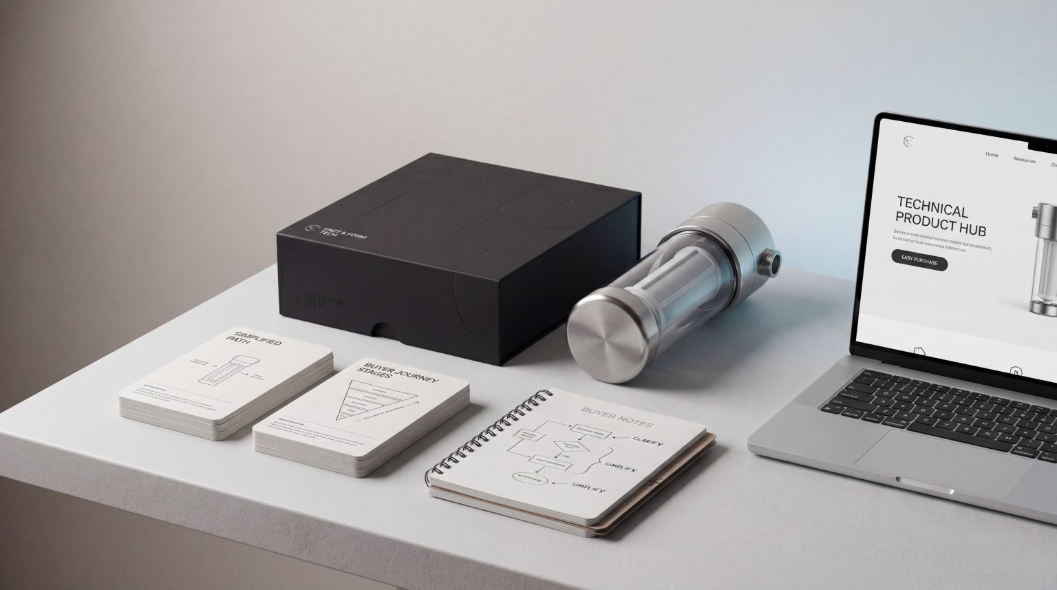
Technical products
Technical product pages need to simplify complexity without removing important detail. Buyers often need reassurance around compatibility, performance, installation, maintenance or long-term use.
Strong technical product communication usually focuses on:
Plain-language benefit
Compatibility information
Specifications in a structured format
Installation or usage steps
Certifications or testing cues
Comparison between models
Support documentation
The goal is to make the product feel credible and understandable at the same time. Technical depth should support confidence, not create confusion.
FAQs
What is product communication online?
Product communication online is the way a product’s value, benefits, features, visuals, proof and next steps are explained across digital channels. On a product page, it includes copy, imagery, hierarchy, specifications, reviews, calls to action and supporting content.
Why do good products fail online?
Good products can fail online when buyers do not understand their value quickly enough. The product may be strong, but unclear benefits, weak visuals, poor page structure, missing proof or confusing next steps can prevent users from feeling confident enough to act.
What is the difference between product features and product benefits?
Features describe what a product has or does. Benefits explain why those features matter to the buyer. Strong digital product messaging usually connects both, so users understand the practical value behind the product details.
How can brands improve product page communication?
Brands can improve product page communication by making the main benefit obvious, using visuals that support the product story, ordering information around buyer decisions, adding proof at key confidence points and making the next step easy to understand.
Does product communication online matter for technical products?
Yes. Technical products often need even clearer communication because buyers may need to understand compatibility, specifications, safety, installation or performance before making a decision. Clear structure helps technical value feel easier to trust.
Final Thoughts
Strong products can underperform online when their value is not communicated clearly enough. Product communication online works best when benefits, visuals, details, proof and next steps are connected in a clear framework.
For FMCG, cosmetics and technical products, this clarity can make the difference between a page that simply presents a product and a page that helps buyers understand why it is the right choice.
Fact & Form helps product brands improve how value is communicated across websites, product pages and digital campaigns, so stronger products are easier to understand, trust and choose.