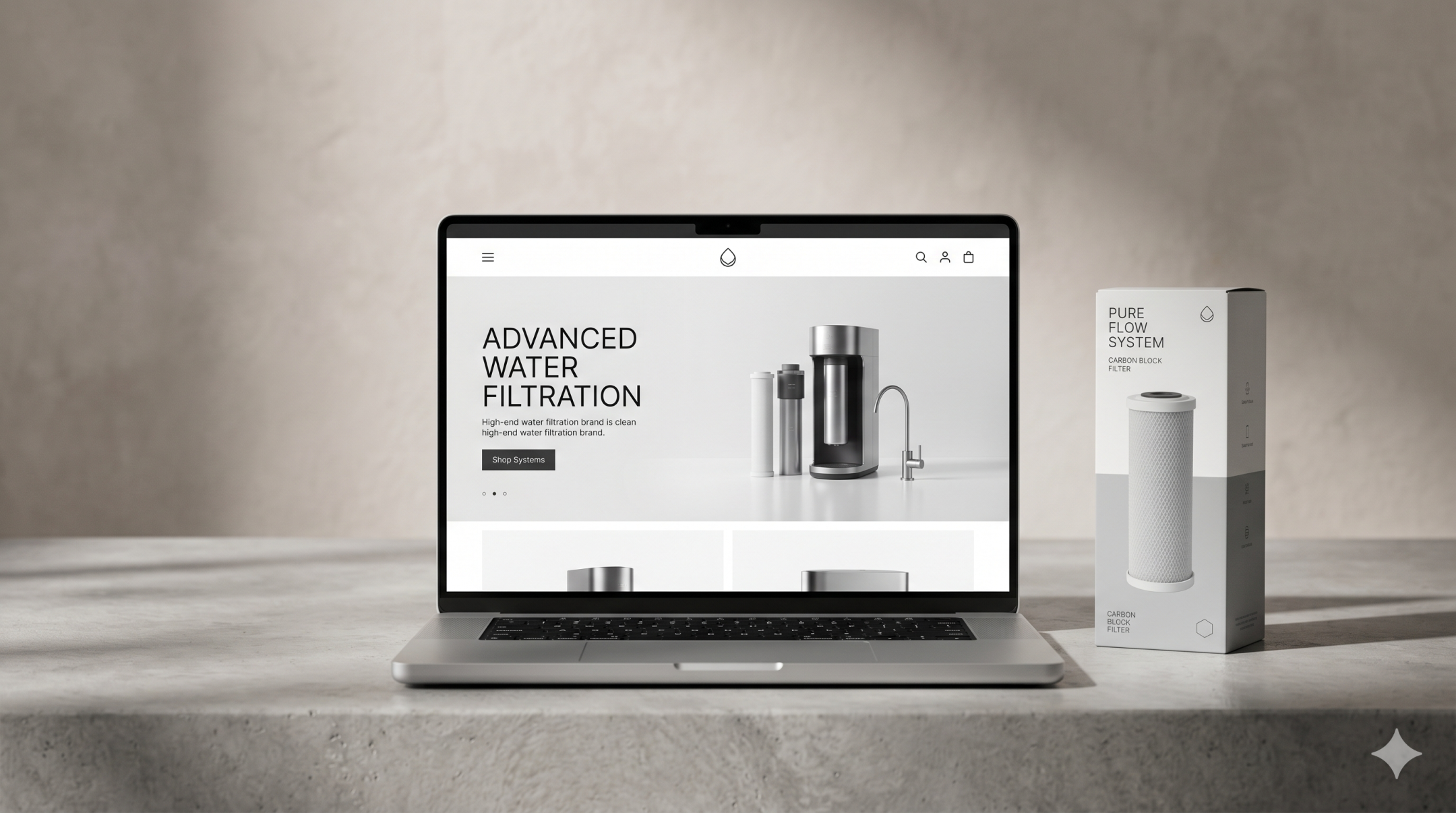
Why Website Design Matters in Water Filtration
In water filtration, the website often does more than present a brand. It acts as a product guide, trust builder and sales support tool at the same time.
Many buyers arrive with practical questions rather than brand familiarity. They want to know what problem a system solves, how it works, whether it fits their context and why one option is better than another. If the website cannot answer those questions clearly, users are left doing extra work.
That is where good website design becomes commercially important. It helps structure complex information into something easier to follow. Instead of asking users to decode technical language on their own, the website should guide them from interest to understanding and from understanding to action.
For water treatment companies, this matters across both B2B and B2C journeys. A homeowner may be trying to understand cartridge replacement or contaminant reduction. A distributor or facility manager may be reviewing specifications, certifications and system fit. In both cases, clarity influences confidence.
What Makes Technical Buying Journeys More Difficult
Technical buying journeys tend to become harder when websites assume users already understand the category.
Water filtration products often involve unfamiliar terminology, layered product ranges and detailed technical claims. Users may need to compare flow rate, filter stages, maintenance requirements, installation methods, certifications or application types before they feel ready to take the next step. When that information is buried, repeated or poorly organised, confusion builds quickly.
Another challenge is that not every visitor is at the same stage of awareness. Some already know what type of system they need. Others are still trying to understand the difference between under-sink, whole-house, reverse osmosis or commercial filtration solutions. A single website has to serve both groups without becoming cluttered.
There is also a trust issue. Water filtration is tied to health, safety, long-term cost and performance. Buyers want reassurance that the product works, that claims are credible and that the company behind it is reliable. A website that feels vague, fragmented or overly technical can weaken confidence even if the product itself is strong.
The Core Elements of Strong Water Filtration Website Design
Clear Product Communication
The first job of a water filter website is to help users understand what is being offered in simple terms.
That means product pages should explain what the system is, who it is for, what problem it solves and how it differs from other options. Technical detail still matters, but it should support understanding rather than replace it.
Clear product communication usually includes:
- short, plain-language summaries near the top of the page
- simple explanations of key features and benefits
- visual breakdowns of stages, components or system types
- easy-to-scan comparison points
- direct answers to practical buyer questions
A user should not need to read an entire technical sheet before understanding whether a product is relevant.
Simplified User Flows
Strong filtration UX is about reducing decision friction.
Users should be able to move from a broad need to a relevant solution without getting lost. That often means building journeys around user intent rather than internal product naming.
For example, a better structure might guide users through questions such as:
- Are you filtering drinking water or whole-house water?
- Is this for home, commercial or industrial use?
- Are you trying to reduce limescale, chlorine, sediment or another issue?
- Do you need a replacement filter, a full system or support with installation?
This approach makes navigation feel more intuitive. It turns the website into a guided path rather than a catalogue of technical pages.
Calls to action also need to match the stage of the journey. Some users are ready to request a quote. Others need a product comparison, buying guide or expert consultation first. Good website design for water treatment companies supports both.
Trust and Credibility
Trust is one of the most important conversion drivers in technical categories.
A water filtration site should make credibility visible throughout the journey, not hide it in one corner of the website. Users are more likely to move forward when they can quickly see that the company is experienced, the products are clearly documented and the claims are supported.
Useful trust elements may include:
- certification references
- test data or standards where relevant
- installation guidance
- case examples or application context
- warranty and support information
- strong contact and service details
- professional design consistency across pages
Design quality matters here too. If the website looks outdated, inconsistent or difficult to use, users may question the product just as much as the presentation.
Better Information Hierarchy
One of the biggest improvements a technical website can make is better hierarchy.
Not all information should have equal visual weight. Users need the most important answers first, then supporting detail as they move deeper.
A well-structured hierarchy often looks like this:
- What the product is
- What problem it solves
- Who it is for
- Why it is credible
- What the next step should be
- Where to find technical detail
This prevents pages from becoming dense blocks of specifications with no clear entry point. It also helps users scan faster, which is essential on mobile and during early-stage research.
Common Water Filtration Website Mistakes
Many water filtration websites struggle not because they lack information, but because they present it in the wrong way.
One common mistake is leading with technical language before establishing context. Users may see acronyms, filter media terms or specification tables before they understand the product category itself.
Another issue is unclear navigation. If visitors have to choose between internal product families that mean little to them, they can easily take the wrong path or leave altogether.
Overloaded pages are also a frequent problem. Long walls of text, excessive PDFs, repeated product claims and unclear calls to action make the experience feel heavy. Instead of building confidence, the page becomes work.
Weak comparison logic creates another barrier. When product differences are not obvious, users struggle to make a decision. They may delay action or contact the company with basic questions the website should have already answered.
Finally, some sites underuse trust cues. They assume performance alone will persuade buyers, but without visible credibility, even strong technical offers can feel harder to trust.
What Better Technical Website Execution Looks Like
Better execution starts with a simple principle: the website should translate expertise, not just display it.
That means building the structure around real buying questions. Pages should help users understand product fit, use cases, differences and next steps in a sequence that feels natural. The most effective websites in technical sectors tend to balance depth with usability.
A clearer water filtration website design often includes:
- audience-led navigation paths
- category pages built around problem types or applications
- product pages with layered information from simple to detailed
- comparison tables that support decision-making
- trust content placed near key conversion points
- strong mobile usability
- consistent calls to action based on buyer readiness
It also means aligning design, content and user experience. Good visuals alone are not enough. Good specifications alone are not enough either. The strongest websites make technical value feel understandable, credible and commercially usable.
For water treatment companies, that can improve both user confidence and internal efficiency. When a site answers common questions clearly, it reduces friction before enquiry, supports better lead quality and makes the sales process easier.
FAQs
What makes water filtration website design different from general product website design?
Water filtration websites often need to explain more technical detail, build trust around performance and guide users through more complex product decisions. That makes structure, hierarchy and clarity especially important.
How can a water filter website improve conversion without oversimplifying technical information?
The goal is not to remove detail. It is to organise it better. Start with clear summaries and user-focused benefits, then allow deeper technical information further down the page or within dedicated specification sections.
Why is filtration UX important for technical products?
Filtration UX helps users move through complex information without confusion. Better UX reduces friction, improves understanding and makes it easier for visitors to find the right solution.
What should a water treatment company prioritise first on its website?
A good starting point is clarity. Make sure users can quickly understand what the company offers, who it serves, what problems it solves and what action to take next.
Do technical product websites need branding as well as UX improvement?
Yes. Branding and UX support each other. A clear, credible brand presentation helps build trust, while better UX makes technical content easier to navigate and understand.
Final Thoughts
Water filtration website design works best when it turns complexity into clarity. Buyers do not need less information. They need better organised information, stronger guidance and a journey that helps them move from questions to confidence.
For technical categories, that shift can make a major difference. A better website does more than look cleaner. It helps people understand products faster, trust the business more easily and take action with less hesitation.
If your website is carrying strong technical knowledge but still feels difficult to navigate or convert from, it may be time to rethink how the journey is structured. A clearer, more commercially effective website often starts with better communication, better hierarchy and a better user path.