Website navigation is one of the clearest signals of how well a site has been planned. When the structure is logical, users can understand where they are, where to go next and how to find the information they came for. When it is unclear, even a visually strong website can feel difficult to use.
What Website Navigation Actually Does
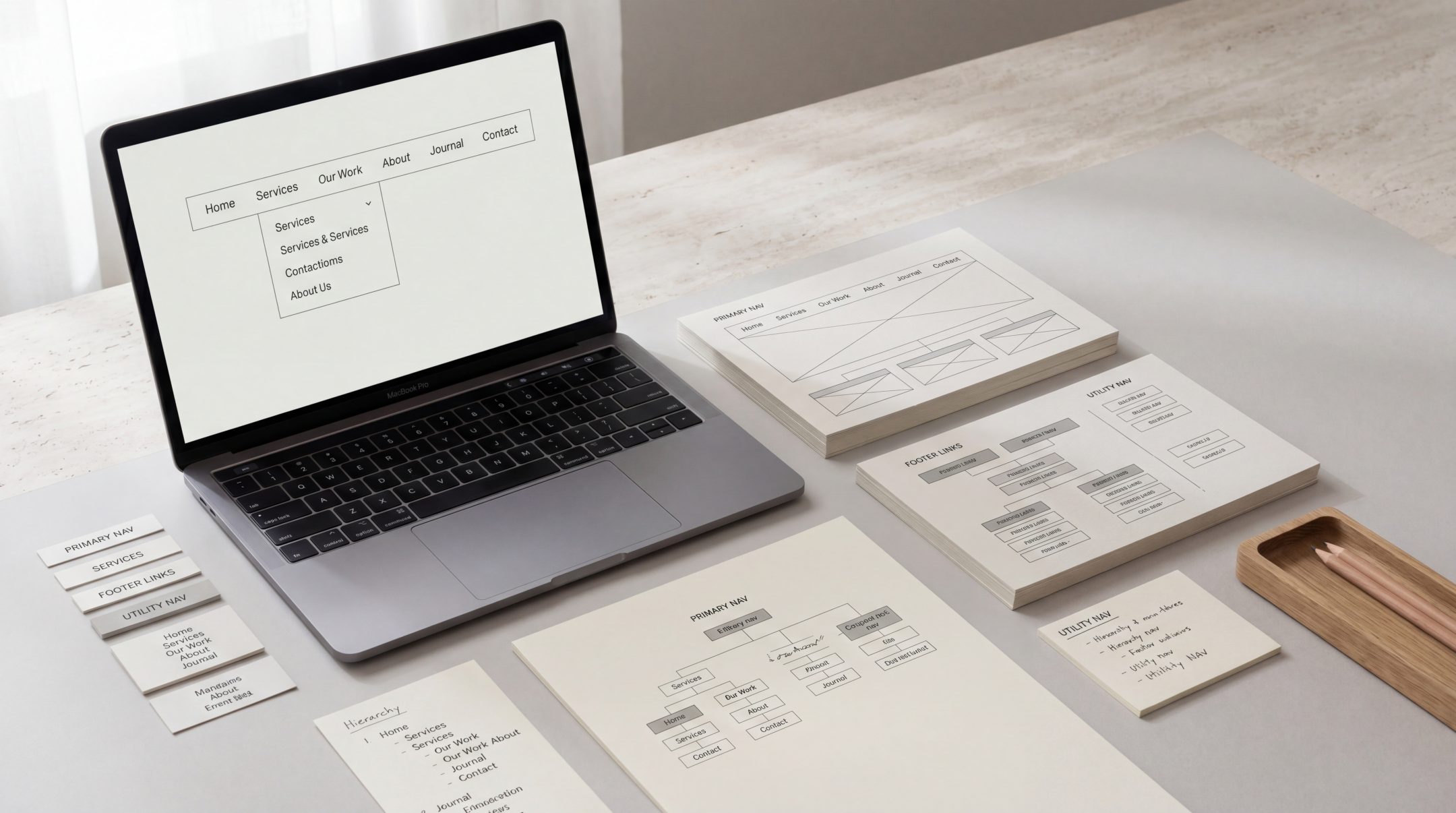
Website navigation is the system that helps people move through a site. It includes the main menu, footer links, page hierarchy, dropdowns, breadcrumbs, category pages, internal links and mobile menus.
Its job is not only to list pages. Good website navigation helps users understand the shape of a website. It shows what the business offers, how information is grouped and which actions matter most.
For service-led businesses, navigation also plays a commercial role. A clear menu structure can guide users from broad interest to more specific information, such as services, industry pages, contact points, case studies or resources. This is where navigation connects directly to UX structure, because the menu needs to support the way users actually think and move.
Why Navigation Matters for User Experience
Users rarely arrive on a website with unlimited patience. They want to understand quickly whether the site is relevant, trustworthy and easy to use. Navigation helps answer those questions almost immediately.
If people cannot find what they need, they may assume the business does not offer it, even when the content exists somewhere on the site. This is why navigation design affects more than convenience. It shapes perception.
Strong website UX navigation helps users:
- Understand the available sections of the site
- Find important pages without unnecessary searching
- Move between related topics naturally
- Recognise what action they should take next
- Feel more confident that the business is organised and credible
Navigation also reduces cognitive effort. When users do not have to guess where information lives, they can focus on evaluating the offer, reading the content and deciding what to do next.
Good navigation is closely connected to information architecture principles, because both deal with how content is organised, labelled and made easier to find.
The Key Elements of Strong Website Navigation
Strong website navigation usually feels simple from the outside, but that simplicity depends on careful structural decisions. The aim is to create a system that is clear enough for new users, flexible enough for growing content and focused enough to support business goals.
Clear Menu Structure
The main menu should show the most important sections of the website without overwhelming the user. A business does not need to place every page in the primary navigation. In many cases, the strongest menu is selective.
The main menu should usually prioritise:
- Core services
- Key audience or industry pages
- About or credibility pages
- Work, case studies or examples where relevant
- Contact or enquiry actions
- Important resources or blog content
A clear menu structure gives users confidence. They can scan the options quickly and understand where to go next.
Logical Page Grouping
Navigation becomes confusing when pages are grouped around internal business logic rather than user needs. For example, a team may think in terms of departments, production stages or internal service names. Users may think in terms of problems, goals or outcomes.
Logical grouping means related pages sit together in a way that makes sense to the visitor. A website with many services, resources or product categories needs careful grouping so that users do not have to work too hard to understand the structure.
This is also where website content structure matters. Navigation and content cannot be separated. The menu points users toward pages, but the pages themselves need to be organised clearly once users arrive.
User-Oriented Labels
Menu labels should be clear, familiar and specific. A label may sound creative internally, but if users do not understand it quickly, it becomes a barrier.
Strong labels usually use language the audience already recognises. They avoid unnecessary abstraction and make the destination predictable. For example, “Services” is often clearer than a vague phrase like “What We Do”. “Website Design” is clearer than “Digital Experiences” if the page is actually about website design.
User-oriented labels help reduce uncertainty. Before clicking, users should have a reasonable idea of what they will find.
Mobile Navigation
Mobile navigation deserves separate attention because it often changes how users experience the site. A desktop menu may show several options at once, while a mobile menu may hide them behind a button or stack them vertically.
Mobile navigation should be easy to open, easy to scan and easy to close. Key actions should not disappear on smaller screens. If the desktop version relies on dropdowns, the mobile version needs a clear alternative that does not feel buried or awkward.
Strong menu design guidelines are especially useful here, because visibility, expected placement and readable link styling all influence whether people can actually use the navigation system.
Common Website Navigation Mistakes
Many navigation problems come from adding too much, too quickly. As websites grow, teams often add new pages to the menu without revisiting the overall structure. Over time, the navigation becomes a record of internal decisions rather than a useful guide for users.
Common website navigation mistakes include:
- Too many top-level menu items
- Vague labels that do not describe the destination clearly
- Dropdowns with too many options
- Important pages hidden too deeply
- Service pages grouped inconsistently
- Mobile menus that are harder to use than desktop menus
- Footer navigation treated as an afterthought
- Different labels used for the same topic across the site
Another common mistake is designing navigation around what the business wants to say first, rather than what users need to understand first. The best structure usually balances both. It supports the business offer while making the user journey feel natural.
How Better Navigation Supports Clarity and Conversion
Better navigation helps users move with less friction. That matters because conversion is rarely the result of one button or one headline. It is usually the outcome of a clear journey.
When navigation is well structured, users can:
- Find the right service faster
- Compare related options more easily
- Understand the business offer with less confusion
- Move from education to enquiry more naturally
- Return to important pages without losing their place
This is especially important when a website has several services or audience types. A user may not know the exact name of the service they need. Good navigation helps them self-select by guiding them toward relevant information.
For existing websites, navigation issues can also be a sign of a deeper structural problem. If the menu is difficult to simplify, the issue may not be the menu alone. It may point to unclear page hierarchy, duplicated content, weak service grouping or a need for a deeper website redesign.
Better website navigation does not mean making every option visible at once. It means making the right options visible at the right level, with labels and pathways that match how users search, compare and decide.
FAQs
What is website navigation?
Website navigation is the system of menus, links and structural pathways that helps users move through a website. It includes the main menu, footer links, dropdowns, breadcrumbs, internal links and mobile navigation.
Why is website navigation important?
Website navigation is important because it helps users find information, understand the site structure and take action with less friction. Poor navigation can make useful content harder to discover and can weaken the overall user experience.
What makes good navigation design?
Good navigation design is clear, logical and user-oriented. It uses familiar labels, groups related pages sensibly, avoids unnecessary complexity and works well across desktop and mobile devices.
How many items should a website menu have?
There is no fixed number that works for every site. The right number depends on the size of the website, the complexity of the offer and the user journey. In general, the main menu should be focused enough to scan quickly.
When should a business review its website navigation?
A business should review its navigation when users struggle to find information, when new services or content have been added, when the site feels cluttered or when conversion paths are unclear.
Final Thoughts
Website navigation is not just a design detail. It is part of the structure that helps users understand a business, find relevant information and move toward action.
When the menu structure, page grouping, labels and mobile navigation all work together, the website feels easier to use and easier to trust. For businesses with growing content, multiple services or unclear user journeys, improving navigation can be one of the most practical ways to create a clearer digital experience.
If your website feels harder to use than it should, Fact & Form can help review the structure and improve the navigation so users can find what they need more easily.