Good service page design helps people understand what a business offers, who it helps and what to do next. When service pages are unclear, users hesitate. When they are structured well, users can compare options, assess fit and move forward with more confidence.
Why Service Page Design Matters
Service pages often sit close to the point of decision. A visitor may have already understood the brand, explored the homepage or arrived from search with a specific need. The service page then has to answer a practical question: is this the right offer for me?
That makes service page design different from general website design. It is not only about looking polished. It is about reducing confusion. Users need to understand the promise, the scope, the value, the process and the next step without having to work too hard.
Strong service page UX supports three important outcomes. First, it helps visitors quickly understand the service. Second, it makes different offers easier to compare. Third, it gives users enough confidence to take a meaningful next action, such as booking a call, requesting a proposal or exploring related services.
This is where structure matters. Clear website content structure helps each page explain the right information in the right order, instead of forcing users to piece the offer together from scattered sections.
Best Practice 1: Start With a Clear Service Promise
The top of a service page should make the offer immediately understandable. A user should not have to scroll through abstract language before discovering what the service actually does.
A strong service promise usually answers three questions:
What is being offered?
The page should name the service clearly. Avoid vague labels that sound impressive but do not tell the user what they are looking at. If the page is about website design, UX strategy, packaging design or SEO, say so clearly.
What problem does it help solve?
The promise should connect the service to a real business need. For example, a service page should explain whether the offer helps improve clarity, increase conversion, strengthen brand consistency, support launch readiness or make a technical product easier to understand.
What outcome should the user expect?
The outcome does not need to be exaggerated. It should simply help the user understand why the service matters. For a service website design page, this might mean clearer user journeys, stronger presentation of expertise or a more structured path from interest to enquiry.
The goal is not to explain everything above the fold. The goal is to orient the user quickly so the rest of the page has context.
Best Practice 2: Explain Who the Service Is For
Many service pages explain what a business does but fail to clarify who the service is best suited to. This creates hesitation because users are left wondering whether the offer matches their situation.
A good service page should make fit easier to assess. This can be done through a short “who it is for” section, use-case examples or clear descriptions of typical business needs.
For example, a service page may be relevant for businesses that are:
- Launching a new brand or product
- Redesigning an outdated website
- Clarifying a confusing service offer
- Improving conversion from existing traffic
- Creating a more consistent digital experience
- Preparing for a market expansion or campaign launch
This kind of guidance makes the page feel more useful because it helps users self-identify. It also reduces low-fit enquiries by making the scope of the service clearer.
The best service pages do not try to appeal to everyone. They help the right users recognise themselves more quickly.
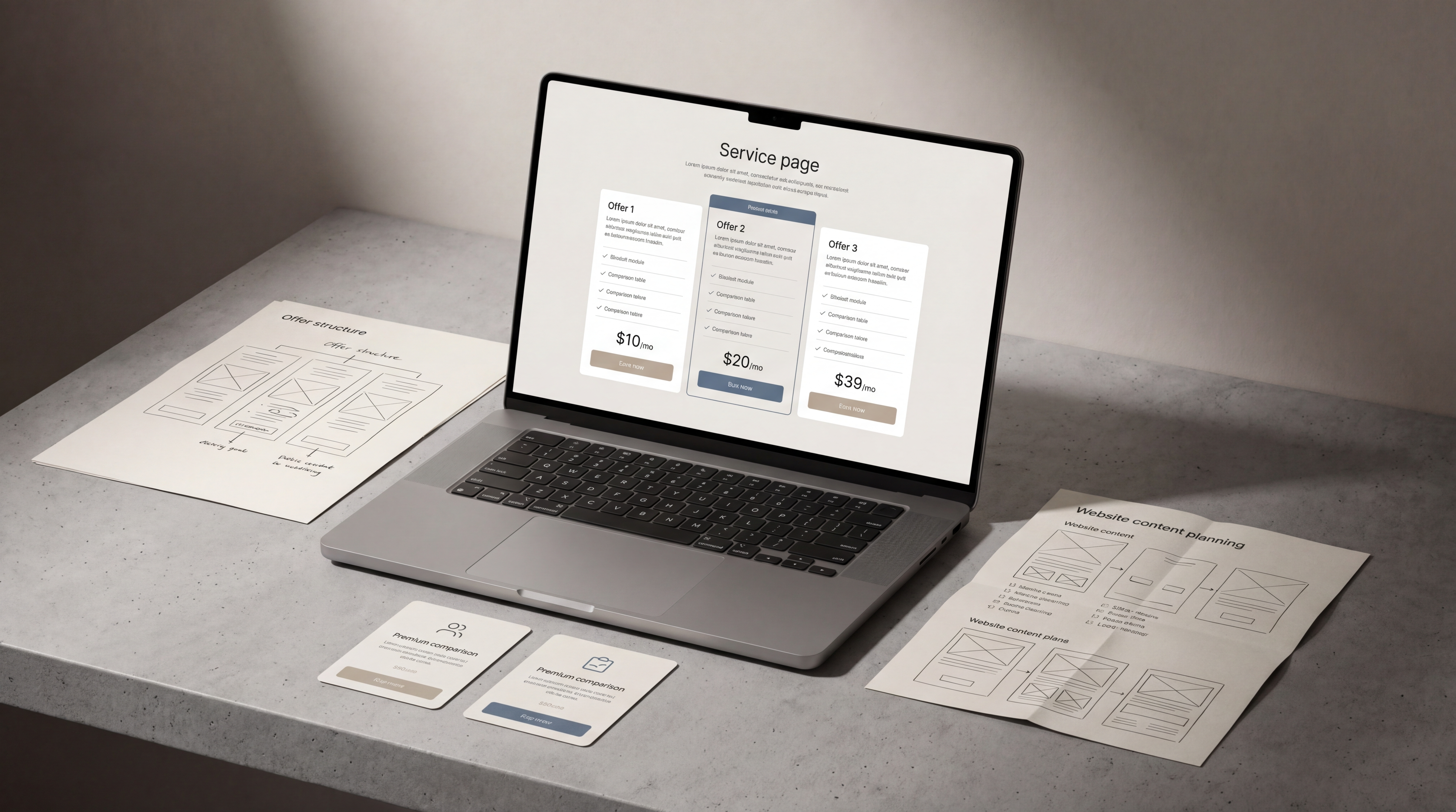
Best Practice 3: Structure Benefits and Deliverables Clearly
One of the most common problems in service page design is mixing benefits and deliverables together without a clear distinction. Both matter, but they answer different questions.
Benefits explain why the service is valuable. Deliverables explain what the client receives.
Benefits explain the value
Benefits should connect the service to user needs and business outcomes. In service page UX, benefits might include clearer communication, easier comparison, better navigation, stronger trust or a more direct route to enquiry.
Good benefits are specific enough to feel practical. “Improved user experience” is useful, but “clearer service journeys that help users find the right offer faster” is more concrete.
Deliverables explain the scope
Deliverables help users understand what is included. These might include strategy workshops, wireframes, content structure, UX recommendations, page designs, CMS development, SEO review or technical implementation.
Clear deliverables are especially important for service businesses because users often compare similar-sounding offers. If one page explains the scope clearly and another stays vague, the clearer page usually feels more trustworthy.
Hierarchy makes both easier to read
Benefits and deliverables should not be buried inside long paragraphs. Use headings, short sections, cards, tables or grouped lists where appropriate. The page should be easy to scan without becoming shallow.
This is where UX strategy becomes important. Strong UX thinking helps decide what information comes first, what needs supporting detail and where users may need reassurance before they take action.
Best Practice 4: Reduce Comparison Friction
Users rarely evaluate a service page in isolation. They may compare your offer with other providers, alternative service levels or internal options such as hiring, delaying or doing the work themselves.
Good service page structure helps users compare without confusion.
Make related services distinct
If a business offers several similar services, each page should explain what makes that service different. For example, web strategy, UX design, website redesign and CMS development may overlap, but they should not sound interchangeable.
Each page should clarify:
- The core purpose of the service
- The type of problem it solves
- When it is most relevant
- What outputs or decisions it supports
- How it connects to other services
This helps users understand whether they need one service or a combination of services.
Avoid hiding key decision information
Users often need practical details before they feel ready to enquire. This does not always mean listing fixed prices. It can mean explaining project stages, typical inputs, collaboration requirements or what happens after the first conversation.
A service page that hides too much can create unnecessary friction. A page that explains everything without structure can feel overwhelming. The balance is to provide enough clarity for a confident next step.
Use comparison-friendly layouts
Comparison tables, grouped service tiers, “best for” sections and clear module descriptions can help users make sense of options. These tools are useful when they simplify decision-making, not when they create artificial packages that do not match the real service model.
A strong service page should help users think: “I understand the difference, and I know which option is probably right for me.”
Best Practice 5: Guide Users Toward the Next Step
A service page should not end abruptly. Once users understand the offer, they need a clear next step.
This does not mean adding aggressive calls to action after every section. It means placing helpful prompts where they match the user’s stage of understanding.
Useful next steps may include:
- Booking a consultation
- Requesting a project review
- Exploring a related service
- Viewing a process overview
- Sending project details
- Reading a supporting guide
The CTA should match the complexity of the service. For a low-consideration offer, a direct enquiry may be enough. For a strategic or high-value service, users may need reassurance, context or a softer invitation before they are ready to act.
Service pages should also support search visibility without sacrificing clarity. Strong on-page SEO fundamentals help service pages align with relevant search intent while keeping the content useful for real visitors.
External guidance on people-first content reinforces the same principle: pages should be created to help users, not simply to fill space around keywords.
Common Service Page Design Mistakes
Even well-designed websites can have weak service pages if the offer structure is unclear. The most common mistakes usually come from trying to sound impressive instead of trying to be understood.
Leading with abstract language
Phrases like “transformative digital solutions” or “end-to-end growth experiences” often make service pages harder to understand. Users need concrete information first. Personality and tone can come later.
Explaining the business instead of the offer
A service page should not behave like an extended about page. It can include expertise and credibility, but the main focus should remain on the service, the user’s problem and the path forward.
Listing features without context
Deliverables are helpful, but only when users understand why they matter. A list of outputs without explanation can feel technical or disconnected from business value.
Making every service sound the same
If every service page uses similar wording, users cannot compare them properly. Each service needs a distinct role within the wider website service ecosystem.
Placing the CTA too early or too late
A CTA before the user understands the offer can feel premature. A CTA hidden at the very end can be missed. Service page design should place next steps at natural decision points.
Ignoring mobile readability
Many users will scan service pages on mobile. Long paragraphs, dense layouts and overly complex comparison sections can make the page harder to use on smaller screens.
Research-led UX resources on effective web user experiences are useful reminders that clarity, usability and interaction patterns all shape how people understand and evaluate digital content.
How to Apply These Best Practices in Real Projects
Improving service page design does not always require a full website redesign. In many cases, the biggest gains come from restructuring the page around user questions.
A practical process might look like this:
1. Define the role of the page
Start by clarifying what the page needs to do. Is it meant to introduce a broad service, explain a specialist offer, support organic search, qualify leads or help users compare options?
A page can do more than one job, but one priority should lead the structure.
2. Map user questions
List the questions a serious visitor is likely to ask before enquiring. These may include:
- What exactly is this service?
- Is it relevant to my business?
- What problem does it solve?
- What is included?
- How does the process work?
- How is this different from related services?
- What should I do next?
The page structure should answer these questions in a logical order.
3. Separate message, structure and design
Before designing the page visually, define the core message and content hierarchy. Then use design to make that structure easier to scan, compare and act on.
This avoids a common problem: visually polished pages that still leave users unsure what the service actually offers.
4. Review the page as a decision journey
Read the page from top to bottom as if you were a potential client. At each section, ask whether the user has enough information to continue. If a section creates more confusion than clarity, it needs to be simplified or repositioned.
5. Connect the page to the wider website
Service pages should not sit alone. They should connect naturally to related articles, case-relevant content, service categories and contact pathways. This supports both user experience and search visibility.
FAQs
What is service page design?
Service page design is the process of structuring and presenting a service page so users can understand the offer, assess whether it fits their needs and take the next step with less confusion.
Why is service page UX important?
Service page UX is important because users often visit these pages when they are comparing options or deciding whether to enquire. Clear structure, helpful content and strong hierarchy make that decision easier.
What should a service page include?
A strong service page should usually include a clear service promise, who the service is for, key benefits, deliverables, process information, trust signals, related services and a clear next step.
How long should a service page be?
A service page should be long enough to answer the user’s main decision questions, but not so long that it becomes difficult to scan. The right length depends on the complexity and value of the service.
Should every service have its own page?
If users search for the service, compare it separately or need a clear explanation before enquiring, it usually deserves its own page. Closely related smaller services may work better as sections within a broader page.
How does service page design support SEO?
Service page design supports SEO by making content clearer, better structured and more aligned with search intent. Good headings, useful explanations and logical internal linking help both users and search engines understand the page.
Final Thoughts
Service page design works best when it makes decision-making easier. The page should explain the offer clearly, show who it is for, separate benefits from deliverables and guide users toward a relevant next step.
For service businesses, this kind of clarity can make the difference between a visitor who leaves unsure and a visitor who understands the value of the offer. If your service pages feel difficult to explain, compare or act on, Fact & Form can help structure them into clearer, more useful digital experiences.