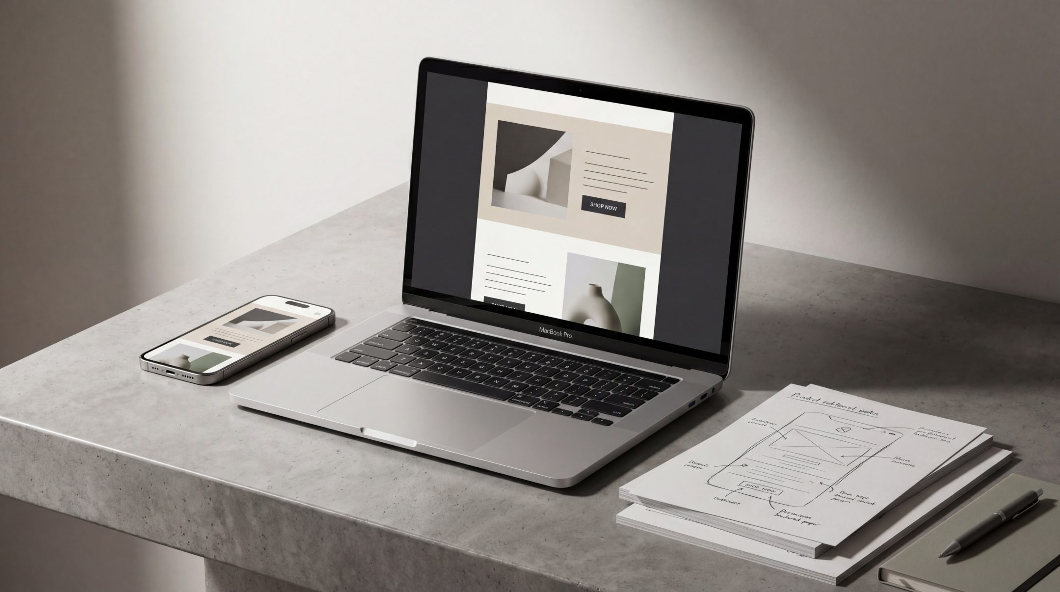
Good email design is not just about making a campaign look polished. It helps people understand the message faster, follow the story more easily and know what to do next. The strongest email campaigns use layout, hierarchy, copy and mobile experience together so the design supports action instead of getting in the way.
Why Email Design Best Practices Matter
Email is often read quickly, on small screens and in busy moments. That means design has to work harder than many teams expect. A campaign may only have a few seconds to make its purpose clear before the reader decides whether to continue.
Strong email design best practices help campaigns feel easier to scan, easier to understand and easier to act on. They reduce friction between the message and the action.
This matters whether the email is a newsletter, product launch, promotional campaign, nurture flow or brand update. If the layout is unclear, the copy is buried or the call to action is weak, the campaign may underperform even when the offer or content is valuable.
Email design should always support the wider email strategy. A well-designed campaign starts with a clear reason for sending, a clear audience need and a clear next step.
Best Practice 1: Make the Main Message Easy to Find
Every email should have one clear main message. Readers should not have to work out what the campaign is about.
The first screen is especially important. Before someone scrolls, they should understand the topic, value and direction of the email. This does not mean every email needs to be short, but it does mean the hierarchy needs to be obvious.
A strong opening usually includes:
- A clear headline
- A short supporting line
- A visible primary action
- A layout that does not compete with the message
The headline should tell the reader why the email matters. The supporting copy should add enough context without explaining everything at once. If the email has a primary action, the design should make that action easy to identify.
Avoid hiding the value
One common issue in campaign email design is starting with too much decoration, too much brand language or too many competing messages. A beautiful hero section can still fail if it does not communicate quickly.
Good email design gives the main message priority. Visual assets, colour, typography and spacing should guide attention toward that message, not distract from it.
Best Practice 2: Use Layout to Support Reading
Email readability depends heavily on layout. Even strong copy can feel difficult to read if it is presented in dense blocks, narrow spacing or inconsistent sections.
A good email layout creates a natural reading path. The reader should move from headline to body copy to supporting content to action without confusion.
Useful layout principles include:
- Short sections with clear separation
- Consistent spacing between content blocks
- Headings that introduce each section
- A single-column structure where possible
- Enough white space to reduce visual pressure
Layout should make the campaign feel ordered. It should also help readers choose how deeply they want to engage. Some people will read the whole email. Others will scan headings, images and buttons. The design needs to support both behaviours.
Use hierarchy, not clutter
Hierarchy is the difference between an email that feels easy and one that feels busy. Size, weight, spacing and placement should show what matters most.
A campaign does not need many visual tricks to feel designed. In most cases, clearer hierarchy is more useful than more decoration.
For example, a product email may need:
- One hero message
- One product explanation
- One proof or benefit section
- One primary call to action
- Optional secondary details below
When every section has the same visual weight, nothing feels important. When hierarchy is clear, the reader can understand the campaign faster.
Best Practice 3: Keep Calls to Action Clear
A call to action should tell the reader what happens next. It should be specific enough to create confidence and visible enough to be easy to find.
A weak CTA often creates hesitation. Phrases like “learn more” or “discover” can work in some contexts, but they become vague when the reader does not know what they are learning, discovering or receiving.
Better CTA text is usually more direct. It can describe the action, destination or benefit. For example:
- View the collection
- Book a consultation
- Explore the product range
- Start planning your campaign
- See the full guide
The best wording depends on the campaign goal. A newsletter may need a softer CTA, while a product launch may need a more direct one.
Limit competing actions
Many campaigns become weaker because they ask the reader to do too much. Multiple buttons, repeated offers and too many links can dilute attention.
This does not mean an email can only contain one link. It means the primary action should be clear. Secondary links should support the message rather than compete with it.
A campaign should answer one simple question: what is the most important action the reader should take after reading?
Best Practice 4: Design for Mobile First
Most email campaigns need to work well on small screens. Mobile-first email design is not just a technical requirement. It affects writing, layout, spacing, CTA placement and image use.
On mobile, long lines become stacked, columns can collapse, buttons need more space and small text becomes harder to read. Designing only for desktop often creates campaigns that look polished in review but feel difficult in real use.
Practical mobile-first considerations include:
- Use readable font sizes
- Keep paragraphs short
- Avoid crowded link groups
- Make buttons large enough to tap
- Test the campaign before sending
- Check that images do not carry essential text alone
Mailchimp’s guidance on mobile-friendly email layouts is useful here because it focuses on readable type, tappable actions and avoiding link clustering on smaller screens.
Think about the thumb, not just the screen
Mobile email design is also about how people physically interact with the campaign. A button may look good visually but still be hard to tap if it is too small or placed too close to other links.
Spacing around CTAs matters. So does the sequence of content. If the reader has to scroll through too much before understanding the point, the design is asking for more attention than the email may receive.
Best Practice 5: Match Design With Brand and Purpose
Email design should feel connected to the brand, but it should also fit the purpose of the campaign. A newsletter, abandoned basket email, event invitation and product launch do not need the same structure.
Good design systems allow flexibility. They create consistency without making every campaign feel identical.
Brand consistency can come through:
- Typography
- Colour use
- Image direction
- Button styles
- Layout rhythm
- Tone of voice
- Visual hierarchy
However, brand consistency should not reduce clarity. If a design choice makes the campaign harder to read, harder to understand or harder to act on, it needs to be reconsidered.
This is especially important for brands that send regular newsletters. A useful newsletter rhythm depends on both content planning and design structure. Readers should feel that the emails are familiar, but not repetitive.
Let purpose shape the layout
The purpose of the email should guide the format.
A product launch may need strong visual hierarchy and a clear product explanation. A thought leadership email may need stronger editorial formatting. A promotion may need direct offer clarity. A retention email may need reassurance, relevance and a simple next step.
The design should not be chosen just because it looks good in isolation. It should fit the message, the audience and the intended action.
Common Email Design Mistakes
Many email design problems come from trying to do too much in one campaign. When teams combine several messages, multiple CTAs and dense visual content, the result can feel difficult to read and easy to ignore.
Common mistakes include:
- Starting with a vague headline
- Using long paragraphs without visual breaks
- Making the CTA hard to find
- Designing for desktop first
- Relying too heavily on images
- Using low contrast text
- Placing too many links close together
- Making every section look equally important
- Treating the email as a webpage instead of a focused message
Accessibility is also part of good email design. Clear contrast, readable typography, descriptive links and thoughtful structure help more people engage with the content. W3C’s accessible design guidance is a useful reference for principles that support clearer, more inclusive digital experiences.
Some mistakes are strategic as much as visual. For example, if every campaign uses the same structure regardless of audience, need or purpose, the design can start to feel generic. Reviewing generic campaign habits can help teams spot patterns that weaken relevance and clarity.
How to Apply These Best Practices in Real Campaigns
The best way to improve email design is to build a practical review process before campaigns are sent. This keeps design decisions connected to audience needs and campaign goals.
A useful review can include five questions.
What is the one main message?
Before reviewing visuals, check the message. If the campaign cannot be summarized in one sentence, the design will likely struggle to create clarity.
Is the hierarchy clear at a glance?
Look at the email without reading every word. The most important headline, section and CTA should be immediately obvious.
Does the layout support scanning?
Most readers scan before they commit. Use headings, spacing and section structure to make the email easier to navigate.
Is the CTA specific and visible?
The reader should understand what the action is and why it matters. The primary CTA should not be hidden below too much supporting content.
Does it work properly on mobile?
Preview the campaign on mobile before sending. Check font size, spacing, button size, image scaling and the order of content after stacking.
This process does not need to slow teams down. Over time, it creates a more reliable standard for campaign email design and helps avoid last-minute fixes.
FAQs
What are email design best practices?
Email design best practices are practical principles that make campaigns easier to read, understand and act on. They include clear hierarchy, readable layouts, strong CTAs, mobile-first design, accessible formatting and brand consistency.
Why does email readability matter?
Email readability affects whether people can quickly understand the message. If an email feels dense, confusing or visually crowded, readers are less likely to continue or take action.
Should every email have one CTA?
Not every email needs only one link, but every email should have one clear primary action. Secondary links can be useful, as long as they do not compete with the main goal.
What makes mobile email design different?
Mobile email design needs larger readable text, clear spacing, tappable buttons and simplified layouts. Content often stacks differently on mobile, so campaigns should be reviewed on smaller screens before sending.
How can brands keep email design consistent without becoming repetitive?
Brands can use a flexible email design system with shared typography, colours, spacing and CTA styles, while adapting layouts to each campaign’s purpose. This keeps emails recognizable without making every message feel the same.
Final Thoughts
Strong email design is not decoration added at the end of a campaign. It is part of how the message is understood. Clear hierarchy, readable layouts, focused CTAs, mobile-first thinking and brand-fit design all help campaigns feel easier to read and easier to act on.
For brands that want email campaigns to feel more useful, structured and commercially clear, Fact & Form can help shape email design systems and campaign layouts that support better communication across the full customer journey.