Website trust signals are the details that help users feel they are in the right place, dealing with a credible organisation and making a safe decision. They matter before a user books an appointment, submits a form, compares a service, downloads a resource or buys a product. Good trust signals do not need to shout. They need to appear at the right moment, answer the right doubt and make the next step feel reasonable.
Why Website Trust Signals Matter
Most users do not arrive on a website fully convinced. They arrive with questions.
Is this business credible?
Can I trust the information?
Is this service right for me?
What happens if I make contact?
Will my details be handled responsibly?
Does this company look professional enough to choose?
Website trust signals help answer these questions without forcing users to work too hard. They support website credibility by making the organisation, offer and user journey feel clearer and safer.
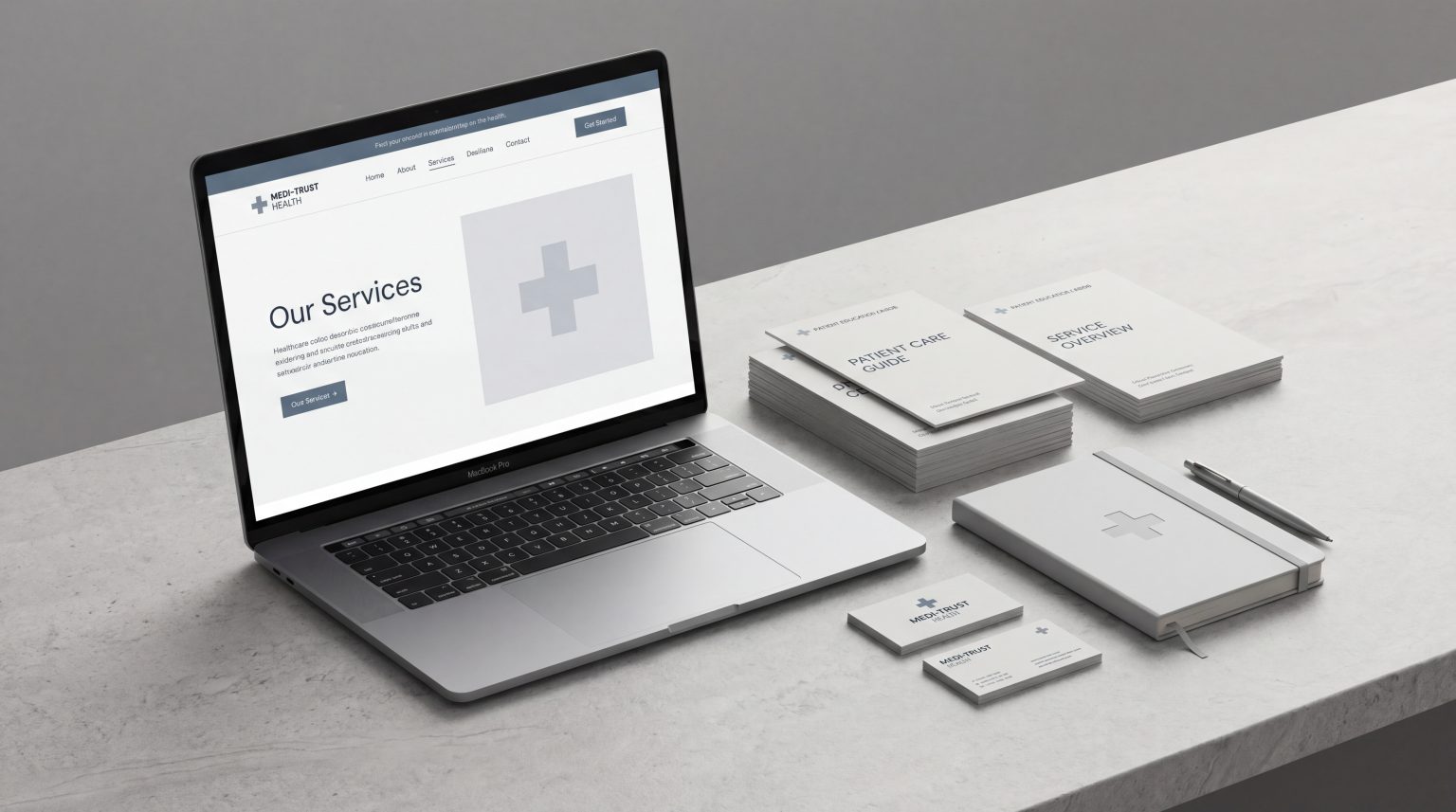
Trust is especially important in medical, healthcare, technical and service-led categories. In these sectors, users are often making considered decisions. They may be comparing providers, looking for signs of expertise or trying to understand a service before they feel ready to act. A modern healthcare website needs to communicate reassurance quickly because patients often judge credibility before they read deeply.
Strong trust signals also support conversion. They reduce uncertainty, make action feel lower risk and help users move forward with confidence. This does not mean adding badges everywhere or filling pages with testimonials. It means understanding where hesitation happens and placing the right evidence, clarity or reassurance near that moment.
UX research has long connected trust with design quality, disclosure, useful content and connection to credible information. Nielsen Norman Group describes these as part of trustworthy web design principles that influence how users judge a site.
Best Practice 1: Make Credibility Visible Early
The first screen of a page should quickly show users who the organisation is, what it does and why it is credible enough to continue exploring.
This does not mean placing every credential in the hero section. It means making the page feel immediately legitimate. Users should not have to search for basic reassurance.
What early credibility can include
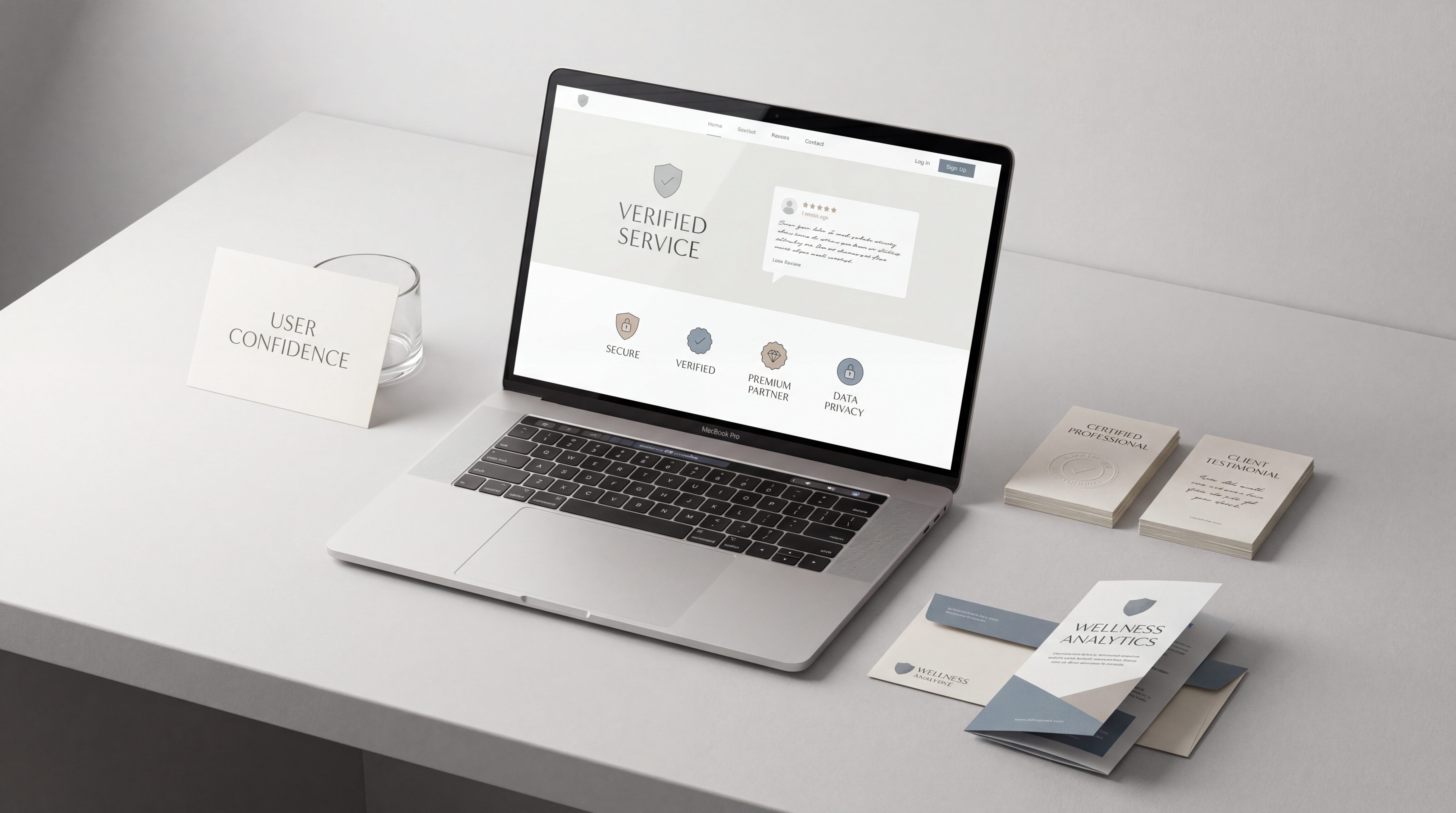
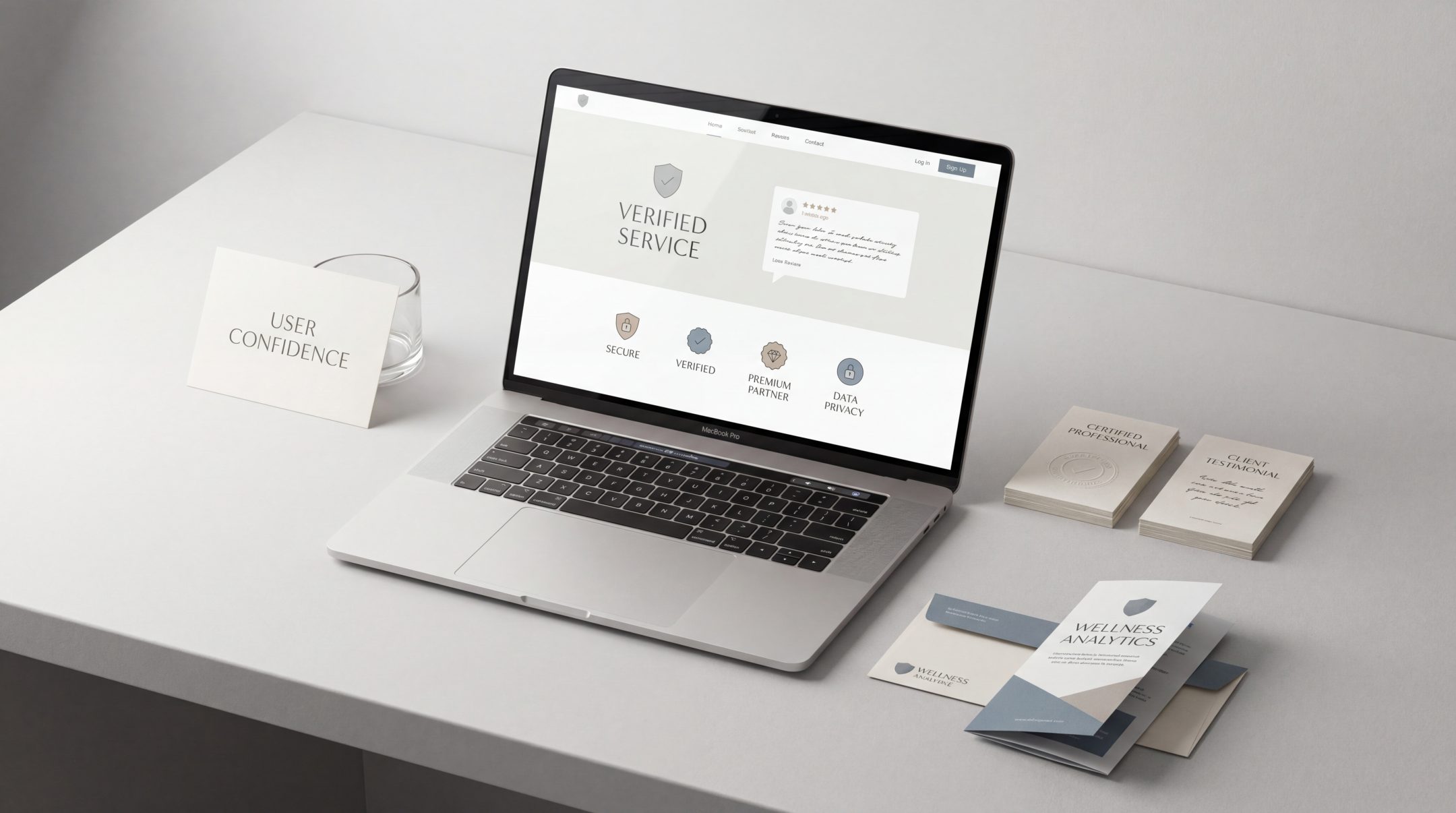
Strong early website trust signals may include:
- A clear, specific headline
- A concise explanation of the service or offer
- Professional visual design
- Relevant credentials, accreditations or affiliations
- Recognisable client, partner or publication logos, where appropriate
- A clear location or service area
- Direct access to contact or booking options
For medical and professional service websites, the early page experience should feel calm, structured and precise. Users are not only judging design taste. They are judging whether the organisation seems capable, serious and safe to engage with.
A vague headline such as “Helping You Thrive” does very little on its own. A clearer headline that names the service, audience or outcome gives users something more concrete to trust.
Why above-the-fold trust matters
Users form impressions quickly. If the first section feels generic, cluttered or unclear, the rest of the page has to work harder. If the first section feels specific and credible, users are more likely to continue.
The goal is not to explain everything immediately. The goal is to remove the first layer of doubt.
Best Practice 2: Use Proof Where Users Feel Uncertain
Trust signals are most useful when they appear close to a decision point or moment of hesitation.
For example, a testimonial buried at the bottom of a page may be less useful than a short proof point placed near a service claim. A certification hidden on an About page may be less effective than a relevant credential shown near a medical treatment, technical process or regulated service.
Match proof to the user’s doubt
Different doubts need different forms of proof.
If users doubt expertise, show qualifications, experience, accreditations or specialist focus.
If users doubt results, show reviews, outcomes, examples or process clarity.
If users doubt safety, show privacy, security, compliance or responsible handling information.
If users doubt fit, show who the service is for and when it is appropriate.
If users doubt value, show what is included and how the process works.
This is where conversion trust signals become practical. They are not decorative. They are decision support.
Use proof carefully
Proof should feel relevant and believable. Overloaded testimonial sliders, vague “trusted by thousands” statements or unexplained badges can weaken trust rather than improve it.
Good proof is specific. It gives users a reason to believe the claim being made.
For example, instead of saying “high-quality care”, a medical website can support trust by showing practitioner credentials, treatment explanations, patient journey information and clear appointment steps. Instead of saying “expert digital partner”, a service website can explain process, deliverables, review stages and team experience.
Best Practice 3: Keep Information Clear and Specific
Clarity is one of the strongest trust signals on a website. Users trust what they can understand.
When information is vague, users start filling gaps themselves. That usually creates doubt. When information is specific, users feel more in control of the decision.
Make the offer easy to understand
A service page should explain:
- What the service includes
- Who it is for
- What problem it solves
- What happens during the process
- What the user needs to do next
- What makes the approach credible or different
This is especially important for service-led businesses. Users often compare several providers before making contact. If your page explains the offer more clearly than others, that clarity becomes a trust advantage.
Strong clearer service pages do not rely on broad claims alone. They make comparison easier by structuring the offer around user questions, decision criteria and next steps.
Avoid vague claims
Many websites weaken digital trust with statements that sound positive but do not actually help users decide.
Examples include:
“Industry-leading solutions”
“Bespoke services for every client”
“High-quality results”
“Trusted experts”
“End-to-end support”
These statements may be true, but they need explanation. What makes the solution industry-leading? What does bespoke mean in practice? What does support include? Who provides the expertise?
Specificity makes trust easier.
Keep important information current
Outdated content can damage credibility quickly. Old team details, expired offers, broken links, dated policies and neglected blog content all suggest a lack of care.
The Stanford Web Credibility Project includes accuracy, real-world organisation details, expertise, contact clarity, professional design and error reduction among its website credibility guidelines. These are practical reminders that trust is built through many small details, not one single feature.
Best Practice 4: Make Contact and Next Steps Easy
Trust drops when users cannot understand what happens next.
A strong website does not only persuade. It guides. When users are ready to act, they should know exactly what to do and what to expect after they do it.
Make contact options visible
Contact details should be easy to find. This may include:
- Phone number
- Email address
- Contact form
- Appointment booking link
- Physical address, where relevant
- Opening hours
- Response expectations
- Alternative contact routes
For medical and healthcare websites, this is particularly important. Patients may need to know how to book, what information to provide, where to go, how urgent enquiries are handled or whether a service is suitable for them.
For B2B service websites, users may want to understand whether the first step is a call, audit, proposal, consultation or project scoping process.
Reduce form anxiety
Forms are often a trust checkpoint. If a form asks for too much information too soon, users may hesitate.
A better form experience explains why information is needed, keeps required fields reasonable and reassures users about what happens after submission. Small UX decisions here can make a large difference to confidence.
Examples include:
- Clear field labels
- Short forms for first contact
- Helpful error messages
- Privacy reassurance near the submit button
- Confirmation messages after submission
- A realistic expectation of response time
These are small details, but they are also conversion-focused UX decisions because they affect whether users complete the action they already intended to take.
Best Practice 5: Align Design With Professional Credibility
Design is not only about appearance. It shapes how credible a website feels.
Users often read visual quality as a sign of organisational quality. A poorly structured, outdated or inconsistent interface can make a capable business feel less reliable than it is.
What credible design usually communicates
A credible website design usually feels:
- Clear
- Consistent
- Appropriate for the category
- Easy to navigate
- Accessible
- Well organised
- Professionally written
- Technically stable
In medical contexts, this may mean calm layouts, readable typography, clear hierarchy and restrained colour use. In B2B service contexts, it may mean structured content, polished case presentation, clear service navigation and strong page logic.
The right design language depends on the business. A cosmetics brand, healthcare provider and technical manufacturer should not all look the same. But they should all feel intentional.
Consistency matters across the whole site
Trust weakens when different pages feel disconnected. If the homepage feels polished but the service pages feel unfinished, users notice. If the design system changes from page to page, the site can feel less reliable.
Consistency should apply to:
- Layouts
- Buttons
- Typography
- Image style
- Tone of voice
- Icon use
- Navigation
- Calls to action
- Forms and confirmation messages
A trust signal is not only a badge or review. Sometimes it is the simple feeling that every part of the website has been considered properly.
Common Website Trust Signal Mistakes
Trust signals can help, but they can also feel forced when they are used without context. The most common mistakes usually come from adding surface-level reassurance without fixing the underlying experience.
Using generic badges without explanation
Badges can support trust if users understand what they mean. But a page full of vague icons such as “quality guaranteed”, “secure” or “trusted service” may not add much credibility.
Where possible, explain the claim. If a badge refers to certification, link to or describe the certification. If a claim refers to security, explain the practical reassurance.
Hiding important credibility information
Many websites place useful trust signals too deep in the site. Team credentials, company details, process explanations, reviews and contact information should be available where users need them.
If users have to search too hard, the signal loses strength.
Relying only on testimonials
Testimonials can be valuable, but they should not carry the full burden of trust. Users also need clarity, structure, professional presentation, accurate information and easy next steps.
A strong testimonial on a confusing page will not solve the deeper issue.
Making the page feel too promotional
Overclaiming can reduce credibility. Users become cautious when every section sounds like a sales pitch.
A trustworthy website explains. It supports claims with evidence. It gives users enough information to make a decision without pressure.
Ignoring technical quality
Broken links, slow loading, layout issues, form errors and poor mobile usability all damage trust. These details suggest that the website is not being maintained carefully.
If the website itself feels unreliable, users may assume the service behind it is unreliable too.
How to Apply These Trust Signals in Real Projects
The best way to apply website trust signals is to map them against the user journey.
Do not start by asking, “What trust badges should we add?” Start by asking, “Where might the user feel unsure?”
Step 1: Identify key decision points
Look at the main pages where users decide whether to continue, compare, contact or buy. These might include:
- Homepage
- Service pages
- Treatment pages
- Product pages
- Pricing pages
- Booking pages
- Contact pages
- Landing pages
Each page should have a clear trust role. A homepage may need to establish general credibility. A service page may need to explain the offer. A booking page may need to reduce friction and reassure users about the next step.
Step 2: List likely doubts
For each page, write down what a user may be questioning.
Can this provider help me?
Is the information reliable?
Do they understand my situation?
Is this service safe?
Is the process clear?
What will happen after I enquire?
Can I compare this offer easily?
These doubts guide which trust signals are needed.
Step 3: Choose the right evidence
Match the signal to the doubt. Do not overload the page. A few well-placed trust signals are often stronger than many weak ones.
For example:
- Credentials near expertise claims
- Reviews near decision areas
- Process steps near service explanations
- Privacy reassurance near forms
- Contact details near booking prompts
- Case examples near capability claims
- Clear inclusions near pricing or comparison sections
Step 4: Check the full experience
Trust is cumulative. A strong hero section helps, but the rest of the page must support it.
Review the website for:
- Clarity of content
- Professional design
- Mobile usability
- Form experience
- Contact visibility
- Accuracy of information
- Consistency across pages
- Speed and technical reliability
- Tone of voice
When these elements work together, trust feels natural rather than added on.
FAQs
What are website trust signals?
Website trust signals are design, content, proof and usability elements that help users feel more confident in a website. They can include credentials, reviews, contact details, clear service information, secure forms, professional design, accurate content and transparent next steps.
Why are trust signals important for conversion?
Trust signals reduce doubt. When users understand who they are dealing with, what is being offered and what happens next, they are more likely to continue, enquire, book or buy. Trust does not guarantee conversion, but lack of trust often prevents it.
Are testimonials enough to build website credibility?
No. Testimonials can help, but they are only one type of trust signal. A credible website also needs clear information, professional design, useful content, easy contact options, accurate details and a smooth user experience.
Where should trust signals appear on a website?
Trust signals should appear where users are likely to feel uncertain. This often includes hero sections, service explanations, comparison areas, forms, booking flows, product pages and landing page calls to action.
Do medical websites need different trust signals?
Yes. Medical websites often need stronger emphasis on professional credibility, practitioner information, clear patient journeys, safety, privacy, accessibility and accurate explanations. Users in healthcare contexts are often more cautious because the decision feels personal and important.
Final Thoughts
Website trust signals are not small decorative extras. They are part of how a website communicates credibility, reduces hesitation and helps users feel confident before they act.
The strongest trust signals are specific, well placed and aligned with the user journey. They make the organisation feel real, the offer feel clear and the next step feel safe.
For brands that need their website to communicate credibility more clearly, Fact & Form can help review the structure, content and experience behind that trust, then shape pages that support more confident decisions.