Brand consistency is not only about making things look neat. It is about making sure the brand feels recognisable, reliable and coherent wherever people meet it. This brand consistency checklist helps teams review visuals, voice, messaging and channel execution before communication starts to scale.
Why a Brand Consistency Checklist Matters
As brands grow, more people start touching the brand. Designers create social assets, marketers write campaigns, sales teams prepare decks, web teams update landing pages and external partners may produce content on behalf of the business.
Without a clear review process, small inconsistencies begin to collect. A slightly different logo file appears in one place. A campaign headline sounds sharper than the website copy. Social posts use colours that do not exist in the identity system. None of these details may feel serious on their own, but together they weaken recognition.
A brand consistency checklist gives teams a practical way to pause and review execution before it reaches the audience. It helps protect the system, not by making every touchpoint identical, but by making sure each one feels like it belongs to the same brand.
Good consistency also saves time. When teams know what to check, they spend less energy debating basic decisions and more time improving the quality of the work. Strong brand guidelines make this easier because they turn brand decisions into usable rules rather than relying on memory or taste.
The Essential Brand Consistency Checklist
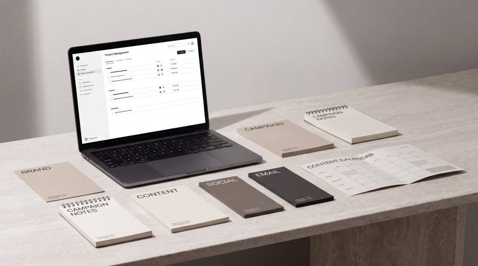
A useful brand review should cover more than the logo. It should look at the full experience: visual identity, asset usage, writing, messaging, website execution, social channels and campaign materials.
The goal is not to police creativity. The goal is to make sure creativity happens inside a recognisable system.
Visual Identity Application
Start with the wider visual identity. This is where many inconsistencies appear first, especially when different teams create assets for different channels.
Review the following:
- Are the correct brand colours being used?
- Are colour combinations consistent with the brand system?
- Is typography applied correctly across headings, body copy and supporting text?
- Are spacing, layout and composition aligned with the brand’s design principles?
- Do photography, illustration or graphic elements feel like they come from the same world?
- Is the level of polish consistent across digital, print and campaign assets?
Visual consistency does not mean every layout should look the same. A strong visual identity system should create enough structure for recognition while allowing enough flexibility for different formats and messages.
This is especially important across websites, social media, email campaigns and presentation materials, where the same brand may need to work in very different sizes and contexts.
External design system thinking is useful here too. Nielsen Norman Group describes design systems as standards that help teams manage design at scale, reduce repeated work and maintain consistency across pages and channels. That same principle applies to brand identity when teams need shared visual standards instead of disconnected design decisions.
Logo and Asset Usage
Logo inconsistency is one of the easiest issues for audiences to notice and one of the easiest for teams to prevent.
Check that:
- The correct logo version is being used for the background and format
- Clear space around the logo is respected
- The logo has not been stretched, cropped, recoloured or distorted
- Old logo files are not still circulating
- Icons, patterns and supporting assets come from the current brand toolkit
- File formats are appropriate for the channel, such as SVG for digital or high-resolution files for print
A common problem is that teams store brand assets in too many places. One person uses files from an old folder, another takes a logo from a presentation, and someone else exports assets from a social post. Over time, the brand becomes fragmented.
A practical fix is to keep one approved asset library and make sure everyone knows where it lives. If a file is not in the approved library, it should not be used without review.
Tone of Voice
Brand consistency is also verbal. A brand can look coherent but still feel inconsistent if the writing changes dramatically from one channel to another.
Review the tone of voice by asking:
- Does the writing sound like the same brand across website, email, social and sales materials?
- Is the level of formality consistent?
- Are sentence length, rhythm and vocabulary aligned with the brand personality?
- Does the brand sound too corporate in one place and too casual in another?
- Are repeated phrases, claims and descriptions written consistently?
- Is the tone appropriate for the audience and context?
Tone should flex by channel, but it should not become unrecognisable. A customer support email may be more direct than a brand campaign. A technical page may be more precise than an Instagram caption. But both should still feel like they come from the same organisation.
Clear tone of voice guidelines help teams understand not only what the brand sounds like, but also what it should avoid.
Messaging Consistency
Tone is how the brand sounds. Messaging is what the brand says.
A brand may have strong visual identity and a clear voice, but if every channel explains the offer differently, customers may still feel confused. This is particularly common when a business has evolved quickly, launched new services or entered new markets.
Review the messaging by checking:
- Is the core value proposition clear and consistent?
- Are product or service descriptions aligned across channels?
- Do campaign messages support the wider brand positioning?
- Are benefits explained in the same way across web, sales and social?
- Are key claims accurate, specific and repeatable?
- Is the brand avoiding vague or inflated language?
Messaging consistency does not require copying the same sentence everywhere. It means the same strategic idea should be communicated clearly, even when the wording changes.
For example, a website headline, sales deck and social caption may all express the brand’s value differently, but they should not create three different perceptions of what the business does or why it matters.
Website and Social Execution
The website is often the central brand touchpoint, while social media is where the brand appears most frequently. Together, they reveal whether the system is strong enough to work in both structured and fast-moving environments.
For the website, check:
- Does the homepage reflect the current positioning?
- Are service, product or category pages visually aligned?
- Is the navigation language clear and consistent?
- Do calls to action use a consistent style and tone?
- Are imagery and icon styles coherent across pages?
- Are forms, buttons and interface elements visually consistent?
For social media, check:
- Do posts feel part of the same brand system?
- Are templates used consistently without becoming repetitive?
- Does the tone match the brand’s wider communication style?
- Are campaign visuals adapted properly for each platform?
- Is the brand recognisable even when the logo is not dominant?
Social media often exposes weak brand systems because assets need to be created quickly. If every post requires a new visual decision, the system is probably not strong enough. If every caption sounds like a different person wrote it, the verbal system needs work.
This is where written standards matter as much as visual ones. Nielsen Norman Group notes that content standards can support a more consistent user experience and better collaboration between writers, content teams and designers.
Campaign and Sales Materials
Campaign and sales materials are often produced under time pressure, which makes them especially vulnerable to inconsistency.
Review:
- Sales decks
- Proposals
- One-page PDFs
- Launch campaigns
- Paid ads
- Email campaigns
- Trade materials
- Product sheets
- Event materials
Ask whether each piece feels aligned with the brand’s current identity, voice and messaging. Sales materials should not feel like they belong to a previous version of the business. Campaign assets should not introduce a visual style that the brand cannot support elsewhere.
This does not mean every campaign must be visually identical to everyday brand communication. Campaigns can have their own energy, concept and emphasis. But they should still sit inside the brand world, not outside it.
Common Areas Businesses Overlook
Brand inconsistency often appears in places that are considered too small, too practical or too temporary to review. These are exactly the places that can weaken the experience.
Commonly overlooked areas include:
- Email signatures
- Proposal templates
- Internal presentations
- Recruitment posts
- Automated email flows
- Website error messages
- Form confirmation messages
- Product instruction sheets
- Partner or distributor materials
- Event stands and printed collateral
These touchpoints may not feel as important as a homepage or campaign launch, but customers and partners still experience them as part of the brand.
Another overlooked area is legacy content. A business may update its identity and website but leave older PDFs, blog graphics, social templates or pitch decks in circulation. This creates a mixed brand experience, especially when older materials still appear in sales conversations or search results.
A good brand review should include both current outputs and existing assets that are still being used.
How to Use This Checklist in Practice
A brand consistency checklist is most useful when it becomes part of the workflow, not a one-off audit.
For small teams, the checklist can be used before publishing major assets. For larger teams, it can become part of a monthly or quarterly brand review. For businesses working with multiple partners, it can help align agencies, freelancers and internal teams around the same standards.
A practical review process might look like this:
- Collect representative materials from each channel.
- Group them by touchpoint, such as website, social, email, sales and campaigns.
- Review visuals, voice and messaging separately.
- Identify patterns, not only individual mistakes.
- Decide which issues need immediate correction.
- Update guidelines, templates or asset libraries where needed.
- Share the findings with anyone who creates brand materials.
The important step is to look for causes, not only symptoms. If the wrong colour appears once, it may be a simple mistake. If it appears across many assets, the colour system may not be clear enough. If the tone changes from one platform to another, the writing rules may need examples. If sales decks look disconnected from the website, the team may need better templates.
Consistency improves when the system becomes easier to use. Strong brands do not rely on everyone making perfect decisions from memory. They create tools, rules and references that make the right decision the easiest one.
FAQs
What is a brand consistency checklist?
A brand consistency checklist is a practical review tool used to check whether a brand is being applied clearly and coherently across visuals, writing, messaging and channels. It helps teams spot inconsistencies before they become visible to customers.
What should be included in a brand consistency checklist?
A strong checklist should include visual identity, logo usage, typography, colour, tone of voice, messaging, website execution, social media, campaign materials and sales assets. It should also review overlooked touchpoints such as email signatures, templates and automated messages.
How often should a brand consistency review happen?
For active brands, a light review can happen monthly or quarterly. A deeper review is useful before a major campaign, website update, rebrand, product launch or expansion into new channels.
Is brand consistency the same as making everything look identical?
No. Brand consistency is about coherence, not repetition. A consistent brand can flex across different channels while still feeling recognisable. The aim is to create a shared system that supports variation without losing identity.
Who should use a brand consistency checklist?
Anyone responsible for brand execution can use it, including marketing teams, designers, writers, founders, sales teams and external partners. It is especially useful when several people or agencies create materials for the same brand.
Final Thoughts
Brand consistency is easier to protect when it is reviewed deliberately. A clear checklist helps teams see where the brand is strong, where it is drifting and where the system needs better rules or tools.
The strongest brands do not leave consistency to chance. They build visual, verbal and channel systems that help every touchpoint feel connected.
If your brand is growing across more campaigns, platforms or teams, Fact & Form can help shape a clearer consistency system across visuals, voice and channels.